i made this several days ago, just, with the whole "Banned" thing, never got to post it, i scrapped the backs to both, and the C-D because they looked like utter shit. forgot who made the dvd temp
i thought that Doom's eye could be chip, rouge could be tails, eggman could be... eggman, no prof. pickle, i hate him, and not amy-counterpart, because i plain hate her
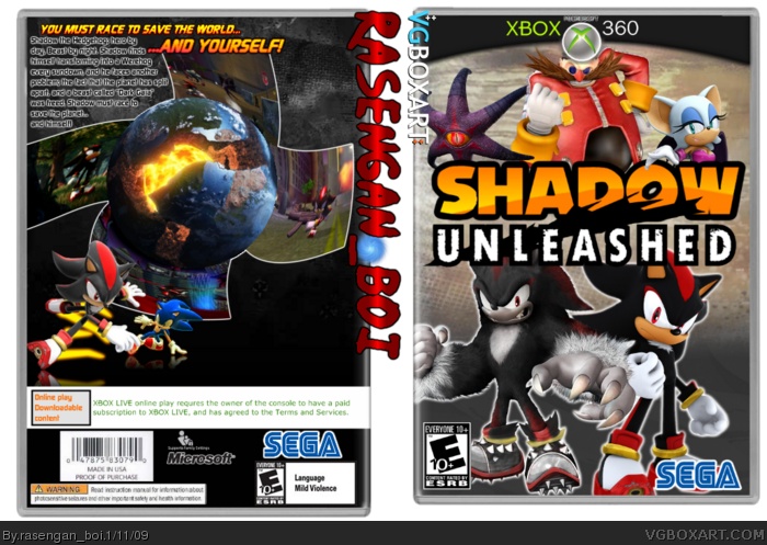
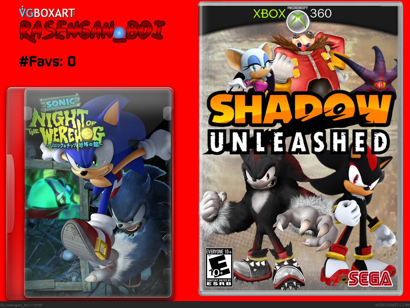
By slapped on, I'm meaning that they are all just standing there, it makes it kind of bland. What I'm saying is to try and think of it this way: instead of placing all the characters just standing there, many of them floating, try to create a scene to make it feel dynamic and interesting. The logo is great. Feels very nice. Also, you should ditch Night of the Werehog from this, post it as its own piece in the movie section, without that bizarre DVD template.
I'm still thinking about accepting your friend request, but you gotta show me you have the maturity to work with some of the suggestions that people give you. I'm not trying to start a fight with you. That's not the attention I want.
EDIT: It's good, just gotta keep control of our tempers. I admit what I said was inflaming to you, too. So I apologize.
#16, the thing I'm going to do, is ditch the night of the werehog, thats got to go, but, I tried not to put them in an envornment, because with the characters at the top, that will prove a bit of a problem, sorry for the whole "got to hell" thing too... I'll see what i can do
#21, I think that's mainly due to the warped screenshots...
Hmmm, I think you should find more characters to have going across the bottom to fill up the space, just two or three more. They could be bad guys or other characters, something like that.
I understand why you did your signature over the box, but try to incorporate it somewhere into your box, so it's not so overpowering. Put it into the barcode or the legal text or something.
#25, I can sympathize as someone who gets their boxes stolen, but it kinda ruins the box a little. I like how you did it in your Sonic Rush Adventure box, still very visible and yet it doesn't take away from the box.
 Shadow Unleashed Box Cover Comments
i made this several days ago, just, with the whole "Banned" thing, never got to post it, i scrapped the backs to both, and the C-D because they looked like utter shit. forgot who made the dvd temp
i thought that Doom's eye could be chip, rouge could be tails, eggman could be... eggman, no prof. pickle, i hate him, and not amy-counterpart, because i plain hate her
Edited at 1 decade ago
[ Reply ]
Would look great apart from the template.
[ Reply ]
#2, which one???
[ Reply ]
looks great. can you pm me the logo? also credit eggboy for the werehog
[ Reply ]
Great improvment.
I love the Shadow the werehog render.
[ Reply ]
#3 Both I guess. Do DVDs actually look like that in america?
[ Reply ]
#4, its on my training thread, here: link
[ Reply ]
It looks nice, but the 360 template is unappealing. An official one would look better.
Also, that Werehog DVD looks bad, and feels very unnecessary.
#6, Not really.
Edited at 1 decade ago
[ Reply ]
The good:
-The logo is awesome.
-The WereShad render.
The Bad:
-The presentation.
-The 360 template.
And the just plain Ugly:
-The red SEGA logo, wtf!?
-It's a Shadow box, not a Sonic box, remove night of the werehog.
[ Reply ]
is that logo transparent?
[ Reply ]
damn, nice box rasengan. were did you get the acctually shadow?
[ Reply ]
#11, imma stealin ur av, it's better than mine xD
Eggboy13 made the werehog
[ Reply ]
The Shadow and WereShadow renders look nice as well as the logo, but the box overall is a bit lack luster.
[ Reply ]
PM me the logo too! This is a great box +fav
[ Reply ]
See comment #7 for the Shadow Unleashed Logo
[ Reply ]
By slapped on, I'm meaning that they are all just standing there, it makes it kind of bland. What I'm saying is to try and think of it this way: instead of placing all the characters just standing there, many of them floating, try to create a scene to make it feel dynamic and interesting. The logo is great. Feels very nice. Also, you should ditch Night of the Werehog from this, post it as its own piece in the movie section, without that bizarre DVD template.
I'm still thinking about accepting your friend request, but you gotta show me you have the maturity to work with some of the suggestions that people give you. I'm not trying to start a fight with you. That's not the attention I want.
EDIT: It's good, just gotta keep control of our tempers. I admit what I said was inflaming to you, too. So I apologize.
Edited at 1 decade ago
[ Reply ]
#16, the thing I'm going to do, is ditch the night of the werehog, thats got to go, but, I tried not to put them in an envornment, because with the characters at the top, that will prove a bit of a problem, sorry for the whole "got to hell" thing too... I'll see what i can do
[ Reply ]
UPDATED! Couldn't find a suitable background for the bottom, fixed the SEGA logo, and improved several positions
[ Reply ]
#18, It's better. Could you see about making a back?
[ Reply ]
#19, ok
[ Reply ]
updated, I don't like the back though...
[ Reply ]
Eh,The screens look stretched and blurry.
And I hate how "Rasengan boi" and "VGboxart" are overlapping the front and back. =/
[ Reply ]
This is your best box so far, great job. I love the logo. +fav
[ Reply ]
#21, I think that's mainly due to the warped screenshots...
Hmmm, I think you should find more characters to have going across the bottom to fill up the space, just two or three more. They could be bad guys or other characters, something like that.
I understand why you did your signature over the box, but try to incorporate it somewhere into your box, so it's not so overpowering. Put it into the barcode or the legal text or something.
[ Reply ]
#24, I had a saying on it, that would throw a monkey wrench into the hands of any thief who's too stupid to inspect the box
[ Reply ]
#25, I can sympathize as someone who gets their boxes stolen, but it kinda ruins the box a little. I like how you did it in your Sonic Rush Adventure box, still very visible and yet it doesn't take away from the box.
[ Reply ]