![]() »
»
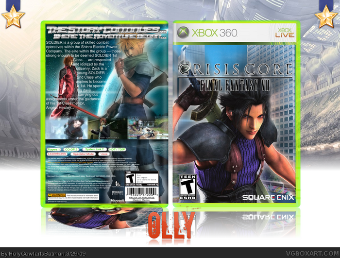
[ Box updated on March 29th, 2009 ] [ original ]
 Crisis Core: Final Fantasy VII Box Cover Comments
Comment on HolyCowfartsBatman's Crisis Core: Final Fantasy VII Box Art / Cover.
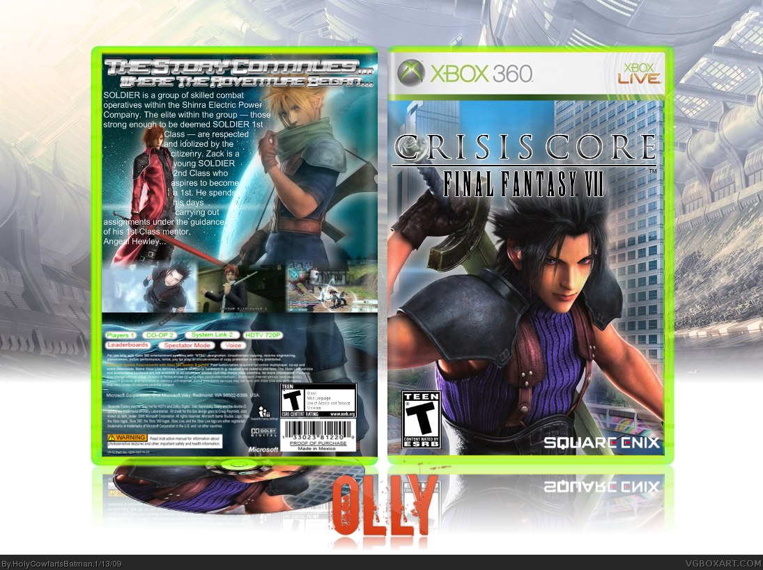
Yeah, I know, it isn't on the 360, should be though...
Can't remember every credit but:
- xxDunexx for the disc template.
- PlanetRenders.net for the renders.
- XCore for the Olly logo.
- Google for everything else. (Ha-ha Cerium, I said it! In your face! =p)
Enjoy!
Edited at 1 decade ago
[ Reply ]
Wow,Dude,You are improving.
=)
[ Reply ]
#2, Thanks dude, any particular favourite part?
[ Reply ]
Huge Improvment fav+
[ Reply ]
nice, +fav
[ Reply ]
Thanks guys!
#5, You didn't +fav...
Edited at 1 decade ago
[ Reply ]
the only thing that catches me wrong is the effects on the tagline, I think they might be a bit to much. otherwise, this is a really nice design, and I agree with everyone else, your definitely getting better!
[ Reply ]
#7, Tagline? Do you mean the whole 'story continues' thing? OMG, You faved, my life is now almost complete, AWESOME!
[ Reply ]
The back is pretty spot on, the screens should just be normal, with maybe just a black line in between them? The front has something off about it.... It looks like his hair is fading at the top. I think you should remove the glow on the logo. That should make it look great-er ;)
[ Reply ]
#9, Worth a +fav from you? Hope so :D, the reason his hair is faded is because that's how the render came. I might remove the glow... and I'm gonna keep the screenshot's though, I quite like 'em.
[ Reply ]
HCFB,How much times are you gonna change your avy? @_@
The back is nice,But I dont like the front so much. To plain. Maybe add something else?
[ Reply ]
looks beautiful =D
[ Reply ]
Okay... I'm getting freaked now, I'm getting faves from Drakxxx, Sentry, gamerking and Master_General... oh... my... god... Thank you guys!
And #11, 'Til I get it right, to be honest, I like this one!
EDIT: I've updated, got rid of the logo glow, and if you view in full, the logo isn't as jagged.
Edited at 1 decade ago
[ Reply ]
That's pretty good. But the text position on the back is not too well laid out. I'd of made the bottom half scale down the sword, and moved the guy in red to the left a tad more. As is, 3.5/5, That's good, but not perfect, although I do see improvement. :D
[ Reply ]
You need to work on text and typography. look at some other boxes for pointers. Really nice job on this though.
[ Reply ]
#15, I didn't actually do the typography, I only do that when I'm making up a game or doing one I've played or own (minus Shadow the Hedgehog) but I'm glad you like it, how many points do you need for HoF?
[ Reply ]
That's pretty damn good. You're best box yet :)
[ Reply ]
#17, You... like... it..? I'm... feeling... woozy... Could this be my HoF (Probably not)
Edited at 1 decade ago
[ Reply ]
Nice job, you are improving.
[ Reply ]
whao =D
[ Reply ]
Congrats on Rank 4 =P
[ Reply ]
if this gets in the hall... wow, if it does, that means a lot of my new boxes should be there too, like my bundle box...
[ Reply ]
Well you pm'd me telling me to check this out. And I am. Not bad. The background on the front doesnt really fit the game though.
[ Reply ]
Honestly I don't like it:
-The tagline is too hard to read
-The text is going over the render of the red guy, which doesn't look good
-The top of the screens seem to fade but the bottom doesn't
-The text is boring
-I don't think the red guy looks good, you should get rid of him. Then have the text covering up that whole area.
-The background on the front doesn't look good. You should use something darker.
Your improving though keep up the good work.
Edited at 1 decade ago
[ Reply ]
#21, Thank you.
#22, Mine won't.
#23, YAY! Never played the game.
#24, I'm sorry you feel that way.
[ Reply ]
Looks pretty good, I also agree with ojoe's crits. Another thing to consider might be to wrap the text around Genesis (the guy in red) all the way instead of only partially.
[ Reply ]
awesome dude :P +fav
[ Reply ]
#27, Thank you! If this gets into the Hall I am gonna be SO happy!
[ Reply ]
Bump. Very sorry, but does anyone have access to a better BG for the front? Oh, and thank you for the faves so far!
[ Reply ]
This is very ridiculously awesome...lol
[ Reply ]
SHIT
[ Reply ]
#30, Lol, thank you, oh, and sonicfanultra, if you don't like me, don't take it out on my boxes, it's actually kinda weird though, you've faved two of my boxes...
[ Reply ]
I like it. I'll fav.
[ Reply ]
#33, Thank you, whoah, 46 points to go...
[ Reply ]
#8 what'll complete it?
This is good and an improvement but the taglines squashed and the arrangement of the screens aren't that good.
[ Reply ]
#35, The tagline isn't squashed...
[ Reply ]
*cough.. cough (me for template :D)* Very nice box man! fav from me!
[ Reply ]
#37, Oh, sorry, Axel Master for the template. Oh, and thanks for the fav dude!
[ Reply ]
i like the front, but the girl on the back looks out of place.
[ Reply ]
Wow. Olly, I don't mind adverts for recent boxes, but for early ones because its 'close' to the Hall?
As for the box, the front is alright, and the back is 'meh'.
[ Reply ]
Holy... Cow... Farts... Batman...
LOL
I LOVE it!
8.5/10 +fav
Edited at 1 decade ago
[ Reply ]
How did I miss this? The tag line looks a bit squished, but pretty good.
[ Reply ]
#41, Lol, that's jokes already been done... on this box...
GARGH! It's got over 150 points! :(
[ Reply ]
Congrats on your box! It's in the HoF!
[ Reply ]
Congrats on your HOF!
[ Reply ]
#44, I can see that! =)
[ Reply ]