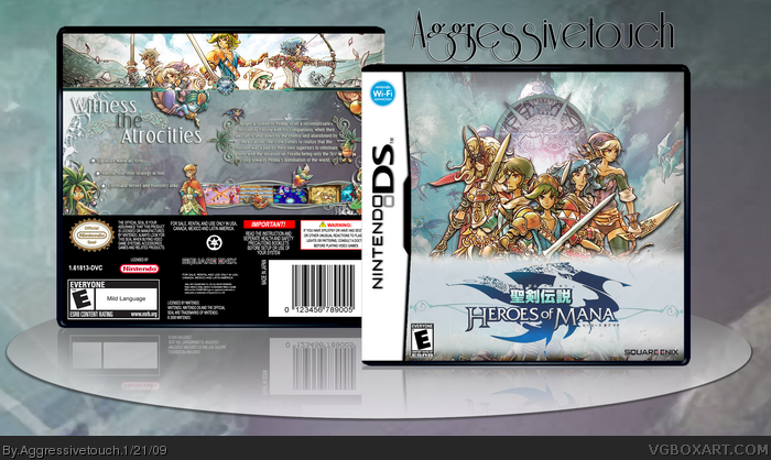
Not bad, but it looks like the logo is badly cut and that bar on the frot seems out of place. I would use the white "squeenix"-logo in the back though, ´cause the outlines would be almost impossible to print (to fine/thin)
The box looks really awesome. Just a few nit-picks though:
CONS:
1. The ESRB and Dev logos are a bit too small. the reflection also has no ESRB description.
2. The Back seems a bit empty in some places.
PROS:
1. I love the artwork. You did a very good job helping the box flow together nicely.
2. The layout on the back seems very clean and professional.
3. Overall, the box looks really clean and well put-together.
4. I love your presentation
cool style but a couple points that are weak IMO is the big block behind the logo on the front. i understand it was to make the logo visible, however its a little distracting and overpowering.
also on the back, realistically if this was a real DS box i think the text would be hard to read and the screens would hardly be visible.
still, its nice and clean and i like how the how box is joined with common color scheme, etc.
 Heroes of Mana Box Cover Comments
New box =]
Enjoy
[ Reply ]
Nice one AT. This game definitely works great with your trademark style. :)
[ Reply ]
yeah very true drakxxx lovely and gives a little rpg feel to it.. i think its an rpg lol
[ Reply ]
Win!
[ Reply ]
Nice.
[ Reply ]
...wow
[ Reply ]
awsome.
[ Reply ]
Not bad, but it looks like the logo is badly cut and that bar on the frot seems out of place. I would use the white "squeenix"-logo in the back though, ´cause the outlines would be almost impossible to print (to fine/thin)
Edited at 1 decade ago
[ Reply ]
Beautiful. If I had this game i'd ask for a printable :D
[ Reply ]
Aww thanks everyone :D
[ Reply ]
NICEEEEE
[ Reply ]
sorry double post
Edited at 1 decade ago
[ Reply ]
The box looks really awesome. Just a few nit-picks though:
CONS:
1. The ESRB and Dev logos are a bit too small. the reflection also has no ESRB description.
2. The Back seems a bit empty in some places.
PROS:
1. I love the artwork. You did a very good job helping the box flow together nicely.
2. The layout on the back seems very clean and professional.
3. Overall, the box looks really clean and well put-together.
4. I love your presentation
Overal: 4.7/5, +fav. Great work!
[ Reply ]
#13, aww thanks didn't notice
I'll have to update when I get on a computer XD
i'm on my cell right now
[ Reply ]
My, you do have quite the Agressive Touch.
[ Reply ]
#15, why thank you =]
[ Reply ]
I agree with #4
[ Reply ]
really nice.. and cute! Prefer bigger screenshots but everything else is well put together. :)
[ Reply ]
aww thanks everyone =]
[ Reply ]
great.
[ Reply ]
yey for hall =]
thanks everyone who faved and commented
[ Reply ]
congrats on hall!
[ Reply ]
Amazing as always. I'd love a printable! +fav
[ Reply ]
i'll see what i can do =]
[ Reply ]
cool style but a couple points that are weak IMO is the big block behind the logo on the front. i understand it was to make the logo visible, however its a little distracting and overpowering.
also on the back, realistically if this was a real DS box i think the text would be hard to read and the screens would hardly be visible.
still, its nice and clean and i like how the how box is joined with common color scheme, etc.
[ Reply ]