[ Buy The Lord Of ... at Amazon ] By Joeseye 47 on January 24th, 2009 No Printable Available The Lord Of The Rings: Conquest Box Cover Comments Comment on Joeseye's The Lord Of The Rings: Conquest Box Art / Cover. Cancel Reply Silent Oblivion 45 [ 1 decade ago ] One word. Brilliant! [ Reply ] gamerking 43 [ 1 decade ago ] it's awesome but i don't like the esrb and dev logos on the top. :/ still fav though! :D [ Reply ] DDWariior 3 [ 1 decade ago ] AWESOME. Faving. [ Reply ] Sentry 45 [ 1 decade ago ] Why couldn't the logo be on top and the esrb and dev logos on the bottom? [ Reply ] roza 44 [ 1 decade ago ] exellent box man, you get a fav from me [ Reply ] HalfSwiss 43 [ 1 decade ago ] Great. I just think it would look better if you put the top at the bottom. [ Reply ] Cheese 21 [ 1 decade ago ] Sweet, I think it's cool how the logos are at the top and not the bottom, as usual. [ Reply ] Maximum 24 [ 1 decade ago ] I don't like how that demon looks like he's going to eat kill those people and horse, and they're just going by like nothing's going on at all >_O [ Reply ] Lenny819 38 [ 1 decade ago ] The backs nice and clean but the fronts a bit weird to be honest. I suggest you move the pic and the logo to the very top and put the esrb and devs where they belong. [ Reply ] MF29 35 [ 1 decade ago ] The front is different and killer. [ Reply ] Arkatox 1 [ 1 decade ago ] Very interesting idea. I like it! [ Reply ]
 The Lord Of The Rings: Conquest Box Cover Comments
One word. Brilliant!
[ Reply ]
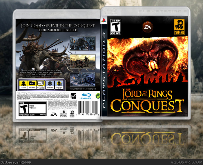
it's awesome but i don't like the esrb and dev logos on the top. :/
still fav though! :D
[ Reply ]
AWESOME.
Faving.
[ Reply ]
Why couldn't the logo be on top and the esrb and dev logos on the bottom?
[ Reply ]
exellent box man, you get a fav from me
[ Reply ]
Great. I just think it would look better if you put the top at the bottom.
[ Reply ]
Sweet, I think it's cool how the logos are at the top and not the bottom, as usual.
[ Reply ]
I don't like how that demon looks like he's going to eat kill those people and horse, and they're just going by like nothing's going on at all >_O
[ Reply ]
The backs nice and clean but the fronts a bit weird to be honest. I suggest you move the pic and the logo to the very top and put the esrb and devs where they belong.
[ Reply ]
The front is different and killer.
[ Reply ]
Very interesting idea. I like it!
[ Reply ]