![]() »
»
[ Box updated on January 26th, 2009 ] [ original ]
 Call of Duty: World at War Box Cover Comments
Comment on xIAMHUNTERx's Call of Duty: World at War Box Art / Cover.
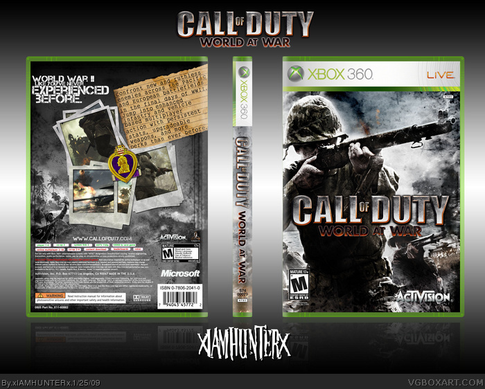
It's hard to design in a speeding car, let me tell you.
The quality's not so good, I had to save as a .jpg because the .png was too big.
[ Reply ]
Loving the front, but the back....
[ Reply ]
#2 said
[ Reply ]
You made this on your laptop in the car? I would throw up if I tried that.
I actually like the back. It's got a military feel, and the purple heart is a nice touch.
[ Reply ]
The backs alright looking but the front is epic. Great work.
[ Reply ]
#4, Yeah my stomach starts to hurt if i try to read while im in a car >_<
The front looks great, both those guys look kinda similar though, the back looks kind of empty and feels like it's missing things.
[ Reply ]
The front's great, but the back seems empty.
[ Reply ]
Front and back are both good :)
[ Reply ]
Yeah the front looks official, but the back seems really empty. Nice job overall.
[ Reply ]
Yea the back is a bit plain as everyone else has said, but otherwise it's great dude b(^_^)d
[ Reply ]
the back kills it. :/
[ Reply ]
LOVE the back
[ Reply ]
I love the front, but the back is a little empty.
If you do a little more to fill up the space, maybe even just spread the screenshots out a bit, then you'll definitely get a favourite from me!
[ Reply ]
Really loving the front but I agree with the others the back is quite empty. Nice job for working in a car.
[ Reply ]
Really slik! nice work dude, i also agree with the others..but other than that nice one
[ Reply ]
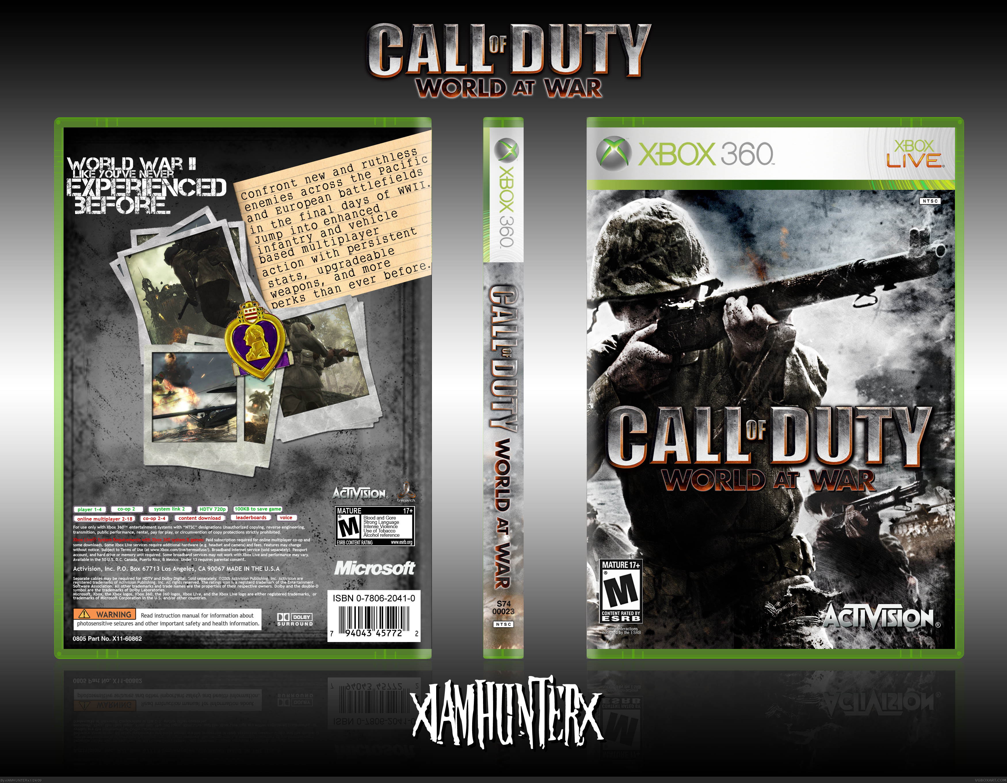
I honestly don't see what's wrong with the back, but whatever. I spiced it up a little bit anyway. I'll upload in a bit if I can find a wireless network at a rest stop or something but I'll probably just have to wait till I get home tonight.
[ Reply ]
Updated.
[ Reply ]
It looks better now. :)
[ Reply ]
Its still empty, but it actually looks awesome now
[ Reply ]
I agree, it still looks empty
[ Reply ]
What the hell are you guys talking about?
[ Reply ]
#21 It's just...plain. I don't know what to tell you. Except maybe add color to the new images on the back.
[ Reply ]
I think it's throwing some people's eye off Ryan because the photos are in the center, and not stretched out to the bottom left corner of the box. If you merged all that stuff, and scaled it to the corner, it wouldn't look empty no more.
I think it looks great as it is though.
[ Reply ]
Nice update, back looks much better now.
[ Reply ]
i totally disagree with everyone its not too plain there is more design in the back than there is in most peoples whole box.
gret job iamhunter
+fav
[ Reply ]
Back is awesome now.
[ Reply ]
i like vagine
[ Reply ]
By the beard of Zeus! says:
Fave my World at War box and I'll suck you off
[ Reply ]
Oh yus
[ Reply ]
Version 2 is much better, good job on updating that back. Front is solid---no complaint's there. The purple heart is a great addition, overall, really nice job ;)
[ Reply ]
Where can I get the template?
[ Reply ]
#31, I made it myself and I don't feel like giving it out just yet, sorry.
[ Reply ]
ur a bitch
[ Reply ]
Supre badass.
[ Reply ]