[ Box updated on February 3rd, 2009 ] [ original ]
 Okami: Sunlight and Moonlight Edition Box Cover Comments
Comment on Periwinkle's Okami: Sunlight and Moonlight Edition Box Art / Cover.
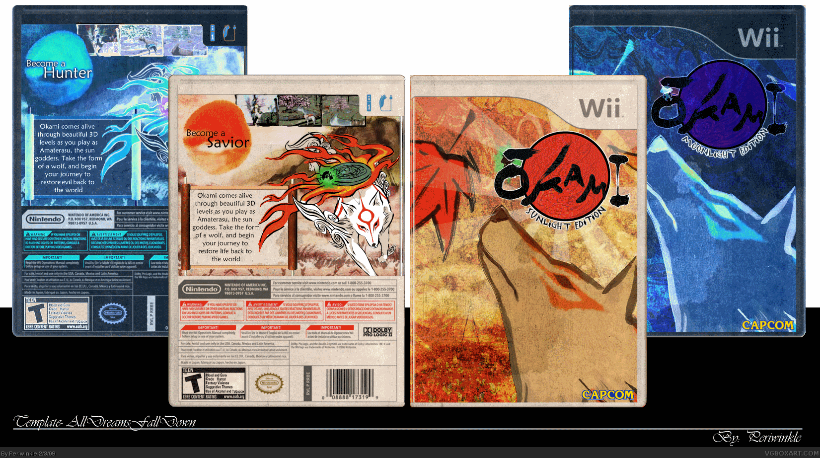
[ Box updated on February 3rd, 2009 ] [ original ]
Comment on Periwinkle's Okami: Sunlight and Moonlight Edition Box Art / Cover.
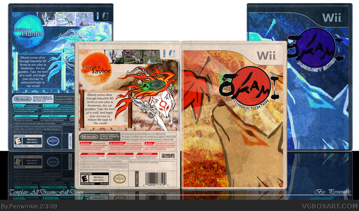
I've been working on this one all day and it's finally done. Let me know what you think.
Edited at 1 decade ago
[ Reply ]
I like the Sunlight, but not the moonlight version
[ Reply ]
Very good.
The moonlight version seems unnecessary, In my opinion.
[ Reply ]
deserves the hall, +fav
[ Reply ]
#4, Damn Right!!!
This is excellent!
[ Reply ]
The Sunlight Edition is cool, but it looks like you just inverted the colors for the Moonlight Edition and it doesn't look so good.
[ Reply ]
I don`t get the moonlight one... you did just invert the colors, even from the template and to me the "art" behind boxarts is to work with the given template, not to change it like you did.
[ Reply ]
I didn't invert the colors, I added a blue overlay to it. But you are right, it didn't turn out great. I made the front and I liked how it turned out but when I made the back it didn't work out the way I had planned. I was trying something different with this one to see how it would go.
Thanks for the comments and the favorites 2-5.
Edit: I forgot the dev and ESRB logos, I'll have an update up soon.
Edited at 1 decade ago
[ Reply ]
Lovely
[ Reply ]
That's Koopa's template by the way.
Nice job.
[ Reply ]
This is great, and I can tell that you did put effort into it, even though it didn't turn out like you planned.
[ Reply ]
i personally love the moonlight edition nice work +fav
[ Reply ]
Moonlight looks light sunlight inverted
[ Reply ]
#8, well... if black turns into white and that orange-red of yours into something blue it sure is somewhat inverted. Anyways, I don´t get why you changed the whole template as well as the nintendo quality logo and some other defined designs. Theres corporate identity and corporate design for a purpose after all...
[ Reply ]
#14 ok well it is my box that i made so i can change whatever i want even if it has a purpose ok. i can change the colors to whatever i want to ok and another thing if u ask me i think it looks great
Edited at 1 decade ago
[ Reply ]