[ Buy Super Mario ... at Amazon ] By paper sonic 37 on February 6th, 2009 No Printable Available Super Mario Sunshine! Box Cover Comments Comment on paper sonic's Super Mario Sunshine! Box Art / Cover. Cancel Reply BrainSick 5 [ 1 decade ago ] Super Mario Sunshine for Wii????I dont know why,but some parts look good. The back is wired,the text to small and the rest boring...the front is okay and the disc,too 3/5 [ Reply ] paper sonic 37 [ 1 decade ago ] hello there my new box and this took 3 days and has 43 layers so yeah it looks awesome cred too Koopadaser for the awesome temp and me for the disc :P 1# How can i make it not boring and the text is not that small [ Reply ] oxol 24 [ 1 decade ago ] I like it all, but it needs a background for a fav ;) [ Reply ] paper sonic 37 [ 1 decade ago ] #3, what!!!!!!!!!!! it has a back ground [ Reply ] HolyCowfartsBatman 38 [ 1 decade ago ] Nice, can you PM me the temp? [ Reply ] BrainSick 5 [ 1 decade ago ] How you can make the text not to small????Make it bigger :D [ Reply ] oxol 24 [ 1 decade ago ] #4, barrely noticible :/ Makes it look plain tho [ Reply ] paper sonic 37 [ 1 decade ago ] #6, Umm thanks [ Reply ] Sonic the Hedgehog 39 [ 1 decade ago ] Not bad =) 4/5. it would look better if you used a background instead of just white [ Reply ] paper sonic 37 [ 1 decade ago ] thanks guys I have 100 favs [ Reply ] DanteAMD 6 [ 1 decade ago ] #9, It has a BG. [ Reply ] Bricky506 1 [ 1 decade ago ] The back is strange... [ Reply ] jayhog 20 [ 1 decade ago ] Good box, i like it, 4/5 jus make the background a bit clearer because it looks a bit bare... I like the disc too 4.5/5 for the disc Edited at 1 decade ago [ Reply ]
 Super Mario Sunshine! Box Cover Comments
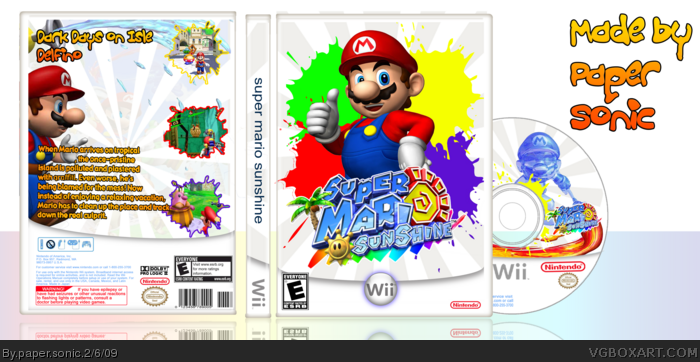
Super Mario Sunshine for Wii????I dont know why,but some parts look good.
The back is wired,the text to small and the rest boring...the front is okay and the disc,too
3/5
[ Reply ]
hello there my new box and this took 3 days and has 43 layers
so yeah it looks awesome cred too Koopadaser for the awesome temp and me for the disc :P
1# How can i make it not boring and the text is not that small
[ Reply ]
I like it all, but it needs a background for a fav ;)
[ Reply ]
#3, what!!!!!!!!!!! it has a back ground
[ Reply ]
Nice, can you PM me the temp?
[ Reply ]
How you can make the text not to small????Make it bigger :D
[ Reply ]
#4, barrely noticible :/
Makes it look plain tho
[ Reply ]
#6, Umm thanks
[ Reply ]
Not bad =) 4/5. it would look better if you used a background instead of just white
[ Reply ]
thanks guys I have 100 favs
[ Reply ]
#9, It has a BG.
[ Reply ]
The back is strange...
[ Reply ]
Good box, i like it, 4/5 jus make the background a bit clearer because it looks a bit bare... I like the disc too 4.5/5 for the disc
Edited at 1 decade ago
[ Reply ]