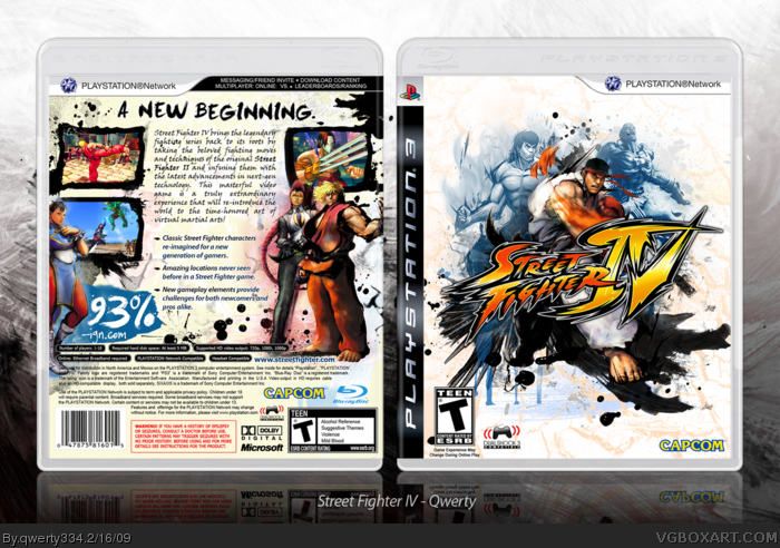
As I have matured as a boxart-designer, Ive slowly learned that a box isnt made solely to be pretty.. its supposed to communicate what the game is about.
So here is my (belated) one-year anniversary box, which was made to do just that: communicate.
Instead of using that overused image of Ryu walking forward, I chose a more dynamic image of Ryu punching to add movement and tell the audience that, yes, this is a fighting game. Brush strokes/splatters were added to complement the sumi-e art style of the game and give off an agressive vibe.
The back, originally created to complement the front, ended up as a whole new message on its own. The layout is traditional and basic, but ink/paint splatters are placed regularly around the composition to give it a fresh feeling.The game claims to be just that: a traditional fighter game with new additions to modernize it. Sure, that concept is a little deep for most people to even figure out, but its the thought that counts, right? X)
Anyway, the fantastic template is made by Sens, a humungormous 300 dpi printable is on its way, and enjoy!
#7, inorite? I just bought a new laptop a few weeks ago though, so I'll be able to make boxarts more often. In fact, I'm working on a new one right now. ;)
#5, #11, haha! I think E_G and Greg had personality changes.
Looks really good. The only small problem I see is on the front, the blue ink splatter right below the log just doesn't look right to me. It kind of just cuts off.
 Street Fighter IV Box Cover Comments
As I have matured as a boxart-designer, Ive slowly learned that a box isnt made solely to be pretty.. its supposed to communicate what the game is about.
So here is my (belated) one-year anniversary box, which was made to do just that: communicate.
Instead of using that overused image of Ryu walking forward, I chose a more dynamic image of Ryu punching to add movement and tell the audience that, yes, this is a fighting game. Brush strokes/splatters were added to complement the sumi-e art style of the game and give off an agressive vibe.
The back, originally created to complement the front, ended up as a whole new message on its own. The layout is traditional and basic, but ink/paint splatters are placed regularly around the composition to give it a fresh feeling.The game claims to be just that: a traditional fighter game with new additions to modernize it. Sure, that concept is a little deep for most people to even figure out, but its the thought that counts, right? X)
Anyway, the fantastic template is made by Sens, a humungormous 300 dpi printable is on its way, and enjoy!
Edited at 1 decade ago
[ Reply ]
#1, my eyes are bleeding.
edit: from reading
Edited at 1 decade ago
[ Reply ]
Get in my bellah.
[ Reply ]
#2, Fix'd. I had to remove all apostraphes and commas. Weird glitch..
#3 kk
Edited at 1 decade ago
[ Reply ]
I hate you.
Sorry I thought I was Vengeance for a minute, great box.
[ Reply ]
I still don't think that that's E_G haha.
Anyways great box.
[ Reply ]
8D
It's been how long since your last one? 4 months? Awesome work as always. ;)
[ Reply ]
Sick :)
[ Reply ]
yes
[ Reply ]
#6, Ok then, I'm not E_G.
[ Reply ]
#5, -_____________________-
[ Reply ]
Grr....I guess I have to post mine in a few days....
[ Reply ]
Gracias gente!
#7, inorite? I just bought a new laptop a few weeks ago though, so I'll be able to make boxarts more often. In fact, I'm working on a new one right now. ;)
#5, #11, haha! I think E_G and Greg had personality changes.
Edited at 1 decade ago
[ Reply ]
#10, Thought so.
[ Reply ]
#6, yeah from that comment I agree.
[ Reply ]
<3
[ Reply ]
STEVE!
I MISS YOU! D=
Get on MSN so we can talketh.
+Fav
[ Reply ]
Love it.
[ Reply ]
Your best!
[ Reply ]
I must have your skills and your soul :P +fav
[ Reply ]
Fuck you, because I never got to talk to you on MSN.
[ Reply ]
Fucking wicked baat!!!
link have to watch this ito get it, and have to apprechiate accents from the valleys. =P
Amazing box btw. fav+
[ Reply ]
I love you.
[ Reply ]
Thanks everyone for the comments and hall! :D
Glad you likey-likey.
[ Reply ]
Looks really good. The only small problem I see is on the front, the blue ink splatter right below the log just doesn't look right to me. It kind of just cuts off.
[ Reply ]
Awesome box +fav
Could you tell me where to get the font for the tagline and summary please?
Thanks
[ Reply ]
Amazing! Simply amazing!
[ Reply ]