Nice.
I like how the full bottom-half and the emptier top half creates a sense of openness. Colors are great too, however, the top section seems a tiny bit colder than the bottom, which sorta breaks the otherwise smooth transition.
Nevertheless, I still love it.
This box is begging for a back though. It feels unfinished without one. Add a back and I'll fav.
#4, Ok, i'll make a back. and the reason about the colors. The bottom was fully in color, and the top was just a dark blue, so no matter how hard i tried, it'd be difficult to get the to blend PERFECTLY.
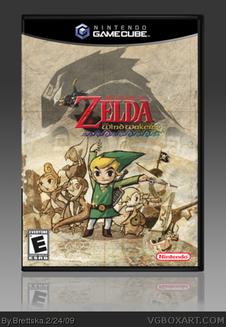
 The Legend of Zelda: The Wind Waker Box Cover Comments
Wow i like it alot
[ Reply ]
I made a quickie cause i'm cool like that. Thanks to Qwerty for the template. Enjoy!
[ Reply ]
As I said before,It's very cool.
:P
[ Reply ]
Nice.
I like how the full bottom-half and the emptier top half creates a sense of openness. Colors are great too, however, the top section seems a tiny bit colder than the bottom, which sorta breaks the otherwise smooth transition.
Nevertheless, I still love it.
This box is begging for a back though. It feels unfinished without one. Add a back and I'll fav.
Edited at 1 decade ago
[ Reply ]
#4, Ok, i'll make a back. and the reason about the colors. The bottom was fully in color, and the top was just a dark blue, so no matter how hard i tried, it'd be difficult to get the to blend PERFECTLY.
Edited at 1 decade ago
[ Reply ]
#5, Try overlaying the top with a transparent layer of desaturated yellow.. or maybe vivid light.
Edited at 1 decade ago
[ Reply ]
Very nice. I like the colors.
[ Reply ]
Really nice flow and colors Brett, I'd love to see a back.
[ Reply ]
Great job, love the colors. A back would be nice.
Edited at 1 decade ago
[ Reply ]
I love it! A back would be awesome.
[ Reply ]
Very pretty.
[ Reply ]
the zelda-logo could be bigger
[ Reply ]
Awesome ;) 9/10
[ Reply ]