Yeah, the PS2 PAL temp is really horrible, but I can't update it because the file is corrupted. But my next SH one, does have the much better NTSC temp!
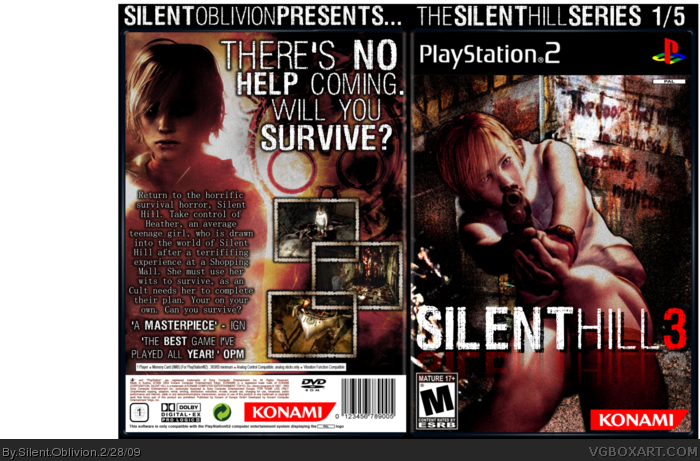
This is very good! I like the use of LK's borders too, it really fits the game/box design well.
The only real problem I see is that the reflection on the logo kind of overcasts onto the ESRB rating, which look like an amateur mistake, like something Capcom'd do on an Okami box.
Outside of that, everything else is perfect. Great placement, really good use of the grainy effect, nice text spacing on the back for the description, and as usual that logo is killer. A+ stuff here man!
Oh, yeah, I really would have liked to see a nice presentation!
This is really well done! One thing is I don't think the reflection on the front logo works. Also it would be cool if you had some presentation and the template doesn't look right.
Overall 8/10
 Silent Hill 3 Box Cover Comments
Great box
[ Reply ]
New Box!
Lots and lots of work into this, enjoy!
Cred to ADFD for the temp and logos and LK for the screenborders, edited by me.
Edited at 1 decade ago
[ Reply ]
Very, very good, awesome use of screenshots, for me its 8.7/10 +fav!
[ Reply ]
Very stylish.
[ Reply ]
awesome, +fav
[ Reply ]
god...........can i have that tag line and the Logo :P love the screenshot borders btw
Edited at 1 decade ago
[ Reply ]
Could you please PM me those screenshot borders..?
[ Reply ]
Yes, great as usual lol
I love your style dude.
[ Reply ]
Amazing box Silent Oblivion! This deserves way more attention.
[ Reply ]
the template sucks.. but the cover.. is awsome!
[ Reply ]
Yeah, the PS2 PAL temp is really horrible, but I can't update it because the file is corrupted. But my next SH one, does have the much better NTSC temp!
[ Reply ]
Excellent, and fav'd already.
[ Reply ]
cool box, 5/5.
[ Reply ]
man, you're really improving.
[ Reply ]
cool 5/5 +fav
[ Reply ]
nice man faved
[ Reply ]
This is very good! I like the use of LK's borders too, it really fits the game/box design well.
The only real problem I see is that the reflection on the logo kind of overcasts onto the ESRB rating, which look like an amateur mistake, like something Capcom'd do on an Okami box.
Outside of that, everything else is perfect. Great placement, really good use of the grainy effect, nice text spacing on the back for the description, and as usual that logo is killer. A+ stuff here man!
Oh, yeah, I really would have liked to see a nice presentation!
Edited at 1 decade ago
[ Reply ]
This is really well done! One thing is I don't think the reflection on the front logo works. Also it would be cool if you had some presentation and the template doesn't look right.
Overall 8/10
[ Reply ]
Awesome, very nice use of those borders indeed, nice work. +fav
[ Reply ]
lovely jubbly! 5/5 for box
not faved bcos its not my kinda box. (soz)
[ Reply ]