I'd have to agree with TTT, it looks too much like all your other boxes. I would say experiment before you start finishing off your design style, you've got enough talent to try something different. Other than that, good job.
#19, And why would I? At least they're not asses about it. I don't mind people telling me that they look the same. I just mind the WAY you say it. And you said you'd ignore my boxes and yet here you are, bringing this back up again. Seems to me like I'm not the one with the issues...
on a side note, thank you RunawayRed. I'll TRY to change it up next time. lol
Back to your old style I see? The classic gamerking style. The one with the character shot and a good screen shot of the setting seperated by the logo. A classic. The back is good, but this one style is starting to kill me.
Personally, I actually don't like it.
The front is really good and everything.
But once you zoom in to full view, the back just kills it for me, the special features, you said to leave alone, so I will, but the background that you took off the Happening in that section doesnt blend with the black background on the second half, and the font looks really...bad, It's a good box, and your an 8, and I'm a 3, so you really shouldn't be taking advice from me, but just putting it out there.
3/5
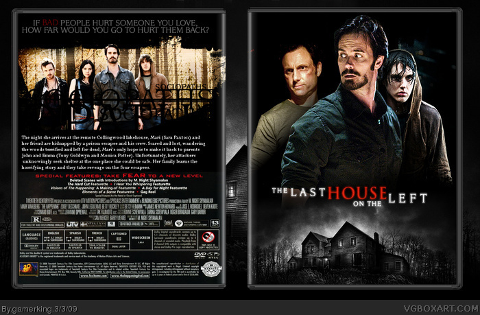
 The Last House On The Left Box Cover Comments
this was fun to make. lol. i'll change the special features later, so no need to comment about that. i just put it like that for now. :)
[ Reply ]
Forgot to comment on the wip.
Awesome. lol :P
[ Reply ]
awww yeah!
[ Reply ]
koooooolio! lol pretty good joe...but is that the old format again? O.o
[ Reply ]
Pretty nice.
[ Reply ]
Looking good Joe. I like those text effects on the back.
[ Reply ]
thanks guys! :)
@ryan: no it's not. <_< >_> =P
[ Reply ]
Looks like all your others, to be honest.
[ Reply ]
Pertty!
[ Reply ]
Great job Gamerking, I really like the effects on the back.
[ Reply ]
Cool
[ Reply ]
Have my babies...
Wow, I'm beginning to sound like a rent boy! :p
Seriously dude, awesome box! +fav!
[ Reply ]
great job joe!(that's your name right?)
Bu i think box is kind of dark. fav/9.5 out of 10
[ Reply ]
yeah, it is rod. =P
and thanks for the favs and comments guys! :D
[ Reply ]
Its nice :D
[ Reply ]
ahahah. thanks kyle. =P
[ Reply ]
awsome box gk!
[ Reply ]
I'd have to agree with TTT, it looks too much like all your other boxes. I would say experiment before you start finishing off your design style, you've got enough talent to try something different. Other than that, good job.
Edited at 1 decade ago
[ Reply ]
#18, So 2 people agree with me.
You gonna be a crybaby on them too?
[ Reply ]
#16, Yeah your welcome lol
[ Reply ]
#19, And why would I? At least they're not asses about it. I don't mind people telling me that they look the same. I just mind the WAY you say it. And you said you'd ignore my boxes and yet here you are, bringing this back up again. Seems to me like I'm not the one with the issues...
on a side note, thank you RunawayRed. I'll TRY to change it up next time. lol
Edited at 1 decade ago
[ Reply ]
Aaw, you murdered it on the back. That's just awesome! I do like how the front is very secluded though!
[ Reply ]
Back to your old style I see? The classic gamerking style. The one with the character shot and a good screen shot of the setting seperated by the logo. A classic. The back is good, but this one style is starting to kill me.
[ Reply ]
#22, I murdered it? :O ...and i'm starting to kill GRP?...aaaaah! :O
[ Reply ]
Agreed with TTT.
[ Reply ]
#25, yes i get that now. lol but just because they have the same style doesn't make them bad. :(
[ Reply ]
I can't believe THIS is getting ignored... it's great, I love what you did with the back! What program did you make it on?
Edited at 1 decade ago
[ Reply ]
i work in gimp. :)
[ Reply ]
You did this in GIMP!! I can't make boxes that good in CS3, as usually, outstanding boxart dude!
[ Reply ]
thanks biggerboss. :)
btw, i might update later. I want to make this the best that i can. :D
[ Reply ]
Realy like the back GK, looks great
[ Reply ]
Love the box, and I cant wait to see this movie!
[ Reply ]
omg i want to see this movie soooo bad!
5/5 +fav +author fav
[ Reply ]
wow, thanks guys. :)
[ Reply ]
not to bad.
[ Reply ]
you ve got 143 pints!
just 7 more and you have a hall of FAME!!!
[ Reply ]
lol thanks! hope it does! :D
[ Reply ]
Hey GK, how'd you get that effect on the Back Photo?
[ Reply ]
Congrats! Damn, you knocked my DMC4 box off the Latest HoF! DAMN YOU! :p
Edited at 1 decade ago
[ Reply ]
Personally, I actually don't like it.
The front is really good and everything.
But once you zoom in to full view, the back just kills it for me, the special features, you said to leave alone, so I will, but the background that you took off the Happening in that section doesnt blend with the black background on the second half, and the font looks really...bad, It's a good box, and your an 8, and I'm a 3, so you really shouldn't be taking advice from me, but just putting it out there.
3/5
[ Reply ]