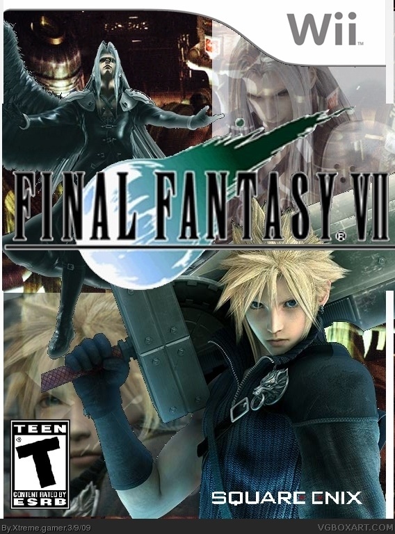
Well... i dont get why there is a not-cut-out picture of cloud and sephiroth in the background, i dont get why there i white bars....
But i really like the cloud on the front, you should make the final fanntasy logo smaller, add a better background and maybe another sephiroth-render. And delete this pictures.
All in all... lets say, it is not average, its a bit worse.
So i have to say 5.1/10 sorry :(
There is still this big white bar. I like the cloud render, it looks awesome, but delete both sephiroth pics and search for one in the style of cloud and replace it better. And search for a more interessting background.
thanks crazy maniac inoticed you hav faved most my work now tis good!
also nothing94 that white bar is the outside of the box. but yeah i shall try and find a new render im putting all my effort in this box atm

 Final Fantasy VII Box Cover Comments
this is my first final fantasy box ever also this is my 2nd time using gimp took me two hours hope you enjoy!
[ Reply ]
Well... i dont get why there is a not-cut-out picture of cloud and sephiroth in the background, i dont get why there i white bars....
But i really like the cloud on the front, you should make the final fanntasy logo smaller, add a better background and maybe another sephiroth-render. And delete this pictures.
All in all... lets say, it is not average, its a bit worse.
So i have to say 5.1/10 sorry :(
[ Reply ]
oh.... ill update it
EDIT: updated
Edited at 1 decade ago
[ Reply ]
There is still this big white bar. I like the cloud render, it looks awesome, but delete both sephiroth pics and search for one in the style of cloud and replace it better. And search for a more interessting background.
[ Reply ]
#4 why does it really matter if their is a white strip down the side
i think this box is quite cool 9/10 for all the effort fav (:
[ Reply ]
thanks crazy maniac inoticed you hav faved most my work now tis good!
also nothing94 that white bar is the outside of the box. but yeah i shall try and find a new render im putting all my effort in this box atm
[ Reply ]
I like the cover better than the psp version.It looks like it would be fun on wii with motion control instead of clicking.
Edited at 1 decade ago
[ Reply ]
ey thx dunc names a bit to obvious lol
[ Reply ]
The first version and this one are very different, in a good way! That's why I'll fav :)
[ Reply ]
where did you get that cloud render?
[ Reply ]
i rendered it myself off google images
[ Reply ]
Fav! This is really good!
[ Reply ]
#11, Could you show me the origins image please?
[ Reply ]