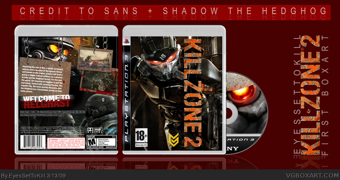
- Blurry images
- Art leaking outside of template
- Bad logo placement (and angle)
- Clashing artstyles on back
- Bad blending (very obvious) blending on the back
- Screenshot has the PSU logo on it (really?)
- There are no chains in KZ so idk why you've got card board hanging there
- Generic font choice doesnt fit the game.
- The planet is called "Helghan", the soldiers on it with the glowing eyes are called "Helghast", Proof read
- Giant space gap in the back info
- What's up with the disc template? eww.
For a first box, id say this looks great from a view, but when i really go to look at it, that is what i see.
 Killzone 2 Box Cover Comments
Hi, This is my first box. please comment and criticize
and don't forget to author fav if you like my style.
EDIT: also i ment to say sens and not sans
Edited at 1 decade ago
[ Reply ]
Welcome to Helghast? Have you ever played this game?
Anyway, the back doesn't fit the game at all and the logo on the front shouldn't be turned.
Edited at 1 decade ago
[ Reply ]
- Blurry images
- Art leaking outside of template
- Bad logo placement (and angle)
- Clashing artstyles on back
- Bad blending (very obvious) blending on the back
- Screenshot has the PSU logo on it (really?)
- There are no chains in KZ so idk why you've got card board hanging there
- Generic font choice doesnt fit the game.
- The planet is called "Helghan", the soldiers on it with the glowing eyes are called "Helghast", Proof read
- Giant space gap in the back info
- What's up with the disc template? eww.
For a first box, id say this looks great from a view, but when i really go to look at it, that is what i see.
[ Reply ]
It should be welcome to helghan. otherwise its good
[ Reply ]