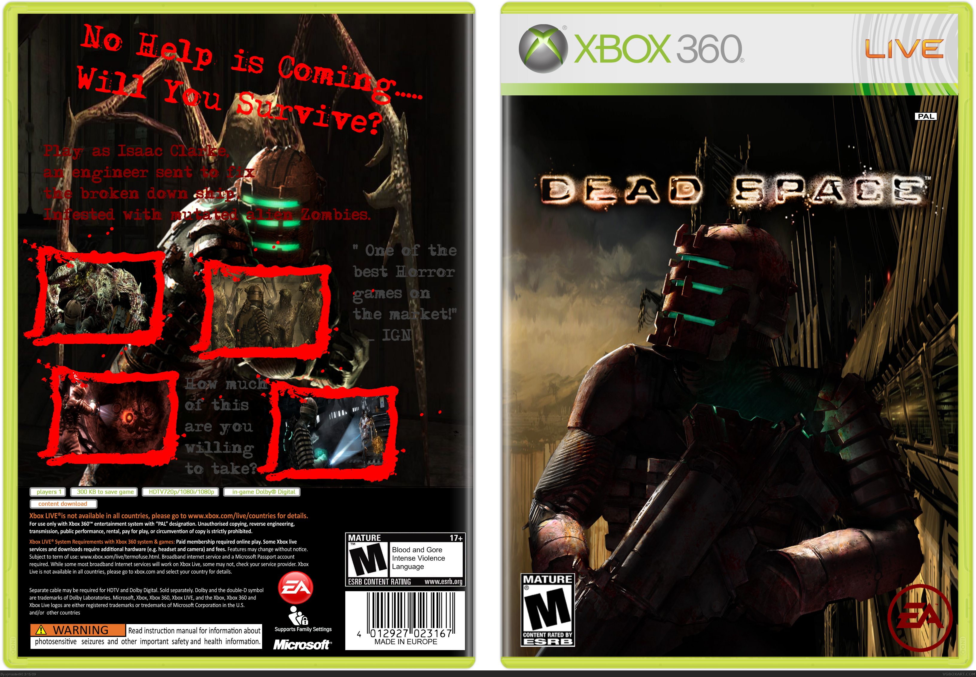
Ok well the idea isn't too bad and you've executed it reasonably well but on the front the ea logo doesn't look good.
On the back I think the screenshot borders are too cartoony for such a grungy and sci-fi game. Also the text for tagline and summary and quotes all looks very plain.
 Dead Space Box Cover Comments
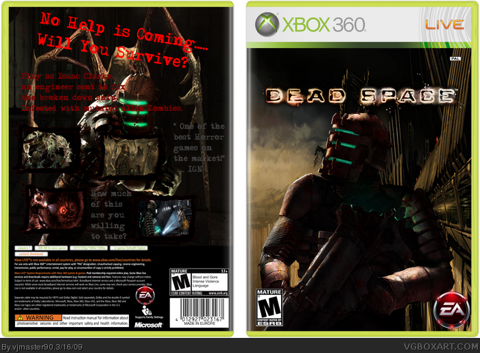
My Dead Space box.
Tell me how I can improve.
Credit to qwerty334.
Edited at 1 decade ago
[ Reply ]
:(..................
This took me three days.
[ Reply ]
Ok well the idea isn't too bad and you've executed it reasonably well but on the front the ea logo doesn't look good.
On the back I think the screenshot borders are too cartoony for such a grungy and sci-fi game. Also the text for tagline and summary and quotes all looks very plain.
[ Reply ]
UPDATE.
Better?
[ Reply ]
Front's OK, but you really should fund better placement for the screens on back, and redo the text with some more style to fit the game better.
[ Reply ]
Hmmm. cant really do that.:(
[ Reply ]