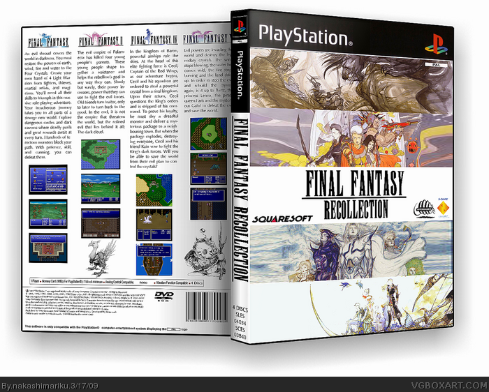
Your getting better however, the dev logos on the front should be on the bottom and on the back, it's a bit to plain, way to much text and screenshots, a few would have been okay with more artwork.
#1, Thanks.
Some developers put their logos in other places than on the bottom (Konami, for example) and I didn't want it to obstruct the artwork.
As for the back, it's a collection, so I wanted descriptions and screens for each of the four games.
 Final Fantasy Recollection Box Cover Comments
Your getting better however, the dev logos on the front should be on the bottom and on the back, it's a bit to plain, way to much text and screenshots, a few would have been okay with more artwork.
[ Reply ]
#1, Thanks.
Some developers put their logos in other places than on the bottom (Konami, for example) and I didn't want it to obstruct the artwork.
As for the back, it's a collection, so I wanted descriptions and screens for each of the four games.
[ Reply ]
I like it very much, youre improving. I agree with what #1 said.
But its still 7.3/10 +fav.
[ Reply ]
Excellent and simple.
[ Reply ]
Hey man I would love to use this as a cover, it would be cool for a printable version.
[ Reply ]
I agree with number 5. Is it possible to get a printable version?
[ Reply ]