that looks really nice.
A tip; Maybe put both the catridges in the middle, and move the boxes slightly away from them, so that it's less of a straigt presentation.
While it's really good, it's not as good as the thumbnail led me to believe. It's important to take into consideration what kind of style your images have. It just doesn't look right for a DS Pokemon game to have CG images on its cover that mixes with photograph backgrounds.
It's not bad, though. In fact, it's much better in concept than 90% of the Pokemon boxes here.
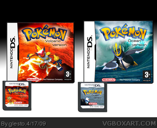
 Pokemon Ocean & Volcano Box Cover Comments
Please enlarge the picture becauese the box is very tiny now.
This is my first box here.
I hope you like it :)
Edited at 1 decade ago
[ Reply ]
Very good for a first!
I'd like too see more of you ;)
Welcome on the site.
[ Reply ]
that looks really nice.
A tip; Maybe put both the catridges in the middle, and move the boxes slightly away from them, so that it's less of a straigt presentation.
Great job.
[ Reply ]
While it's really good, it's not as good as the thumbnail led me to believe. It's important to take into consideration what kind of style your images have. It just doesn't look right for a DS Pokemon game to have CG images on its cover that mixes with photograph backgrounds.
It's not bad, though. In fact, it's much better in concept than 90% of the Pokemon boxes here.
[ Reply ]
whoa, nice.
[ Reply ]