#3,#4,#5-thats hardly fair. Just because there are other boxes doesnt mean you dont have to favourite or critisize. Your supposed to focus on the design.
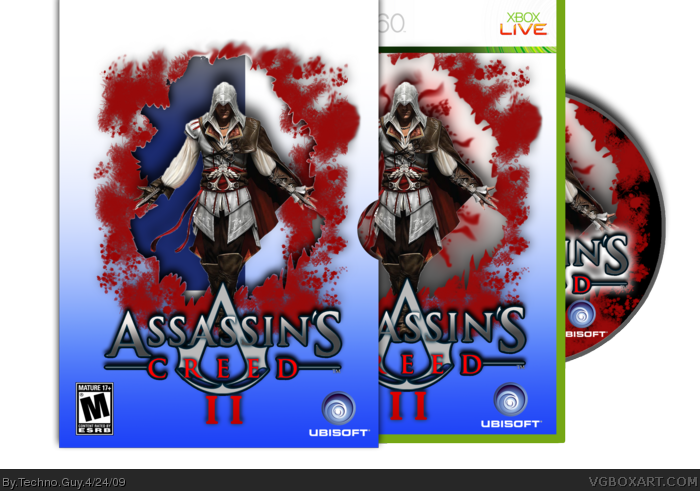
It's not that there's other boxes with the same art, I just don't like the black red scheme for assassins creed.
And your see through cut-out doesn't line up with the inner box, either.
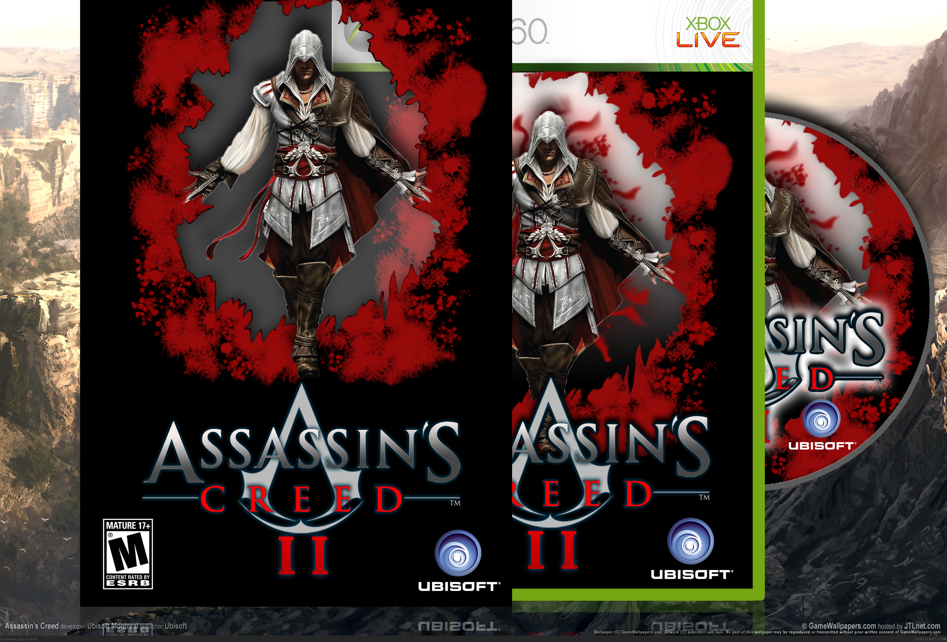
The slip cover is great. The actual cover should be something different than that design, something of the environment of the game or something like that.
Its a nice idea but like everyone said, the images dont line up and the colour scheme doesnt really do it for me. Also i think the main image is badly cut as is the logo. Its a nice idea though.
#16, actualy the logo and render would be ruined if i fixed them up so i left them how they were. ive got another version here so give us a sec and ill update it.
Updated! sorry about the delay i had to go out... ive improved the box though! Its lined up, i changed the colours ( i ditched the background cause it was making the file just too big) and i got rid of the plastic on the sleeve. hope you like it! :)
 Assassin's Creed II Box Cover Comments
NICE
[ Reply ]
I see the effort, but... nah. I doesn't appeal.
[ Reply ]
Another box! im quite pleased with this one myself. hope you like the idea. rate and comment :)
[ Reply ]
#2, Agreed.
[ Reply ]
I agree with #2- too many assassins creed 2 boxes.
[ Reply ]
#3,#4,#5-thats hardly fair. Just because there are other boxes doesnt mean you dont have to favourite or critisize. Your supposed to focus on the design.
[ Reply ]
#6, It is good...Ahh you have twisted my arm i'll fav.
[ Reply ]
#7 thanks :) its appreciated.
[ Reply ]
It's great. I really like your boxes and style.
[ Reply ]
#9 thanks alot!
[ Reply ]
It's not that there's other boxes with the same art, I just don't like the black red scheme for assassins creed.
And your see through cut-out doesn't line up with the inner box, either.
[ Reply ]
You're really very talented. +fav
[ Reply ]
Thats a sweet idea, i might have to do somthing like that somtime. Great box +fav
[ Reply ]
The slip cover is great. The actual cover should be something different than that design, something of the environment of the game or something like that.
That's my opinion anyway.
[ Reply ]
thanks everyone! i might update it (ill line up the plastic and stuff).
[ Reply ]
Its a nice idea but like everyone said, the images dont line up and the colour scheme doesnt really do it for me. Also i think the main image is badly cut as is the logo. Its a nice idea though.
[ Reply ]
#16, actualy the logo and render would be ruined if i fixed them up so i left them how they were. ive got another version here so give us a sec and ill update it.
[ Reply ]
Updated! sorry about the delay i had to go out... ive improved the box though! Its lined up, i changed the colours ( i ditched the background cause it was making the file just too big) and i got rid of the plastic on the sleeve. hope you like it! :)
[ Reply ]
#18, i don't like it :(
[ Reply ]
Eh, the colors just don't fit. Look at the art-style, look at the time the game is set in. The bright blues and basic reds just don't fit.
Go to animus.com and look at the way they present the material. We're talking 15th century Italy, not Naruto.
It looks like a crappy anime cover with a render of Ezio slapped in the middle.
Look at some of these: link
link
link
link
Not trying to beat you up, but these are all tastefully done, and take inspiration from the source material.
[ Reply ]