I like this but yes the presentation could have been try lining them up better or something see if that makes a difference. I like the Disks the best.......Simple but effective.
The presentation needs to be worked on and in full view blurryness is a problem. I also don't like the back,remember to move the cd out of the way of it.
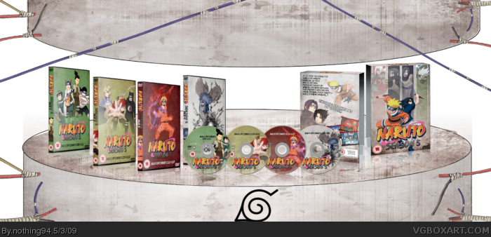
Nice. The main issue on the front of the Season 5 box set cover is the faded characters. You have 4 bars which Itachi, Jiraiya, Kakashi and Orichimaru are in, yet their bodies are running into each others spaces. You should probably cut off the bits running out of the bars.
Aug, another one in a long line of Naruto boxes, this isn't really that appealling the prsentation isn't that good. The cases for each individualy disk is really uh ok, but the box that holds the boxes is actualy very good.
I actually preferred the original background thingy. :x
New one looks a lot like Mad Spikes, which i always felt was too distracting from the box itself (though i'll admit, it's shnazzy xP.
But the individual boxes themselves are really pretty nice, i really like the one on the far right. :)
Overall very impressive, i can tell the amount of work that went into this, so great job! ^_^
Not a fan of the presentation, I think it looks a bit odd. The boxes themselves look great, and show alot of effort. This should be in the HoF already, great job. :)
 Naruto Season 5 Box Cover Comments
So, heres my new box! Took me pretty long to finish it.
This is also my entry for the "Anime Box Competition". Enjoy and give comments :)!!!
[ Reply ]
I really hate the presentation, but the actual boxes are nice =)
[ Reply ]
#2, could you give me an advice how to make a good presentation :P^^?
[ Reply ]
I like this but yes the presentation could have been try lining them up better or something see if that makes a difference. I like the Disks the best.......Simple but effective.
[ Reply ]
Make the presentation... a table...
And you've been doing ALOT of Naruto lately.
[ Reply ]
YAY!
Insta-fav!
If this is your anime box...
I shudder to think what your manga one is...
[ Reply ]
#5, i know :P^^
[ Reply ]
Sexy, really, it's lovely. :)
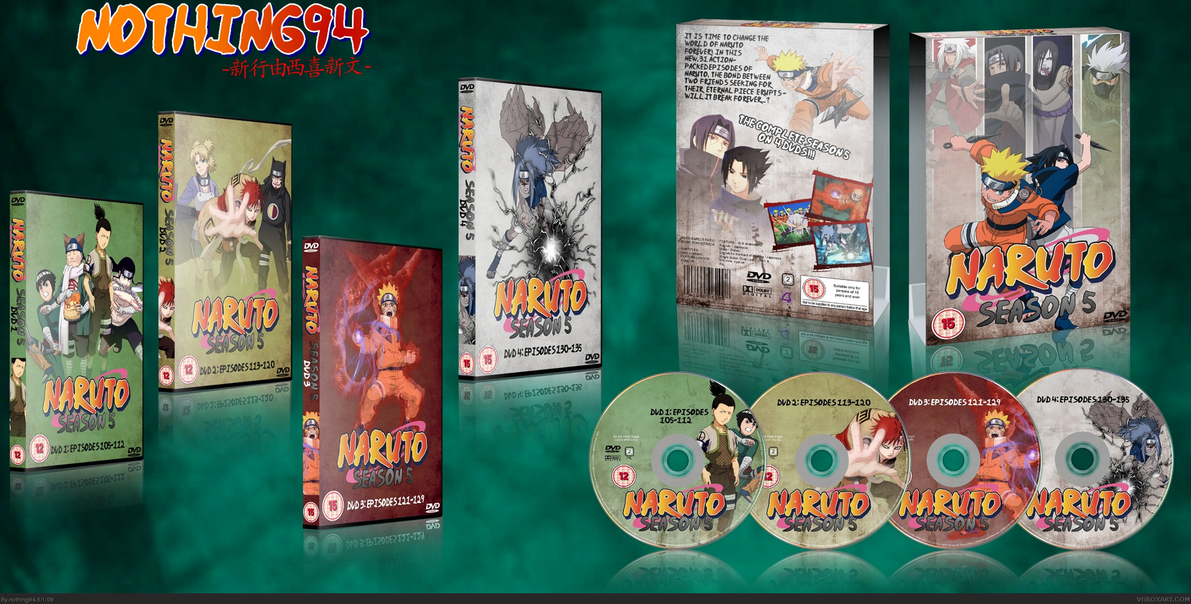
I can't help to think the back feels, empty, though.
And I love how you used game art on the DVD boxes. :)
+Fav
EDIT: OMFG,YOU UPDATED IT AS I POSTED. It's awesome! :D
Edited at 1 decade ago
[ Reply ]
pretty good set, congrats...
[ Reply ]
#8-9 Thanks :D
UPDATED!!!
[ Reply ]
Really awesome presentation.
Nice Work
[ Reply ]
wow really your really one awesome boxartist
[ Reply ]
I feel like the back could be more descriptive.
[ Reply ]
This is good, except for the back of the box set and the blurry ripoff presentation.
[ Reply ]
The presentation needs to be worked on and in full view blurryness is a problem. I also don't like the back,remember to move the cd out of the way of it.
[ Reply ]
Nice. The main issue on the front of the Season 5 box set cover is the faded characters. You have 4 bars which Itachi, Jiraiya, Kakashi and Orichimaru are in, yet their bodies are running into each others spaces. You should probably cut off the bits running out of the bars.
[ Reply ]
Naruto is awesome and so is this box. +fav BTW, it's Story Arcs, but I'd still do seasons...
[ Reply ]
looks awesome!
[ Reply ]
Aug, another one in a long line of Naruto boxes, this isn't really that appealling the prsentation isn't that good. The cases for each individualy disk is really uh ok, but the box that holds the boxes is actualy very good.
[ Reply ]
#2, agreed
But i'll fav
[ Reply ]
Looks sweet but i hate the presentation, it was a good try at somthing diff. though. +fav
[ Reply ]
The only thing I don't really like is the presentation, everything else is great. Fav
[ Reply ]
It's really good, except from those sticks in the background that are blurry.
[ Reply ]
Damn.
[ Reply ]
fav...
[ Reply ]
#20-25 Thanks :D
#23 I know, i will replace / remove them today :)
[ Reply ]
Woah, the 3D rocks! Nice presentation too.
[ Reply ]
Very Impressive. Reminds me of Mad Spike though.
Edited at 1 decade ago
[ Reply ]
#27-28, thanks :D
#28, Why? You mean because of the presentation?
[ Reply ]
That's pretty impressive!
[ Reply ]
My only complaint is the back of the boxset. Could use some work. Otherwise awesome!
[ Reply ]
Impressive set!
+ fav
[ Reply ]
#30-32, thanks :)
[ Reply ]
Good +fav
[ Reply ]
very nice ;) faved
[ Reply ]
I actually preferred the original background thingy. :x
New one looks a lot like Mad Spikes, which i always felt was too distracting from the box itself (though i'll admit, it's shnazzy xP.
But the individual boxes themselves are really pretty nice, i really like the one on the far right. :)
Overall very impressive, i can tell the amount of work that went into this, so great job! ^_^
[ Reply ]
#34-36 Thanks :D
#36, I know, the presentation is based on mad spikes, but i like his much more^^ This was just an experiment :)
Yay! Already 153 points, i hope this can enter hall of fame :)
[ Reply ]
UPDATED! Isnt blurry anymore :)
[ Reply ]
cool
[ Reply ]
#39, thanks :)
I dont get why it isnt in HoF, it has over 160 Points!
Edited at 1 decade ago
[ Reply ]
Not a fan of the presentation, I think it looks a bit odd. The boxes themselves look great, and show alot of effort. This should be in the HoF already, great job. :)
[ Reply ]
#41, thanks
I would like to know why this isnt in HoF yet, it has about 180 points^^
[ Reply ]
It will get in when it gets in.
Which will be soon.
Good work.
[ Reply ]
Awesome and i love Naruto. Favorite.
[ Reply ]
#43, i know :P
#43-44 Thanks :)
[ Reply ]
Very cool, i like the thing that is not the box, but the other that is behind the box
[ Reply ]
How come this isn't in HoF yet?
[ Reply ]
#47, the box is cursed.
[ Reply ]
#47, dont know, it has over 180 points :(
#48, definitly agree ;)
[ Reply ]
Congrats!
[ Reply ]
Congrats on HoF!
[ Reply ]
Congrats on reaching HoF status!
[ Reply ]
congrats!!
[ Reply ]