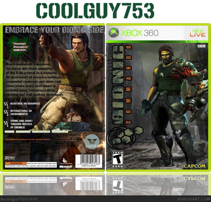
Newest box for the developer competition. So I thought bionic commando would be a change from the obvious resi or devil may cry(the round is capcom) Credit to techne for the template I believe. PLEASE VIEW IN FULL FOR BEST RESULTS! Also I reuploaded because I needed to touch up a couple of things. C&C always welcome.
#2, Thanks!
#3, I shall work on that.
#4, The front is supposed to give off a post-apocalyptic theme. As for the back,it was a hard one to make but that doesn't make it good. Any suggestions?
Hello
as the main character on the front and especially on the back is streched, it make quality go down...the back, if you put a proportionnal respected picture, will change a lot, setting your tagline and find an other idea for screenshoots will an occasion to make then.
the template is fine, but not always readable
with a bit more work, you'll get an nterresting box
I agree with others, you are definitely improving. :)
A few things i think you could improve on this though.
Does the text have anti-aliasing on? It looks a bit choppy.
Taglines for backs of boxes usually have a bit more distinguished look, making it stand out from the rest of the text, maybe make it bigger, using a different sort of font?
The quality of the actually pictures looks a bit blurry, if you need some great sites to get game art, let me know and i can PM you a few. :)
This is pretty good Coolguy, you are getting a lot better. The only thing I don't really like about it is the screenshots and the font on the back. Everything else is great!
 Bionic Commando Box Cover Comments
Newest box for the developer competition. So I thought bionic commando would be a change from the obvious resi or devil may cry(the round is capcom) Credit to techne for the template I believe. PLEASE VIEW IN FULL FOR BEST RESULTS! Also I reuploaded because I needed to touch up a couple of things. C&C always welcome.
[ Reply ]
I like it but the tagline could have been bigger.
[ Reply ]
Your getting better and better Coolguy =)
I agree with #2, also you could blend the two back pics together, as the bottum kind of stops when it gets he back.
[ Reply ]
Sorry, the back is not that good, looks very uninspired, the front has not enough action for me. 5/10.
[ Reply ]
#2, Thanks!
#3, I shall work on that.
#4, The front is supposed to give off a post-apocalyptic theme. As for the back,it was a hard one to make but that doesn't make it good. Any suggestions?
[ Reply ]
Awsome your improving! I see dead peo....xD
I see talent in you! Fav and keep up the good work and you'll be my fav author soon :D
[ Reply ]
Cool box, your definitly improving man.
[ Reply ]
#6 and #7 and #8,That really means alot man.
Edited at 1 decade ago
[ Reply ]
The front is great.
I agree with #7, you're really getting much better.
[ Reply ]
looks awesome! you are deffinatley improving ^^
[ Reply ]
I agree with roza, but i wish you would have screens. Like it anyway though :)
[ Reply ]
Cool box! 4/5.
[ Reply ]
yeah your getting there :)
[ Reply ]
#11, There are some screens under the legs but they do look quite blurry to me. Does anyone know how you make things look more high res?
[ Reply ]
Hello
as the main character on the front and especially on the back is streched, it make quality go down...the back, if you put a proportionnal respected picture, will change a lot, setting your tagline and find an other idea for screenshoots will an occasion to make then.
the template is fine, but not always readable
with a bit more work, you'll get an nterresting box
[ Reply ]
I agree with others, you are definitely improving. :)
A few things i think you could improve on this though.
Does the text have anti-aliasing on? It looks a bit choppy.
Taglines for backs of boxes usually have a bit more distinguished look, making it stand out from the rest of the text, maybe make it bigger, using a different sort of font?
The quality of the actually pictures looks a bit blurry, if you need some great sites to get game art, let me know and i can PM you a few. :)
Overall looks good though.
[ Reply ]
You are improving, I'm just not that fussy on this one. 6/10
[ Reply ]
#3, agreed.
[ Reply ]
#15 and #16, Critique appreciated,an update will be coming soon.
#17, Any suggestions?
#18, Thanks for the fav.
[ Reply ]
good job coolguy :) youre improving!
[ Reply ]
This is pretty good Coolguy, you are getting a lot better. The only thing I don't really like about it is the screenshots and the font on the back. Everything else is great!
[ Reply ]
Its very good, i would fav it if you made the tagline bigger in a version 2.
But overall its very good.
[ Reply ]
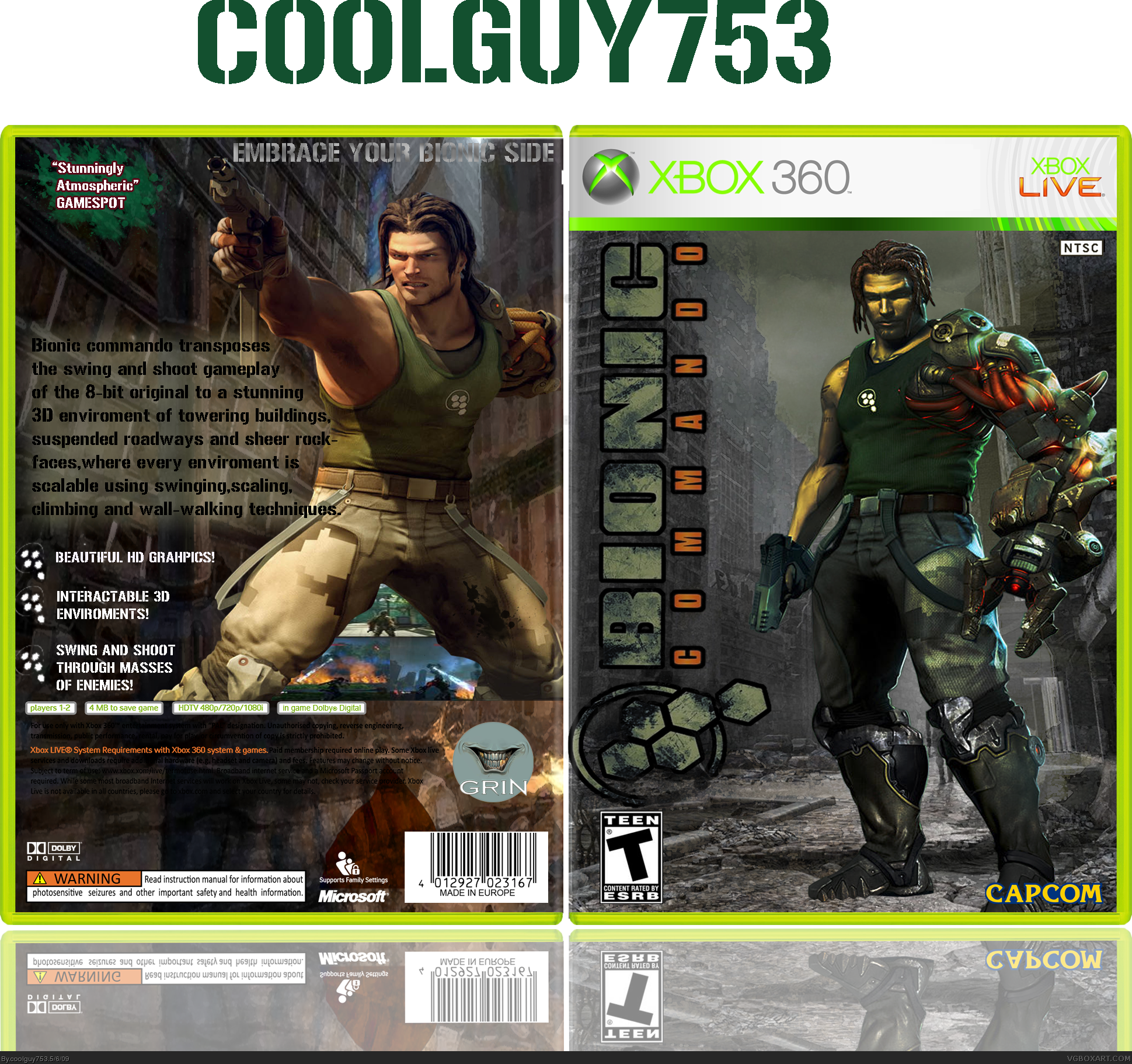
UPDATE: Box made bigger,tagline made bigger and screens hopefully less blurry.
[ Reply ]
Nice update, coolguy!
[ Reply ]
Great improvement :)
[ Reply ]
#24,#25, Thanks guys. It really means alot coming from you two :)
[ Reply ]
Preety good. Your best yet IMO. Great job! 4.5/5. (Simplicity reasons)
[ Reply ]
#27, Thanks!
[ Reply ]
Now i will fav, good update.
[ Reply ]