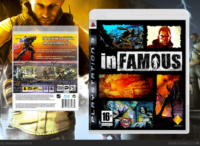
Pretty cool idea. Only thing is the border you used on each image is too similar. It also takes too much off of the image and looks like a stamp.
Also I agree that a back should be done for this one.
You've got a good concept going for the back, but it could use some improvement. The templates obviously don't match up (in appearance or size) and it looks like you let something bleed out at the top.
Keep at it though. The basic idea is great but the execution needs some tightening up.
 inFAMOUS Box Cover Comments
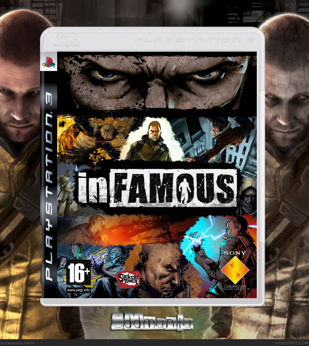
An other box ;) I was inspired by the design of the official Special Editon cover, but I made the rest, of course.
[ Reply ]
A-M-A-Z-I-N-G
[ Reply ]
#2, Thanks ;)
[ Reply ]
Your my fav artist now.!
[ Reply ]
Oh and did I mention you should be Rank 5 or 6..?
[ Reply ]
Make a back NAO!
[ Reply ]
#5, Wow thanks, that's kind of you !
[ Reply ]
#7, I'm not trying to be king, I speak the truth!
Edited at 1 decade ago
[ Reply ]
#8, When you said that you sounded like Jesus or something lololololol!
Anyway I don't completely agree,maybe rank 4 ;).
[ Reply ]
+Soon enough you will get HoF not on this box maybe another! Love to see a back though!
[ Reply ]
Pretty nice.
And btw: I keep getting you confused for me :S
[ Reply ]
#10, Haha yeah, that would be great !
[ Reply ]
If you make backs for all your boxes then you will get most in HoF trust me!
[ Reply ]
Yer good.
[ Reply ]
#11,#12,#13, 3 world ends with you avatars in a row! :O
[ Reply ]
#15, Haha yeah :p
[ Reply ]
I like where you are going with your boxes but you should really try and make backs for them as well.
[ Reply ]
Why is everyone getting TWEWY Avatars?
It's really confusing.
[ Reply ]
Pretty cool idea. Only thing is the border you used on each image is too similar. It also takes too much off of the image and looks like a stamp.
Also I agree that a back should be done for this one.
[ Reply ]
Oh ok, thanks, I guess I should make a back, but I'm not English, I'm not sure I could write a perfect long text...
[ Reply ]
Ok, so I made a back ;) It's smaller than the front, sorry, but I didn't find a template as big as the front.
Well, I'm not sure it's good...
[ Reply ]
You've got a good concept going for the back, but it could use some improvement. The templates obviously don't match up (in appearance or size) and it looks like you let something bleed out at the top.
Keep at it though. The basic idea is great but the execution needs some tightening up.
[ Reply ]
#22, Ok, thanks ;)
[ Reply ]
Printable please? This is the best cover i've seen
[ Reply ]
Nice BoxArt,Front Amazing . . .
[ Reply ]
Awesome
[ Reply ]
Thanks! :) This is an old one though!
[ Reply ]