I love the front. Here are my suggestions for the back, you could make the text grungier and you can edit the description's text to make it not as close to the edges.
I agree with what #1 and #4 said. It took me a second to get what the tagline was meant to be, and the clean look of the text doesn't fit with the grungy style. I absolutely love the front though.
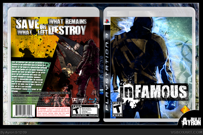
 inFAMOUS Box Cover Comments
I love the front. Here are my suggestions for the back, you could make the text grungier and you can edit the description's text to make it not as close to the edges.
[ Reply ]
Hey everyone.
A small project for my 2-year-anniversary on VGBA.
Credit to shadysaiyan for the art-pack ;)!
#1--thanks E_G, i'll update it soon ^^
[ Reply ]
Oh yeah, Happy Anniversary. You've been a very good asset to this site.
[ Reply ]
I have no idea what I'm reading when I look at the tagline, I'd suggest making it more clear.
[ Reply ]
What #4 said.
Also, I don't like the text, screenshots, or general layout of the back.
[ Reply ]
I agree with what #1 and #4 said. It took me a second to get what the tagline was meant to be, and the clean look of the text doesn't fit with the grungy style. I absolutely love the front though.
Edited at 1 decade ago
[ Reply ]
thanks for commenting guys,i'll start working on another back today ^^.
#3-- thanks alot E_G,means alot for me !
[ Reply ]