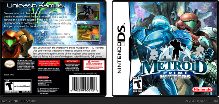
Newest box, worked my butt off :D. Credits! Credit to Yoshistar for the Metroid Prime logo and Spiderpig24 for editing it. Credit to master_general for the renders and Nintendo Logo.
Really cool, I like the front logo, kind of a retro feel, but make the 'II' more pronounced because it was hard to see at first. The outlines of the hunters on the front is a cool touch too. One last thing is put Dark Samus behind Samus, it would balance better overall. A good design though 4/5.
 Metroid Prime Hunters 2 Box Cover Comments
Newest box, worked my butt off :D. Credits! Credit to Yoshistar for the Metroid Prime logo and Spiderpig24 for editing it. Credit to master_general for the renders and Nintendo Logo.
[ Reply ]
I just have a feeling it would look better without Dark Samus. Everything else is cool though.
[ Reply ]
Really cool, I like the front logo, kind of a retro feel, but make the 'II' more pronounced because it was hard to see at first. The outlines of the hunters on the front is a cool touch too. One last thing is put Dark Samus behind Samus, it would balance better overall. A good design though 4/5.
[ Reply ]