![]() »
»
[ Box updated on May 30th, 2009 ] [ original ]
 Where the Wild Things Are Box Cover Comments
Comment on ELCrazy's Where the Wild Things Are Box Art / Cover.
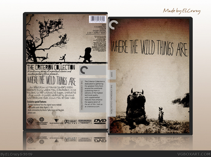
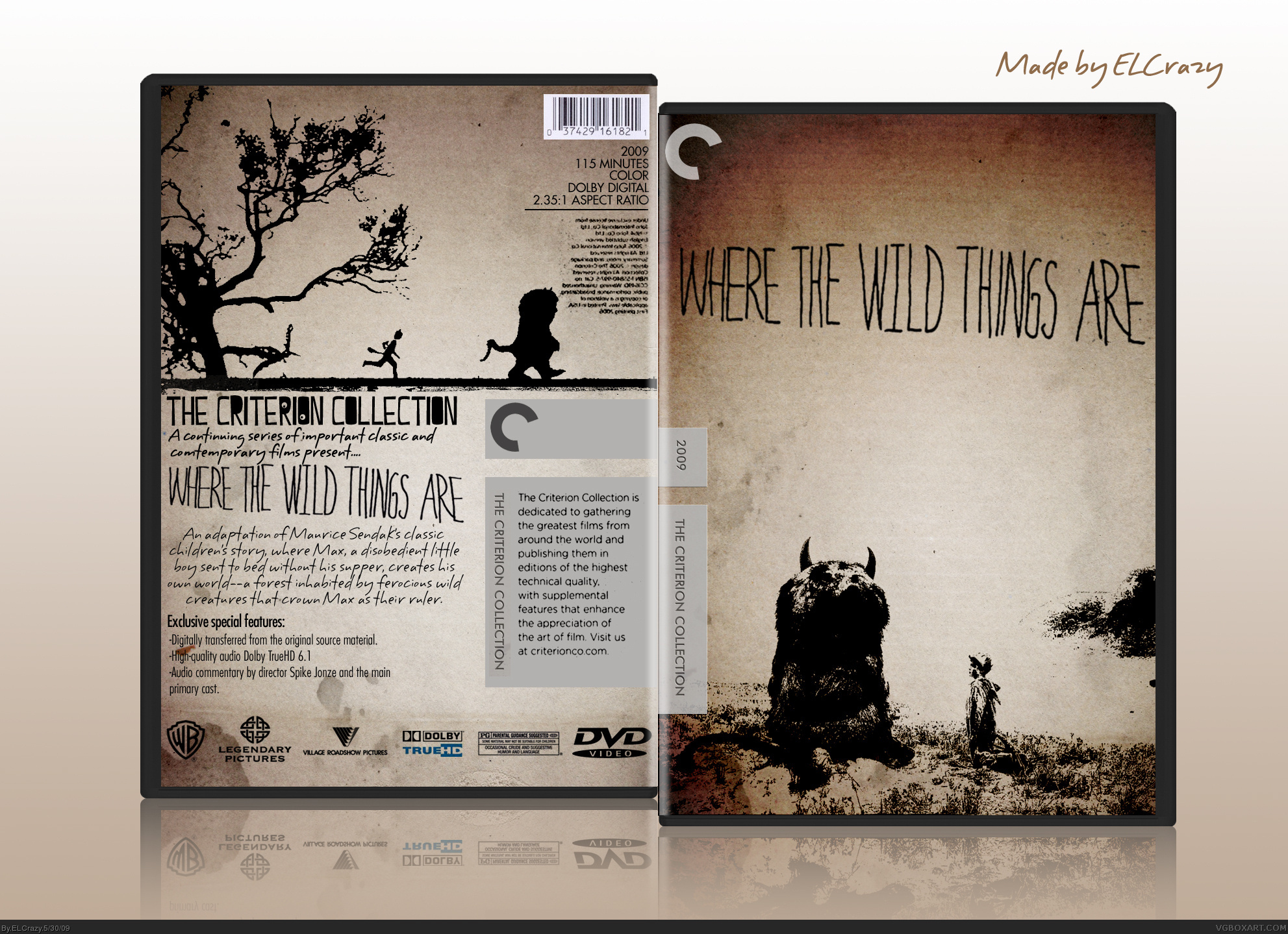
Looking at more Criterion boxes and the stills from the upcoming Where the Wild Things Are have given me such a creative outburst. I really think this is one of my best works ever.
Enjoy! :D
[ Reply ]
It's sex in a boxart.
[ Reply ]
I'm being honest: I don't like it. I think your manipulation of the images has really detracted from the art, particularly on the front.
I feel the single block of flipped text is out of place on the back.
I find the italic script on the back to jar with the rest of the design.
Sorry :/
Edited at 1 decade ago
[ Reply ]
#3, I see. Then what do you suggest to make it better?
[ Reply ]
#5, you know, it's growing on me.
I just think the image on the front would benefit from a bit more of the original detail.
Perhaps replace the back font with a more wobbly style handwriting, like this? link
I do like it now a lot more than on first seeing it.
Edited at 1 decade ago
[ Reply ]
Dude........................................................................................................................................
[ Reply ]
Amazing job Dan!
+Fav
[ Reply ]
Fantastic solution.
[ Reply ]
This movie is going to be awesome. Great cover Dan :)
[ Reply ]
Thanks guys!
[ Reply ]
Not only is it a beutiful design in it's on right, it really looks like the minimalist box arts Criterion puts out.
It's a long shot, but I would LOVE to see you do one for "Eyes Without a Face". The Criterion DVD is the only version that exists.
[ Reply ]
#11, Thanks man. And reading about Eyes Without a Face, I would LOVE to do a box for it. I've already got a rough concept I'll execute soon. ;)
And dude, LOG ON TO MSN DAMMIT! :p
[ Reply ]
Wonderful box and looking forward to the eyes without a face box. I would've liked you to do a box for something cartoony/real hybrid like the film "run lola run".
Also "where the wild things are" is in great hands, as it is being made by spike jonze.
[ Reply ]
#13, Hmmm....I've heard of that movie before. Maybe I'll try it. I've just been on a Criterion fever lately. :p
Thanks man.
[ Reply ]
I like it, the minimalist approach REALLY works. Great artistic design and very unique/creative. 5/5 + fave
[ Reply ]
Damn, damn.
[ Reply ]
If this does not get into the hall of fame, I will leave this site.
Did you guys not have a childhood?
[ Reply ]