I like, very effective. I don't think the little Playstation logo in the corner looks that good though, I think you should maybe try and add effects to make it look like it's part of the actual background or something, it looks a bit tacky just in that black box. Actually, you know what, I think it would look good in a black box, but just a black box, not faded around the edges like yours, just a solid black box with a white border, I think that would look pretty good. I'd give it a try first because I can't guarantee it'd look right.
#4, ...did you just bump a box within the same minute?
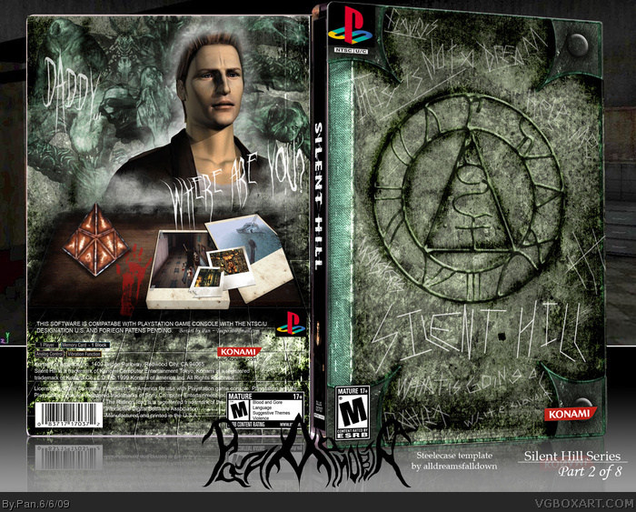
#5, It actually has the PS2 logo from my Silent Hill Origins box behind it, an update will be coming that fixes that and a few other things though. I may try to make the table set up on the back look better.
#10, Glad you like it, seems all my effort again didn't get me very far though. Update will be coming later today that fixes some things, the printable is available already updated.
#15, My Origins box had Travis on the back so I wanted Harry on the back of this one, and that was the only decent resolution picture of him I could find.
I like this a lot! The only thing that I don't like is the render of Henry on the back... It seems "too clean" and out of place a little bit. Otherwise I love it though
 Silent Hill Box Cover Comments
Silent Hill Series part 2.
Part 1: link
5 boxes ago I said I would be doing the entire Silent Hill series, here is the first game. The front is meant to look like a book with carvings in it.
The front was made with no artwork from the game at all. The Seal of Metatron was made by me, and is available here:
link
I think I may have outdone my Origins box, but I don't know. Also, please check out my Killer7 box I made for the contest.
Edited at 1 decade ago
[ Reply ]
Holy Shit!!!!
[ Reply ]
Awesomeness.
[ Reply ]
[Bump] Acknowledge this box.
[ Reply ]
I like, very effective. I don't think the little Playstation logo in the corner looks that good though, I think you should maybe try and add effects to make it look like it's part of the actual background or something, it looks a bit tacky just in that black box. Actually, you know what, I think it would look good in a black box, but just a black box, not faded around the edges like yours, just a solid black box with a white border, I think that would look pretty good. I'd give it a try first because I can't guarantee it'd look right.
#4, ...did you just bump a box within the same minute?
Edited at 1 decade ago
[ Reply ]
FOAD, this is too cool.
[ Reply ]
#5, It actually has the PS2 logo from my Silent Hill Origins box behind it, an update will be coming that fixes that and a few other things though. I may try to make the table set up on the back look better.
[ Reply ]
FECK.
[ Reply ]
Now that's badass.
[ Reply ]
You're a fucking God, I have been waiting for this, but didn't expect it to be THIS amazing.
I love you.
Edited at 1 decade ago
[ Reply ]
#10, Glad you like it, seems all my effort again didn't get me very far though. Update will be coming later today that fixes some things, the printable is available already updated.
[ Reply ]
You get my fav, Pan. So much detail, it really is something amazing.
[ Reply ]
Version 2 is up...
[ Reply ]
B u m p
This really went underlooked.
[ Reply ]
the front his good but i don't like the back the image of the character just seems out of place to me
[ Reply ]
#15, My Origins box had Travis on the back so I wanted Harry on the back of this one, and that was the only decent resolution picture of him I could find.
[ Reply ]
Totally missed this, which is surprising cause i LOVE silent hill! Bumpin'
[ Reply ]
This also a nice piece, not as much as the other 2, but I think it's pretty cool.
[ Reply ]
I faved this because I thought the layout was pretty impacting.
[ Reply ]
I like this a lot! The only thing that I don't like is the render of Henry on the back... It seems "too clean" and out of place a little bit. Otherwise I love it though
[ Reply ]