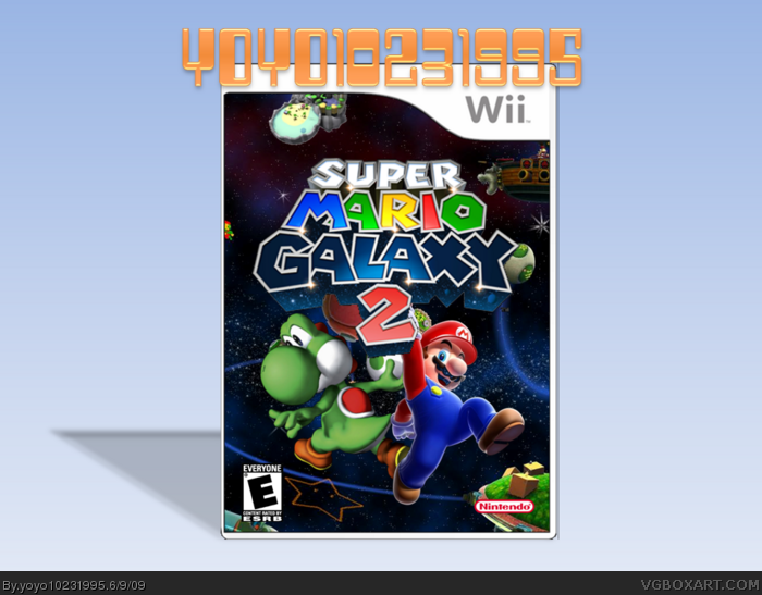
Don't say "you need to wait until more info comes out" please! Just tell me what you think of the box. Also, tell me if you like the starry logo or the metallic logo better.
Credit to Koopa Dasher for the template. Everything else made by me.
sorry man, the back kills it, my advice is that newcomers should not make backs, they all look so bad and empty. get rid of the back and ill fav.
btw. advertising can get you banned, just some advice ;)
i like it, but I'd use a different nintendo logo. maybe not completely different than your current logo, but I would definitely change the current tint. Pretty nice presentation, though! +favorite
#10, Well, make the text small and make the tagline here. link
also, make more text, maybe throw in some IGN ratings and well, maybe make 1 render on it fairly big, not small
 Super Mario Galaxy 2 Box Cover Comments
My new box, enjoy!
Don't say "you need to wait until more info comes out" please! Just tell me what you think of the box. Also, tell me if you like the starry logo or the metallic logo better.
Credit to Koopa Dasher for the template. Everything else made by me.
Be sure to look at my other boxes: link
Edited at 1 decade ago
[ Reply ]
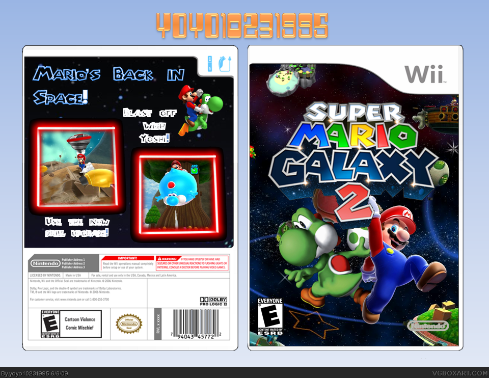
Not bad the back could use some work.
Ive made a box also. It is without a doubt my best box since Uncharted Bioshock.
[ Reply ]
#2, thanks. I couldn't think of anything else that would look good on the back.
Edited at 1 decade ago
[ Reply ]
I updated because I wanted a shadow of the box.
[ Reply ]
It's alright. The front looks odd due to the two different styled renders though.
[ Reply ]
link
Don't advertise on other people's boxarts. It's rude.
[ Reply ]
#6, oh, excuse me. Sheesh, who cares? I'm just a new guy who wants more views on his box!
Edited at 1 decade ago
[ Reply ]
sorry man, the back kills it, my advice is that newcomers should not make backs, they all look so bad and empty. get rid of the back and ill fav.
btw. advertising can get you banned, just some advice ;)
Edited at 1 decade ago
[ Reply ]
#8, it can? Not gonna do that again! I'll update without the back!
Updated!
Edited at 1 decade ago
[ Reply ]
#8, can you give me some pointers on backs? Yours always look good.
[ Reply ]
i like it, but I'd use a different nintendo logo. maybe not completely different than your current logo, but I would definitely change the current tint. Pretty nice presentation, though! +favorite
Edited at 1 decade ago
[ Reply ]
#11, done!
Update: Is that Nintendo logo better?
Edited at 1 decade ago
[ Reply ]
#10, Well, make the text small and make the tagline here.
link
also, make more text, maybe throw in some IGN ratings and well, maybe make 1 render on it fairly big, not small
[ Reply ]
#7, Don't do it again. It's a banable offense.
Edited at 1 decade ago
[ Reply ]
#13, thanks!
#14, sorry! Don't hurt me!
[ Reply ]