Legit front and back tagline!
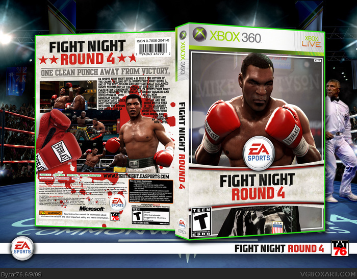
The back is hard to read; maybe you should arrange the screenshots in a more orderly way, remove the splatter, and fit the text in a nice block.
Other than the legibility issues, this is a very official-looking box! Great job.
 Fight Night Round 4 Box Cover Comments
Big Tyson fan I'am. I wanted to do offical looking box on the different way. I think I nailed it...
[ Reply ]
Im not really digging the blood splatters, but this looks real good.
[ Reply ]
#2, me neither but the design of this box is great. Well done
[ Reply ]
Legit front and back tagline!
The back is hard to read; maybe you should arrange the screenshots in a more orderly way, remove the splatter, and fit the text in a nice block.
Other than the legibility issues, this is a very official-looking box! Great job.
Edited at 1 decade ago
[ Reply ]
This needs a lot more attention! The only part I don't really like is the text on the back, but everything else is great.
[ Reply ]
*Dud dun dud dunnn CHHHHH* *THWACK* "Oooowww" "He's Still got it!"
=P fav
[ Reply ]