It's nice. I think you might want to consider adding some kind of border to the screenshots, and/or having Hermione (whoever that girl is, I think it's her)'s head just above the screen, if you understand.
This is pretty beast I must say but I think the logo on the front should be straight 180 degree instead of slanted. But I get that its supposed to be following the angle of the characters. Thats my only nitpick really.
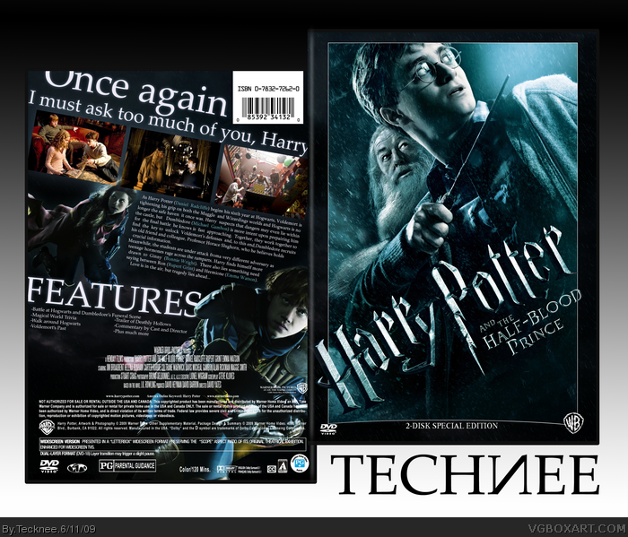
 Harry Potter and The Half-Blood Prince Box Cover Comments
Just something that I decided to finish.
[ Reply ]
Awsome, just awsome. Fronts got a great feal, and i love how evrythings tilted on the back.
[ Reply ]
You need to make more boxes.
[ Reply ]
<3
[ Reply ]
Thanks guys.
Also, I noticed that I misspelled disc on the cover. I'll fix it soon.
[ Reply ]
It's nice. I think you might want to consider adding some kind of border to the screenshots, and/or having Hermione (whoever that girl is, I think it's her)'s head just above the screen, if you understand.
[ Reply ]
#6, It's Ginny, and after playing around with it for a while while making it, I decided that I personally like it best like that. Thanks though.
[ Reply ]
looks great but why have you spelled Disc 'Disk' on the front?
[ Reply ]
This is pretty beast I must say but I think the logo on the front should be straight 180 degree instead of slanted. But I get that its supposed to be following the angle of the characters. Thats my only nitpick really.
Edited at 1 decade ago
[ Reply ]
I like how you merged two posters together!
Great job! +fav
[ Reply ]
GIMME MY CREDIT!!11!@2!2!
and I don't really like how you tilted the logo.
[ Reply ]
looks good
[ Reply ]
#11, That's just how it is on the official poster: link
[ Reply ]
#11, Credit for what?
Thanks guys.
[ Reply ]
Secks.
NOW.
[ Reply ]
Looks good. This movie is going to kick ass.
[ Reply ]
Late comment
Well, this is just pure "Teckneechal" awesomeness
>_>
[ Reply ]
How did I miss this?
[ Reply ]