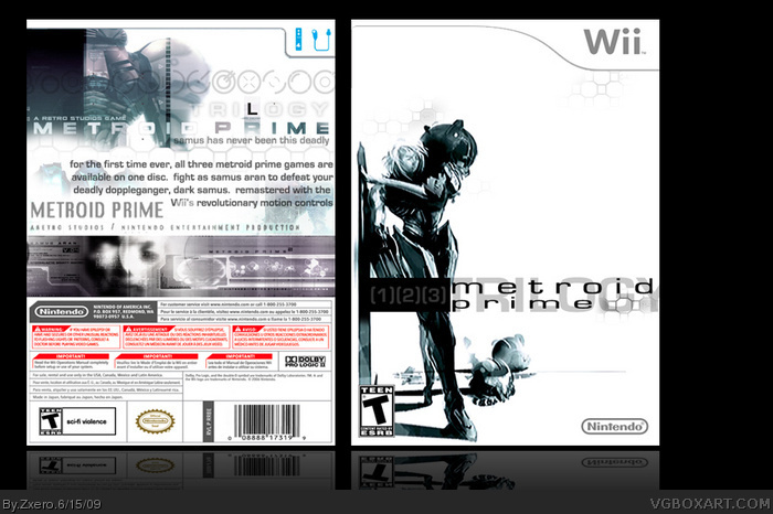
Love the whitespace of the front,
Back feels too generic IMO. Try changing that black wavy thing with the logos to a white BG, and simplify the text by decreasing it a few points (8 or 9 pt. is a good standard)
it`s weird. either the front does not match the back or vice versa. the plain style is well done, but the back seems a bit overdone for that. guess you should try again at eiter front or back.
The black L on the back got a diffrent font and does not fit the rest of the text that way. Guess you should fix that too.
 Metroid Trilogy Box Cover Comments
it's good but i think there's way too much white space on the front.
[ Reply ]
I, for one, am a fan of the simplicity of the front, and love the logo.
But, I think the back is just no as good, you should of went for the same style as you did for the front.
Fix up that back, and you have a favorite from me =)
[ Reply ]
Yup, I'm a fan of the front, but the back is kinda' messed up.
1. I don't like the logos near the bottom because that doesn't match the artstyle you're going for at all.
2. The text seems a bit too big for me and I'm not a fan of the font either. Make it more technological if that helps at all. :p
[ Reply ]
Love the whitespace of the front,
Back feels too generic IMO. Try changing that black wavy thing with the logos to a white BG, and simplify the text by decreasing it a few points (8 or 9 pt. is a good standard)
[ Reply ]
Where is the Samus image from? I agree with Qwerty.
[ Reply ]
i will fix this right away
[ Reply ]
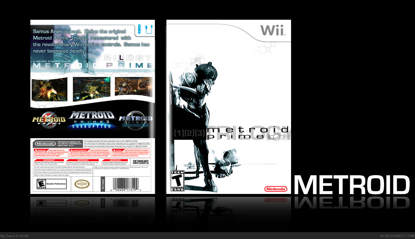
Okay, brand new, and sleeker, thanks for the tips.
[ Reply ]
Awesome update!
Faved.
You've inspired me to make a Metroid Trilogy box. :D
[ Reply ]
Dude, awesome, i must of been high cos i nearly missed this! The back looks so good and the simple front does it for me too! Great work.
Edited at 1 decade ago
[ Reply ]
I really like everything about this, the back looks much better than version 1, and the front looks great as is, no need to add anything to it.
My second favorite Metriod Prime Trilogy box, next to Wasa-Bi's.
Edited at 1 decade ago
[ Reply ]
Neat. Classy. Epic.
5/5, fav'd, etc... =D
I just don't really like the " 1| 2| 3 ", I woulda used the same style as the title ;)
Edited at 1 decade ago
[ Reply ]
it`s weird. either the front does not match the back or vice versa. the plain style is well done, but the back seems a bit overdone for that. guess you should try again at eiter front or back.
The black L on the back got a diffrent font and does not fit the rest of the text that way. Guess you should fix that too.
[ Reply ]
Very awesome. I love the design perspective of the front and the complexity of the back.
[ Reply ]
#10, Wow, that truly is a compliment, thanks to the rest of you guys too for the compliments.
[ Reply ]
This NEEDS HoF now.
Edited at 1 decade ago
[ Reply ]
really awesome
i love the front
and like the back
thanks for comment
[ Reply ]
looks awesome
[ Reply ]