There is simply the colour difference between the front and back that is holding me from faving this. If HS could maybe go back and add that tinge of pinkish, orangish and reddish to his back and a bit of a sharpen, it'd look superb!
Don't think that I think the back looks bad, but the colour inconsistency between the two is holding me back
It looks like people have completely ignored that the spine looks choppy and low quality, the top of the front on the right has an unintelligible object, the characters are scratchy and low in quality, and behind them, there are random objects I can't identify.
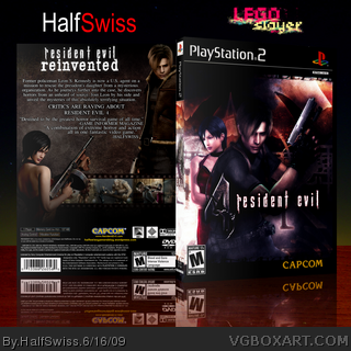
 Resident Evil 4 Box Cover Comments
PLEASE VIEW IN FULL VIEW!
A collaboration with me and LEGOslayer.
LEGOslayer = Front + spine
HalfSwiss = Back + presentation
ADDITIONAL CREDITS:
Stevencho - 3D'ing box with reflection
Ladykiller - Texture on the back, screenshot borders.
[ Reply ]
great work
Edited at 1 decade ago
[ Reply ]
Nice collab, guys!
[ Reply ]
yees, nice (:
[ Reply ]
Great stuff!
[ Reply ]
Thanks guys.
[ Reply ]
Nice separate parts, they just don't compliment each other very much.
[ Reply ]
#7, they're not THAT different are they?
[ Reply ]
This is terrible, whomever did such a horrid job on the front and spine should be strung up and shot repeatedly.
[ Reply ]
#9, lol.
[ Reply ]
Awesome bawks.
[ Reply ]
#11, thanks a bunch!
[ Reply ]
Woo, awesome collab, looks great.
[ Reply ]
Good stuff.
[ Reply ]
Thats very nice, Don't like the way the logo is squished on the spine, you should try using a font and just writing it.
[ Reply ]
#15, I think the problem was that was how Lego started it, and it seems that he's been busy so I think he just didn't have time to change it.
Thanks a lot, guys!
[ Reply ]
There is simply the colour difference between the front and back that is holding me from faving this. If HS could maybe go back and add that tinge of pinkish, orangish and reddish to his back and a bit of a sharpen, it'd look superb!
Don't think that I think the back looks bad, but the colour inconsistency between the two is holding me back
[ Reply ]
Why no hof?
Awesome Box!
[ Reply ]
#18, Thanks man.
[ Reply ]
tanks
[ Reply ]
tanks
[ Reply ]
It looks like people have completely ignored that the spine looks choppy and low quality, the top of the front on the right has an unintelligible object, the characters are scratchy and low in quality, and behind them, there are random objects I can't identify.
With these problems fixed, I would like it.
[ Reply ]
#22, well LEGOSlayer doesn't really go on anymore so we can't get it fixed.
[ Reply ]
Nice cover!
[ Reply ]