Picture on front is stretched, theres no logo on front. Needs dev logo and esrb rating. Bad font choice on the back, the front just looks like a wallpaper without manipulation. The background on the back needs some editing and put outlines on the screenhots. 0.5/5 =(
ok well i can tell by what i have read its crap i no but its my first ever full cover also i didnt no so many people can be a bit outta line on this but the hole reason of this is fpr people to give there thoughts on other peoples covs and i now know i should put more work into it thanks for yor thoughts every one
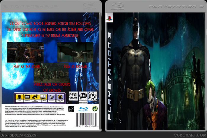
 Batman Arkham Asylum Box Cover Comments
Picture on front is stretched, theres no logo on front. Needs dev logo and esrb rating. Bad font choice on the back, the front just looks like a wallpaper without manipulation. The background on the back needs some editing and put outlines on the screenhots. 0.5/5 =(
[ Reply ]
no title no logos squashed front
[ Reply ]
before you submit a box ask yourself. "Could I see this on shelves?"
[ Reply ]
OH DEAR..................
[ Reply ]
#4, How about you try being helpful?
[ Reply ]
#5, how about im allowed to say whatever I want. Its not good its stretched and you don't have a logo on the front???????????????? WTF
[ Reply ]
#6, That is very ignorant of the rules. They are placed there so people can be constructive.
[ Reply ]
#6 No you're not. See comment rules below genius.
#3 That's something I say all the time! It must be catching on! :P Not really, eh.
Box: What can I say that hasn't already been said? Maybe you should post your boxes in the Critiques part of the forums before posting it on here.
[ Reply ]
#6, Wrong person to say that to bub
[ Reply ]
ok well i can tell by what i have read its crap i no but its my first ever full cover also i didnt no so many people can be a bit outta line on this but the hole reason of this is fpr people to give there thoughts on other peoples covs and i now know i should put more work into it thanks for yor thoughts every one
[ Reply ]