Ok, here i go. It needs alot of work. To start, the presentation (meaning the image as a whole) should not be that big. It should be about half the size, getting rid of all the wite. The box itself: The logo is horific, it needs lots of work. Try making it the same fonts and making it closer together. The box looks streched to try and fit the image. Now for the actual box, if you want to get favs here you need alot more thatn a wallpaper image. Try to find a render or make your own and try to put together a nice front. Those are the negitives. Here are the positives. Your logos and your dev and esrb are cut out, which is nice, and the disc seems really well put together. Just keep working on your box arts, dont get discoriged beacuse of this comment.
#6, look below.
Comment Rules:
If you can't be bothered to post coherently and spell out "you" instead of "u" (as an example), don't bother posting at all.
It is very bland and it doesn't have much of a foreground. The box is a bit stretched out. There is a random white space. The two different types of title words dont go together. You might want to work on those things.
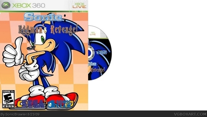
 Sonic: Eggman's Revenge Box Cover Comments
Ok, here i go. It needs alot of work. To start, the presentation (meaning the image as a whole) should not be that big. It should be about half the size, getting rid of all the wite. The box itself: The logo is horific, it needs lots of work. Try making it the same fonts and making it closer together. The box looks streched to try and fit the image. Now for the actual box, if you want to get favs here you need alot more thatn a wallpaper image. Try to find a render or make your own and try to put together a nice front. Those are the negitives. Here are the positives. Your logos and your dev and esrb are cut out, which is nice, and the disc seems really well put together. Just keep working on your box arts, dont get discoriged beacuse of this comment.
Edited at 1 decade ago
[ Reply ]
This is my first box using Paint.net. thanks for your input! I thought it would be cool with different font. apparently not! thanks again!
[ Reply ]
It does need a lot of work... It looks a little stretched, too. You're on your way, though, just like I am!
[ Reply ]
Thanks for the compliment! I heared (well..read) that you are special on this site?
Edited at 1 decade ago
[ Reply ]
#4, There's a spelling rule.
[ Reply ]
#5 wha?
[ Reply ]
#6, look below.
Comment Rules:
If you can't be bothered to post coherently and spell out "you" instead of "u" (as an example), don't bother posting at all.
[ Reply ]
ok
[ Reply ]
#4, no, I'm just a normal member of the site.
[ Reply ]
ok! thanks!
[ Reply ]
#10, He is just awesome (with his talent in boxarts)... I assume you heard me saying that one??? lol
[ Reply ]
yes! yes i did!
[ Reply ]
It is very bland and it doesn't have much of a foreground. The box is a bit stretched out. There is a random white space. The two different types of title words dont go together. You might want to work on those things.
[ Reply ]
k
[ Reply ]
#14, the speeling rule..
[ Reply ]
Its too simple ... 2/5
[ Reply ]