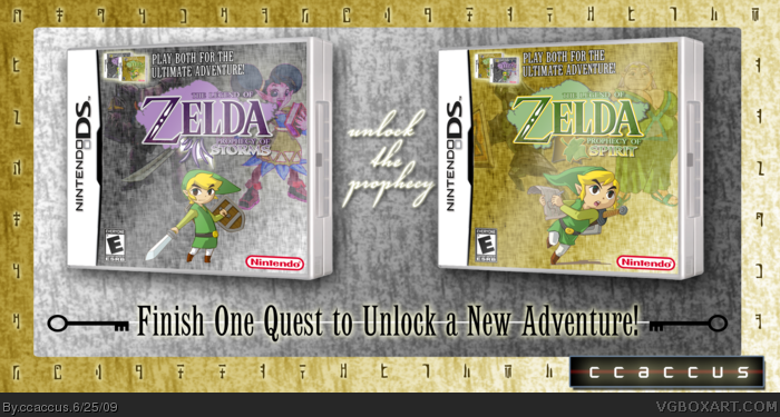
[ Box updated on June 25th, 2009 ] [ original ]
 Legend of Zelda: Prophecy of Storms / Spirit Box Cover Comments
Comment on ccaccus's Legend of Zelda: Prophecy of Storms / Spirit Box Art / Cover.

Got the idea while playing Oracle of Ages - a dual-game release. The Gold/Silver coloring was derived from the fact that the original color schemes were Red/Blue... so I sort of pulled the sequel coloring from the Pokemon series.
I'm probably still going to do some editing to the boxes, but I thought I'd see what the VG box art community thinks.
Credits-
Template goes to Ninty
ESRB and Nintendo logo goes to ADFD
Rendered images are originally from gamehiker.com
[ Reply ]
Good job.
[ Reply ]
Love the idea! And the names are awsome! ;)
[ Reply ]
Excellent, only topped by backs. Good job still.
[ Reply ]
I love the idea! It's really nice, but I think this could've been better.
1) I think it would've been nice if you used two different Links on the boxes. Oracles / Seasons had different pics, and so do all the same generation Pokemon games. How it is right now kind of makes it look like a special edition of the same game or something (if you miss the logo).
2) I'm kinda picky about logos. In my opinion, the logos aren't great ... Not sure what exactly is about them ... but they lack professionalism somewhere ...
3) I'm not a fan of the lower-opacity images in the background, but I guess others may like them.
A lot of people get me wrong and think I hate the box, but I don't. It's really good. Awesome job!
[ Reply ]
Excellent + fav!
[ Reply ]
its good, but not epic.
[ Reply ]
Everyone, thanks for the comments and fav's!
#5 - Thanks for the constructive feedback, I've made some changes that I hope you'll find appealing. I decided to keep the lower opacity, not sure why - it just seemed less appealing when they were clear.
Version 2 -
Updated the logos, hopefully they look a bit better now.
Fixed some (very) minor mistakes (wrong mini box on one and the interior of the Z on Spirit)
Changed the Link on the Storms box.
Edited at 1 decade ago
[ Reply ]
Very awesome. What did you use for the texture on the boxes? I like the feel of that. Also, I think the Links should be a bit bigger and perhaps anchored to some sort of ground.
I like the originality of this.
[ Reply ]
#9 - Thanks!
To make the texture:
I use Photoshop, so some elements may not be available in other programs:
1. Make a square.
2. Fill the square with a pattern (Wax Crayon on Vellum).
3. Overlay with a color (35% opacity, Vivid Light)*
4. Group and rasterize the layer.
5. Apply a Water Paper filter (Filters -> Sketch -> Water Paper)
Just play with some of the settings in the process if it doesn't look right - the Gold took more tweaking than the Silver, as grey on grey hides the mistakes that color reveals.
*The light settings vary widely by the intensity of the color you're using, you may have to play with these for a while before finally filtering.
Edited at 1 decade ago
[ Reply ]