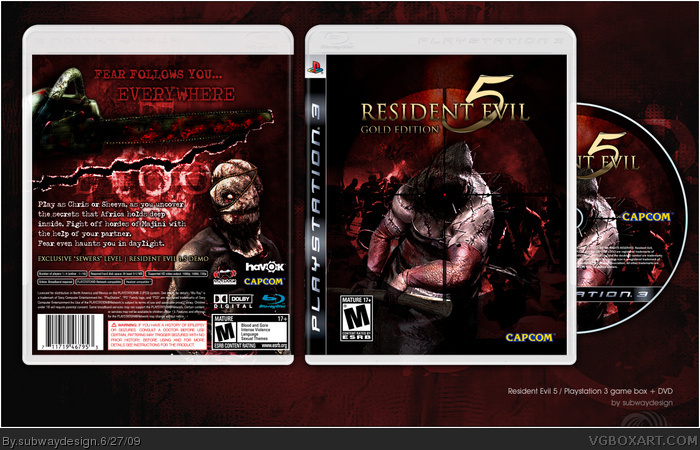
Made this one today, inspired by the box submited by RoarShark.
I don't know who made the template so i can't credit :(
I made the blood background 5 years ago. It can be found here link (even then i related it to Resident Evil haha)
And yes, no screens on the back. Everyone knows how RE5 looks anyway :P
I agree, this is indeed original-looking and a nice idea. It also evokes a sense of dread, something very few survival horror boxes manage with all those pretty faces on the cover :)
I disagree, I feel the logo works nicely as it is. It breaks up the rest of the front. If I were to change anything with the logo, it would be the five. Maybe make that harder.
 Resident Evil 5 Gold Edition Box Cover Comments
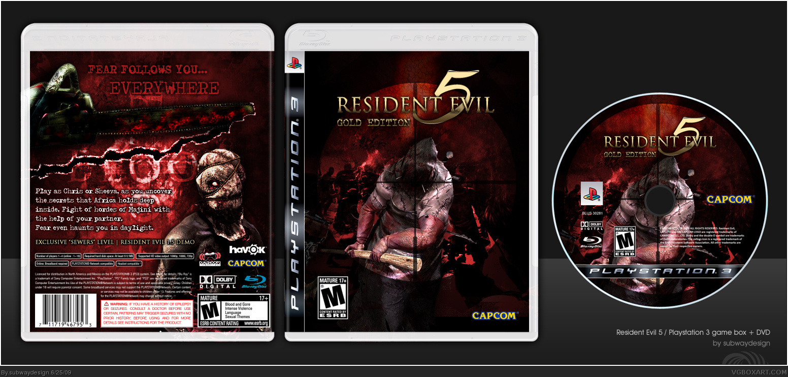
Made this one today, inspired by the box submited by RoarShark.
I don't know who made the template so i can't credit :(
I made the blood background 5 years ago. It can be found here link (even then i related it to Resident Evil haha)
And yes, no screens on the back. Everyone knows how RE5 looks anyway :P
Edited at 1 decade ago
[ Reply ]
I love it! the most original Resi 5 box I have seen!
Fav! Author Fav!
[ Reply ]
Better than a ton of the plain old same RE5 boxes around here. i like your take on it, and the logo as well.
[ Reply ]
great stuff. It's a bit choppy in places though.
[ Reply ]
The most original RE5 box evar.
[ Reply ]
I agree, this is indeed original-looking and a nice idea. It also evokes a sense of dread, something very few survival horror boxes manage with all those pretty faces on the cover :)
[ Reply ]
Great work. The back is awesome. :)
[ Reply ]
Thanks guys! I wasn't expecting such comments, i'm glad that you liked the box that much!!!
#4 I'd love to know what is choppy so i can improve it and upload a better version (i know about the executioner, is there anything else?)
[ Reply ]
Nice but I don't like the logo.
The logo is not grungy enough.
[ Reply ]
I disagree, I feel the logo works nicely as it is. It breaks up the rest of the front. If I were to change anything with the logo, it would be the five. Maybe make that harder.
[ Reply ]
#9, It is intended to be embossed, that's why it isn't grungy.
#10, I used that 5 because it reminds me of a snake hehe. Can you point me to a font that you think might work for this box? Thanks!!
[ Reply ]
Wow, I love this.
The logo is a nice touch to.
[ Reply ]
Guess what guys? CAPCOM is releasing a Gold version of RE5 soon! HAHAHA. I think I got my degree at the Nostradamus Academy a few months ago LOL!
[ Reply ]