[ Box updated on June 27th, 2009 ] [ original ]
 Super Mario Galaxy: The Official Soundtrack Cover Comments
Comment on StarMario22's Super Mario Galaxy: The Official Soundtrack Cover.
[ Box updated on June 27th, 2009 ] [ original ]
Comment on StarMario22's Super Mario Galaxy: The Official Soundtrack Cover.
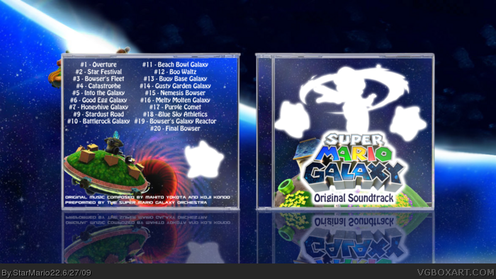
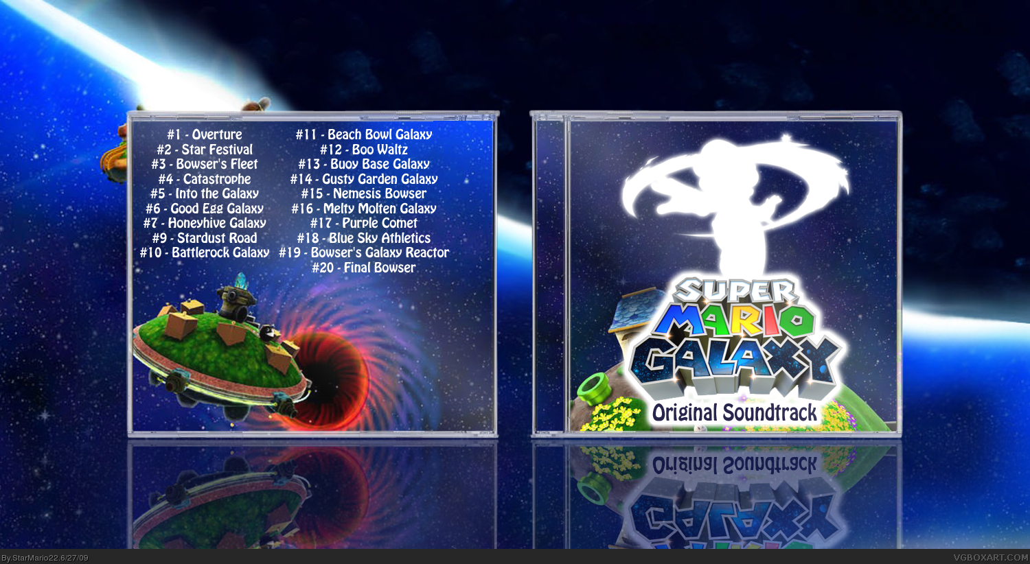
Just a simple Box I made.
Creidts:
JavanGod - Template
Logo + Renders - Planet Renders
Background - Google
What schould i put in/edit?
Edited at 1 decade ago
[ Reply ]
it looks cool but mario looks a bit strange like that, maybe put some sort of starry texture on him.
[ Reply ]
#2, ok I try
[ Reply ]
I concurr with @2, and to me the back feels empty without copyright info and logos, etc. But i think it's on the right path!!
[ Reply ]
Well, it was no info. Does anybody has it?
[ Reply ]
Darn, just failed with the starry texture :P
[ Reply ]
Nice!
[ Reply ]
I like mario like that, don't change him.
[ Reply ]
UPDATE: I put little info on it :p and star... those starguys.
[ Reply ]
It looks good at first glance, but then you realize that it's really nothing spectacular. Don't get me wrong, it was a nice concept, but it seems all you did was make the renders white, put a glow on them, put a white stroke on the logo, type "Official soundtrack" and quickly put together a boring back.
Try something with more "wow" factor next time.
Edited at 1 decade ago
[ Reply ]
Nice + fav!
[ Reply ]
It honestly looks like you didn't put more than 30 minutes into it.
[ Reply ]