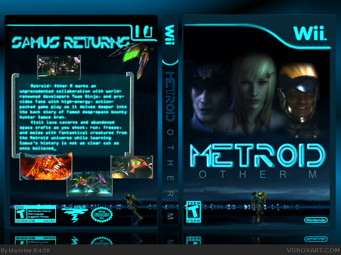
Metroid Other M. The box I submitted for the annual VGBA Cup Round 2 against Roarshark. I worked really hard on this, I continued my Tron trend, which is funny because I made THIS before I made my Tron Legacy box.
I created the template myself because I didn't feel the original white template fit the feel of the box.
Being limited to E3 boxes that hadn't been done yet was hard, but after finding inspiration in Tron, I knew what to do.
Please fave and comment!
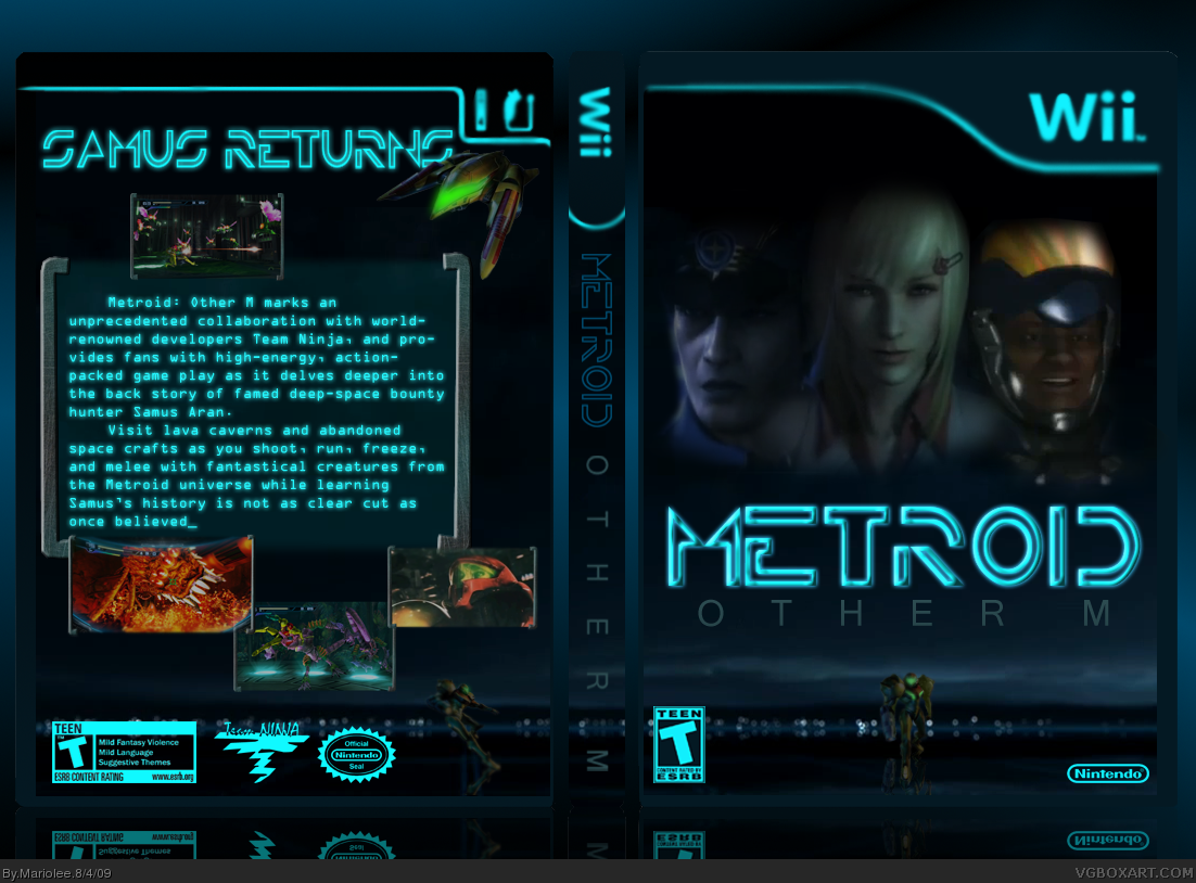
The fronts concept is nice, but the three heads colour really clash, especially the dude on the far right, also the bottum Samus doesn't look right where it is, and just doesn't blend.
Also, the template doesn't look to good in my opinion, its looks just iffy. I suggest toning the glows down a smidge, just so its not so strong.
The back is better, but the text is hard to read, and the screenshots look just randomly placed.
 Metroid: Other M Box Cover Comments
Metroid Other M. The box I submitted for the annual VGBA Cup Round 2 against Roarshark. I worked really hard on this, I continued my Tron trend, which is funny because I made THIS before I made my Tron Legacy box.
I created the template myself because I didn't feel the original white template fit the feel of the box.
Being limited to E3 boxes that hadn't been done yet was hard, but after finding inspiration in Tron, I knew what to do.
Please fave and comment!
[ Reply ]
Yeah, I kind of noticed the Tron theme, considering you used the same font for the logo :P.
It's just a bit too dark for me, though.
[ Reply ]
@Deleted, accidental double post.
Edited at 1 decade ago
[ Reply ]
Nice idea to use a Tron theme for it, but it's way to dark, couldn't even see anything at first, nice try though.
[ Reply ]
#2, #3
It's that dark? I guess it's a love it hate it thing. I might try to lighten it up.
UPDATED.
Edited at 1 decade ago
[ Reply ]
ohh dear.
[ Reply ]
Unique use of the Tron theme, but it doesn't convey well with the metroid series in my opinion.
[ Reply ]
#6 ....I'm sorry...but what should I do?
[ Reply ]
Thats just amazing. I love how its unique from the others.
[ Reply ]
It's an interesting idea, but I don't think a Tron-like theme really works with Metroid.
[ Reply ]
#6, Constructive criticism FTW!
[ Reply ]
Sorry, but I really don't like this.
The fronts concept is nice, but the three heads colour really clash, especially the dude on the far right, also the bottum Samus doesn't look right where it is, and just doesn't blend.
Also, the template doesn't look to good in my opinion, its looks just iffy. I suggest toning the glows down a smidge, just so its not so strong.
The back is better, but the text is hard to read, and the screenshots look just randomly placed.
Sorry for the long critque =P
[ Reply ]
#8 Ignore Javan, hes know for making pointless and over critical comments.
[ Reply ]
#13, Over critical? Fuck you. I was surprised to see someone use the new Tron movie style for a metroid game.
[ Reply ]
I'm sorry I don't like this. It's just too dark and... well, it just doesn't fit the metroid theme to me.
[ Reply ]
#14, Well explain that you moron. Don't attack HellKnight for your own mistake.
[ Reply ]
I think it looks nice alone, but like others said Tron doesn't fit Metroid
[ Reply ]
:D LOVE IT!
[ Reply ]