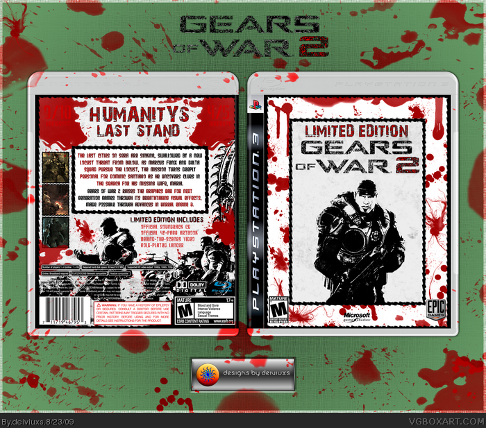
Hey,
First of all, I know that Gears of War 2 is only on Xbox 360, but I can care less..I made it for PS3. =)
So..I just got this idea for GOW2 box while I was camping several weeks ago and I just had to make it happen.
I wanted to make "a different" box for this game since most of the boxes are dark and "scary" (which is not a bad thing, since the game is like that). So, I though to go with a "lighter" feeling for this box.
Every single image has been edited in some way (excluding dev logos, etc.). I also wanted to go "crazy" with blood splatters, because..well..game does have A LOT of blood, lol.
Hope you enjoy! =)
Favs & comments always appreciated.
Oh, I think I don't need to say this, but Please FULL SIZE.
#6, don't apologize. Everyone has their own opinions and I appreciate yours.
# 7, well, you can't like all of my boxes.. =)
# 8, why don't you like the scores? I actually think they look pretty good.
# 9, well you advertised, so why can't I? =)
# 10, I always try to go for something "different"
# 11, limited colors for limited edition! =D
# 12, I actually wanted Marcus alone on the front since he's the main character you play as in the game.
 Gears of War 2 Box Cover Comments
Looks really good!
[ Reply ]
Hey,
First of all, I know that Gears of War 2 is only on Xbox 360, but I can care less..I made it for PS3. =)
So..I just got this idea for GOW2 box while I was camping several weeks ago and I just had to make it happen.
I wanted to make "a different" box for this game since most of the boxes are dark and "scary" (which is not a bad thing, since the game is like that). So, I though to go with a "lighter" feeling for this box.
Every single image has been edited in some way (excluding dev logos, etc.). I also wanted to go "crazy" with blood splatters, because..well..game does have A LOT of blood, lol.
Hope you enjoy! =)
Favs & comments always appreciated.
Oh, I think I don't need to say this, but Please FULL SIZE.
#1 damn, you beat me. Anyways, thanks!
Edited at 1 decade ago
[ Reply ]
Did you mistake this game for MADWORLD? lol anyways its pretty cool
[ Reply ]
Im liking the whole black and white bloody thing. But im not feeling all that empty space on front.
Edited at 1 decade ago
[ Reply ]
#3, no, I didn't. I wanted something different.
#4, it's supposed to be simple, since it's "Limited Edition"
[ Reply ]
I'm sorry.Just not feeling it.
[ Reply ]
Not really liking this one, I hate the font used as the tagline etc, and just generally dislike the design as a whole.
[ Reply ]
Good concept, ok execution, and I hate the scores in the corners. Also the limited edition/tagline text is meh. Still fav worthy.
Edited at 1 decade ago
[ Reply ]
I don't know why, but i kind of like this design.
Please, don't advertize anymore,though.
[ Reply ]
You took quite a different approach for a Gears box, and I think it turned out great.
[ Reply ]
Very nice! :) It's always good to see boxes with limited color range.
[ Reply ]
It's nice! Maby you should put more characters to the front... But it's nice!
[ Reply ]
#6, don't apologize. Everyone has their own opinions and I appreciate yours.
# 7, well, you can't like all of my boxes.. =)
# 8, why don't you like the scores? I actually think they look pretty good.
# 9, well you advertised, so why can't I? =)
# 10, I always try to go for something "different"
# 11, limited colors for limited edition! =D
# 12, I actually wanted Marcus alone on the front since he's the main character you play as in the game.
[ Reply ]
UPDATE:
- presentation, because this box is all about blood! =)
[ Reply ]