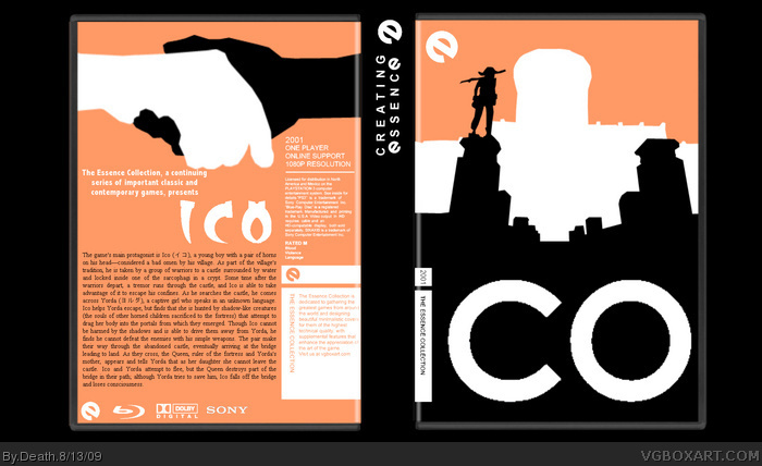
Heres my essence collection box, i loved how it turned out. ICO was an easy choice. The i in ICO is also the bar for the collection. Next box will be a hand drawn watchmen box. C and c welcome. Credit to qwerty and indexnos for the temp
I liked it until I saw the art on the back, and the "ICO" logo. (I don't dislike the back, it's just not as original as I expected) Both are from the same box in the GAF collection. Otherwise, it's pretty neat.
Don't get me wrong, it's still a good box on it's own, I was just pointing out how obvious the inspiration was. That box was one of my favorites in that collection. ;)
 ICO Box Cover Comments
Heres my essence collection box, i loved how it turned out. ICO was an easy choice. The i in ICO is also the bar for the collection. Next box will be a hand drawn watchmen box. C and c welcome. Credit to qwerty and indexnos for the temp
[ Reply ]
I liked it until I saw the art on the back, and the "ICO" logo. (I don't dislike the back, it's just not as original as I expected) Both are from the same box in the GAF collection. Otherwise, it's pretty neat.
[ Reply ]
That box was my biggest inspiration. Sorry if its too much like somthing else. There is very little in this world that is totaly original anymore
[ Reply ]
Don't get me wrong, it's still a good box on it's own, I was just pointing out how obvious the inspiration was. That box was one of my favorites in that collection. ;)
[ Reply ]
Mine too. It, in a way, was the only reason i made a ico box, and a box in this collection in the first place
[ Reply ]
Really cool. :D
The new vector images look much sharper and better, and I love the colors/composition as well.
[ Reply ]
I love how you're using the box design for the letter 'i' on the front. Did you come up with that? It's brilliant!
[ Reply ]
Thanks qwerty and delcioius "D
[ Reply ]