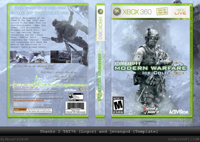
My second box. This time I have worked on her (from the idea up to the conversion) during 5 days. How you can recognise, it concerns the first DLC for Modern Warfare 2 (in this case it is christened by me "Ice Cold") that exclusively on the Xbox 360 will appear.
Great box. I like the snow effects. Should put some borders around the screens though. Text on the back is somewhat hard to read also.
One thing that annoys me about the DLC maps that don't make sense, is that they're coming out shortly after the game is released. So why don't they just put them in the game? I don't get it.
But this is really good, only thing is that I think the tagline on the back is too spaced out from each line. Like there's this big space between the first line and the second. I suggest bringing the first line down more.
I think that's pretty cool, I really dig the snow effects. I'm still new to this so I don't see any glaring flaws but I think a black border around the shots on the back would look good as #2 said.
 Modern Warfare 2: Ice Cold DLC Box Cover Comments
My second box. This time I have worked on her (from the idea up to the conversion) during 5 days. How you can recognise, it concerns the first DLC for Modern Warfare 2 (in this case it is christened by me "Ice Cold") that exclusively on the Xbox 360 will appear.
C&C is welcome :)
Edited at 1 decade ago
[ Reply ]
Great box. I like the snow effects. Should put some borders around the screens though. Text on the back is somewhat hard to read also.
One thing that annoys me about the DLC maps that don't make sense, is that they're coming out shortly after the game is released. So why don't they just put them in the game? I don't get it.
Edited at 1 decade ago
[ Reply ]
#2 To make more money.
But this is really good, only thing is that I think the tagline on the back is too spaced out from each line. Like there's this big space between the first line and the second. I suggest bringing the first line down more.
[ Reply ]
I think that's pretty cool, I really dig the snow effects. I'm still new to this so I don't see any glaring flaws but I think a black border around the shots on the back would look good as #2 said.
Edited at 1 decade ago
[ Reply ]
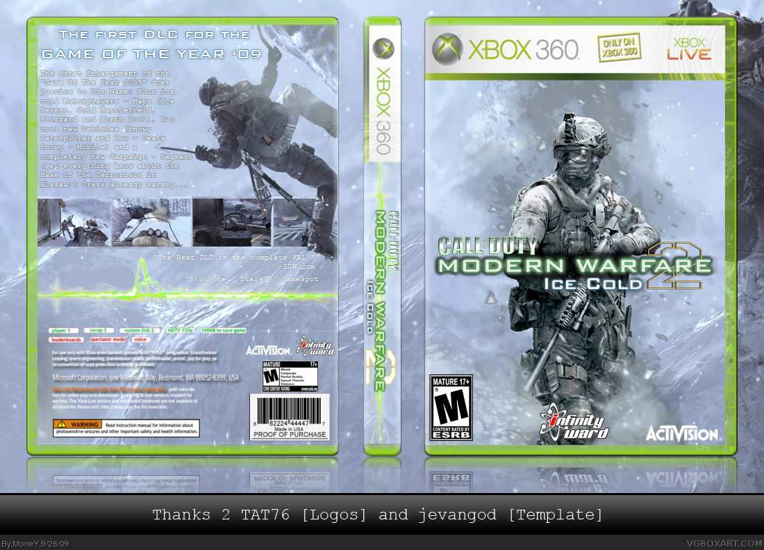
So, Version 2 is online!
The colour of the font is now black and the green line is now deeper on the back.
[ Reply ]
OMG!!! Its Fantastic O.O I Love It ^^
[ Reply ]