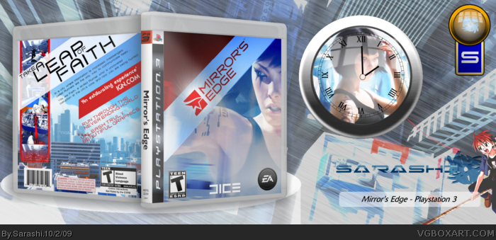
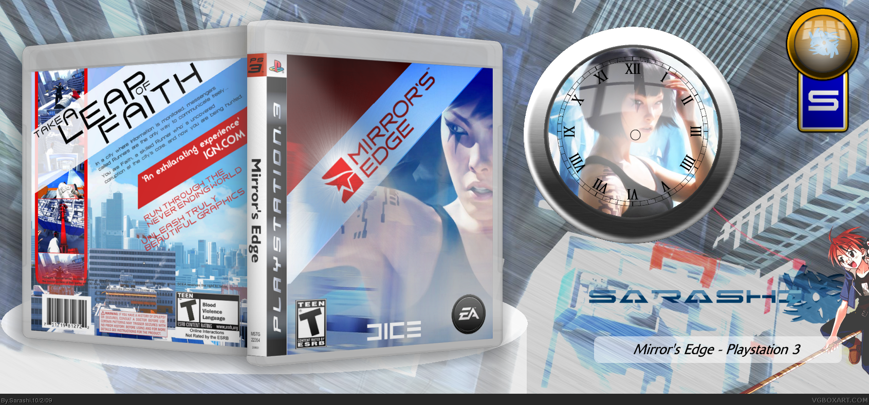
[ Buy Mirror's Edge at Amazon ] By Sarashi 46 on October 2nd, 2009 Download Printable [ Box updated on October 2nd, 2009 ] [ original ] Mirror's Edge Box Cover Comments Comment on Sarashi's Mirror's Edge Box Art / Cover. Cancel Reply Sarashi 46 [ 1 decade ago ] Truely the best box I have ever made. Try and spot the easter egg =P Credit to M_G for the temp. [ Reply ] paper sonic 37 [ 1 decade ago ] That's quiet nice, I really like the back the front seems very plain and dark Brighten it up and it will look awesome! 3, well can't you turn the Burgundy to a red? Edited at 1 decade ago [ Reply ] Sarashi 46 [ 1 decade ago ] #2, I tried to, but it looked really bad and blurry =( It was a red, until I ran the effects over, and now, I am stuck for design... Edited at 1 decade ago [ Reply ] Cerium 43 [ 1 decade ago ] The clock doesn't have any hands :[ [ Reply ] Sarashi 46 [ 1 decade ago ] #4, ARGH! [ Reply ] StarMario22 34 [ 1 decade ago ] A little different then the other Mirror's Edge Boxes. Very Cool, the back looks really nice! :D ... And why do I love this Presentation? xD EDIT: Oh look! It's your best Boxart! :) Congrats! Edited at 1 decade ago [ Reply ] Sarashi 46 [ 1 decade ago ] #6, Who doesn't love a good clock? [ Reply ] Oddmania 40 [ 1 decade ago ] I love it, amazing job, as usual ! :D [ Reply ] Sarashi 46 [ 1 decade ago ] UPDATE: Printable. [ Reply ] Cerium 43 [ 1 decade ago ] The clock hands don't make any sense. They cant be in that position. What time is it meant to be? [ Reply ] Sarashi 46 [ 1 decade ago ] #10, Sloppy work past I was rushing. Anyway, Shouldn't you judge the box, not the presentation? Edited at 1 decade ago [ Reply ] GlowBlue 43 [ 1 decade ago ] #11, The presentation is part of the art. If you don't want people to consider the presentation when they judge your box submit a printable only. [ Reply ] deiviuxs 46 [ 1 decade ago ] I would like to see the box only, the other things (clock, etc.) are necessary and distract from the design of the box. [ Reply ] Sarashi 46 [ 1 decade ago ] #13, Isn't that what the quite small printable is like? [ Reply ] Drakxxx 46 [ 1 decade ago ] Very nice design. I for one like the all out presentation, and your trademark novelty wall clock is indeed growing on me. Nice job. Edited at 1 decade ago [ Reply ] dpmm07 15 [ 1 decade ago ] Looks great. I like the use of colors that are seen frequently in the game. [ Reply ] deiviuxs 46 [ 1 decade ago ] #14, it is, but the first thing you see is not the printable and the first opinion is quite important. However, it is my opinion. If you like this kind of presentation, then keep it, but I think you will get tired of it in a while.. [ Reply ] Sarashi 46 [ 1 decade ago ] #17, I understand. I'll think about switching later. [ Reply ]
 Mirror's Edge Box Cover Comments
Truely the best box I have ever made.
Try and spot the easter egg =P
Credit to M_G for the temp.
[ Reply ]
That's quiet nice, I really like the back the front seems very plain and dark Brighten it up and it will look awesome!
3, well can't you turn the Burgundy to a red?
Edited at 1 decade ago
[ Reply ]
#2, I tried to, but it looked really bad and blurry =(
It was a red, until I ran the effects over, and now, I am stuck for design...
Edited at 1 decade ago
[ Reply ]
The clock doesn't have any hands :[
[ Reply ]
#4, ARGH!
[ Reply ]
A little different then the other Mirror's Edge Boxes. Very Cool, the back looks really nice! :D
...
And why do I love this Presentation? xD
EDIT: Oh look! It's your best Boxart! :) Congrats!
Edited at 1 decade ago
[ Reply ]
#6, Who doesn't love a good clock?
[ Reply ]
I love it, amazing job, as usual ! :D
[ Reply ]
UPDATE: Printable.
[ Reply ]
The clock hands don't make any sense.
They cant be in that position.
What time is it meant to be?
[ Reply ]
#10, Sloppy work past I was rushing.
Anyway, Shouldn't you judge the box, not the presentation?
Edited at 1 decade ago
[ Reply ]
#11, The presentation is part of the art. If you don't want people to consider the presentation when they judge your box submit a printable only.
[ Reply ]
I would like to see the box only, the other things (clock, etc.) are necessary and distract from the design of the box.
[ Reply ]
#13, Isn't that what the quite small printable is like?
[ Reply ]
Very nice design. I for one like the all out presentation, and your trademark novelty wall clock is indeed growing on me. Nice job.
Edited at 1 decade ago
[ Reply ]
Looks great. I like the use of colors that are seen frequently in the game.
[ Reply ]
#14, it is, but the first thing you see is not the printable and the first opinion is quite important. However, it is my opinion. If you like this kind of presentation, then keep it, but I think you will get tired of it in a while..
[ Reply ]
#17, I understand. I'll think about switching later.
[ Reply ]