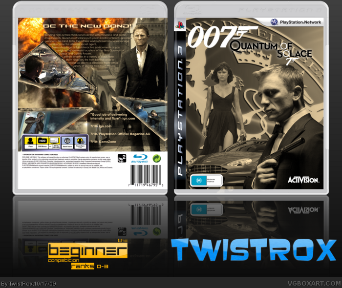
Hey guys,
This is my entry for the Beginner Comp.
And after my last box got overshadowed I hope that this box does not.
Credit:
Template:Sens
QoS Logo:Me
007 Logo:PlanetRenders
007:PlanetRenders
Camile:Ray Blade
Car:PlanetRenders
Rating:ADFD
Glass Shards:Scorpion Soldier
Backgrounds:Google
Screenshots:Google
3-D:Felipe
I hope all you guys like!
Your comments are always welcomed
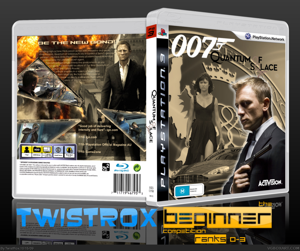
I think you should put Bond in the same color scheme of the rest of the box, also, remove that outer glow.
And the spine seems to be too empty...
And put a transparent gradient in the reflection.
Overall, it's very good, I like it.
+Fav
Dude dude dude dude, its broken glass! (inside joke). Anyway, i love the box dude, but i think the bond on the front should be sepia (or whatever effect your using)
Update
I've made Bond the same colour and I have fixed the logo.
Your comments are always welcomed!
Enjoy
PS: I've decided not to 3-D it because you lose a bit of perspective.
#12, What would make the logo more readable?
And thanks for your comments guys.
My boxarts never seem to get noticed:( It's quite sad, annoying and frustrating:(
Update!
Added a white glow to the "Quantum o S lace" logo
I would have put a white outline but it made the logo all choppy for some reason.
Your comments are always welcomed!:)
When I look at the front cover, nothing stands out and gets my attention. There is a lot going on and I think adding a subtle gaussian blur to the large logo in the back would be good and add an outline to the girl and car to give some depth and separation. I would do something to Bond to make him be the first thing your eye goes to. The first version is good but the outer glow could be more subtle.
As for the back, the glass is cool but takes up a lot of real estate that could be used to put full screenshots of the game and evenly space out the description. I would also stay away from putting number reviews (IE - 7/10) unless it got like a 9 or 10 and stick with written quotes. Also, the eye goes towards bold/larger text and I saw the reviews first and, as the above comment is considered, would make me put the disk back on the shelf and keep looking.
Well, you just won the comp. The back is great but the front is monotone. Also the non real background throws off the theme of the entire box. I'd of gone with a real scenery with an explosion for the background on the front and Sepia'd what wasn't in flames.
Overall it's good, but it's not as uniformed as it should be.
#19, You have to use them for the Beginner Competition and I couldn't think of anything else to use them for.
And guys, thanks for the favs, hopefully this boxart keeps going strong since all my other boxes start to die around about now:(
 007 Quantum of Solace Box Cover Comments
Hey guys,
This is my entry for the Beginner Comp.
And after my last box got overshadowed I hope that this box does not.
Credit:
Template:Sens
QoS Logo:Me
007 Logo:PlanetRenders
007:PlanetRenders
Camile:Ray Blade
Car:PlanetRenders
Rating:ADFD
Glass Shards:Scorpion Soldier
Backgrounds:Google
Screenshots:Google
3-D:Felipe
I hope all you guys like!
Your comments are always welcomed
[ Reply ]
I think you should put Bond in the same color scheme of the rest of the box, also, remove that outer glow.
And the spine seems to be too empty...
And put a transparent gradient in the reflection.
Overall, it's very good, I like it.
+Fav
Edited at 1 decade ago
[ Reply ]
Dude dude dude dude, its broken glass! (inside joke). Anyway, i love the box dude, but i think the bond on the front should be sepia (or whatever effect your using)
[ Reply ]
Well I wanted Bond to stand out but if I get one more comment to change him, I will.
And guys, thanks for the favs!
[ Reply ]
Great box, especially for rank 2 ! :]
Only 1 thing, I think the O of " of " and the other O of " Solace " should be duskier, it's not really readable.
[ Reply ]
I love the way you did the screenborders. However, I agree with #5, the logo is too hard to read. Fix that, and I'll fav!
I disagree with #3, Bond should stay coloured.
Edited at 1 decade ago
[ Reply ]
Update
I've made Bond the same colour and I have fixed the logo.
Your comments are always welcomed!
Enjoy
PS: I've decided not to 3-D it because you lose a bit of perspective.
[ Reply ]
I don't like Bond being Sepia. I'll fav though.
[ Reply ]
#8, Well everyone on here and on the WIP said that he should be Sepia as well. Guess I can't please everyone.:(
[ Reply ]
It's awesome!
[ Reply ]
#10, Thanks
[ Reply ]
The logo is hard to read, but overall the box is better now.
[ Reply ]
#12, What would make the logo more readable?
And thanks for your comments guys.
My boxarts never seem to get noticed:( It's quite sad, annoying and frustrating:(
[ Reply ]
#13, A white stroke of 1px arround it.
[ Reply ]
Update!
Added a white glow to the "Quantum o S lace" logo
I would have put a white outline but it made the logo all choppy for some reason.
Your comments are always welcomed!:)
[ Reply ]
When I look at the front cover, nothing stands out and gets my attention. There is a lot going on and I think adding a subtle gaussian blur to the large logo in the back would be good and add an outline to the girl and car to give some depth and separation. I would do something to Bond to make him be the first thing your eye goes to. The first version is good but the outer glow could be more subtle.
As for the back, the glass is cool but takes up a lot of real estate that could be used to put full screenshots of the game and evenly space out the description. I would also stay away from putting number reviews (IE - 7/10) unless it got like a 9 or 10 and stick with written quotes. Also, the eye goes towards bold/larger text and I saw the reviews first and, as the above comment is considered, would make me put the disk back on the shelf and keep looking.
Hope that helps.
Sessoneon
[ Reply ]
Good news TR!!
Eco hasn't sent me a box and if he doesn't by the end of today you will go through automatically.
[ Reply ]
Thats really awesome
[ Reply ]
This is actually pretty good. I was about to fav it until I saw the glass screenshots. Those things are so overused and annoying now.
[ Reply ]
#19, In the beginner comp people should use those screenshot borders...
[ Reply ]
Well, you just won the comp. The back is great but the front is monotone. Also the non real background throws off the theme of the entire box. I'd of gone with a real scenery with an explosion for the background on the front and Sepia'd what wasn't in flames.
Overall it's good, but it's not as uniformed as it should be.
[ Reply ]
#19, You have to use them for the Beginner Competition and I couldn't think of anything else to use them for.
And guys, thanks for the favs, hopefully this boxart keeps going strong since all my other boxes start to die around about now:(
[ Reply ]