#2, it's not just you no, this is version 1 of maybe 3 depending on how good i can get it to look, i am working on version 2 right now, i managed to fix altair somehow.
i changed the back a little aswell, i only have a 360 version of the game so i can only go on that.
the front template is the only 1 i could find on the resources thread and the next box is hopefully gonna be in 3D.
New version is posted, totally finished version #2.
thanks to a few guys on the resources thread for the template and of course the screen borders (Although i altered them in blood).
check all of my boxes and see how i have progressed thanks to the help from alot of people, now all i have to do is figure out how the heck to make the spine of the case 3D and i will be all set to make some good boxes from here on out.
Looks good, you have improved a lot since your last box. You should download some fonts for the backs of your boxes, the ones you have been using look boring. I used to know a really good site for getting them, I'll pm you if I find it.
#10, fonts, yeah i got this gimp thing but all it gives me is a basic package with Times New Roman which i used for the Legend logo, i'll take that download if you got it.
 Assassin's Creed Legend Box Cover Comments
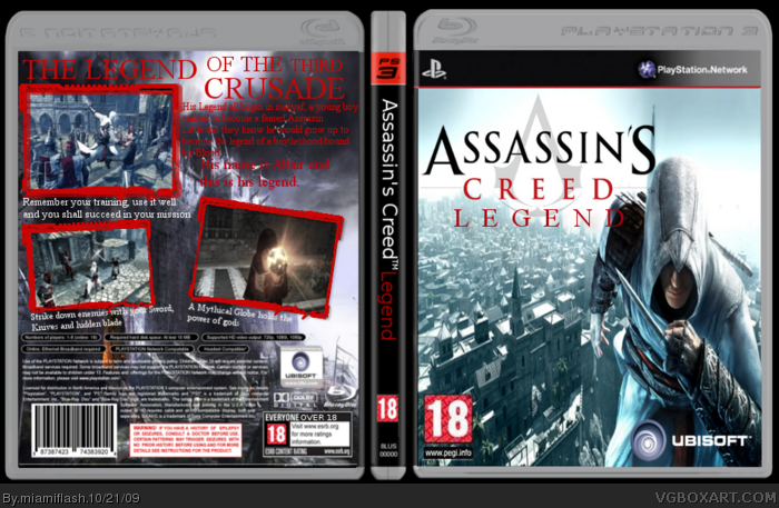
anyone think this is an improvement for me ?
[ Reply ]
Yeah, I think it's an improvement for you. Is it just me or is Altair stretched on the front?
(the front template is different from the rest of it.)
Edited at 1 decade ago
[ Reply ]
#2, it's not just you no, this is version 1 of maybe 3 depending on how good i can get it to look, i am working on version 2 right now, i managed to fix altair somehow.
i changed the back a little aswell, i only have a 360 version of the game so i can only go on that.
the front template is the only 1 i could find on the resources thread and the next box is hopefully gonna be in 3D.
[ Reply ]
#2, THE SECOND EDITION WILL BE UP TOMORROW.
UPDATED OF COURSE, I HAVE CHANGED EVERYTHING.
[ Reply ]
New version is posted, totally finished version #2.
thanks to a few guys on the resources thread for the template and of course the screen borders (Although i altered them in blood).
check all of my boxes and see how i have progressed thanks to the help from alot of people, now all i have to do is figure out how the heck to make the spine of the case 3D and i will be all set to make some good boxes from here on out.
Edited at 1 decade ago
[ Reply ]
i like it altair a little stretched and blury still but i like it so
fav
[ Reply ]
Not bad, but he still seems stretched on the front, and that bg on the front doesn't match him all that well.
[ Reply ]
#7, well the original version of altair is a render that is 2000 width by 5000 height.
i can't find any smaller versions of him atm.
but i will see what i can do for version 3.
[ Reply ]
okay, here it is, Version 3, hope you guys like it.
[ Reply ]
Looks good, you have improved a lot since your last box. You should download some fonts for the backs of your boxes, the ones you have been using look boring. I used to know a really good site for getting them, I'll pm you if I find it.
[ Reply ]
#10, fonts, yeah i got this gimp thing but all it gives me is a basic package with Times New Roman which i used for the Legend logo, i'll take that download if you got it.
[ Reply ]
Altair is a bit stretched on the front, other than that nice improvement. (Agree with ojoe2000)
[ Reply ]