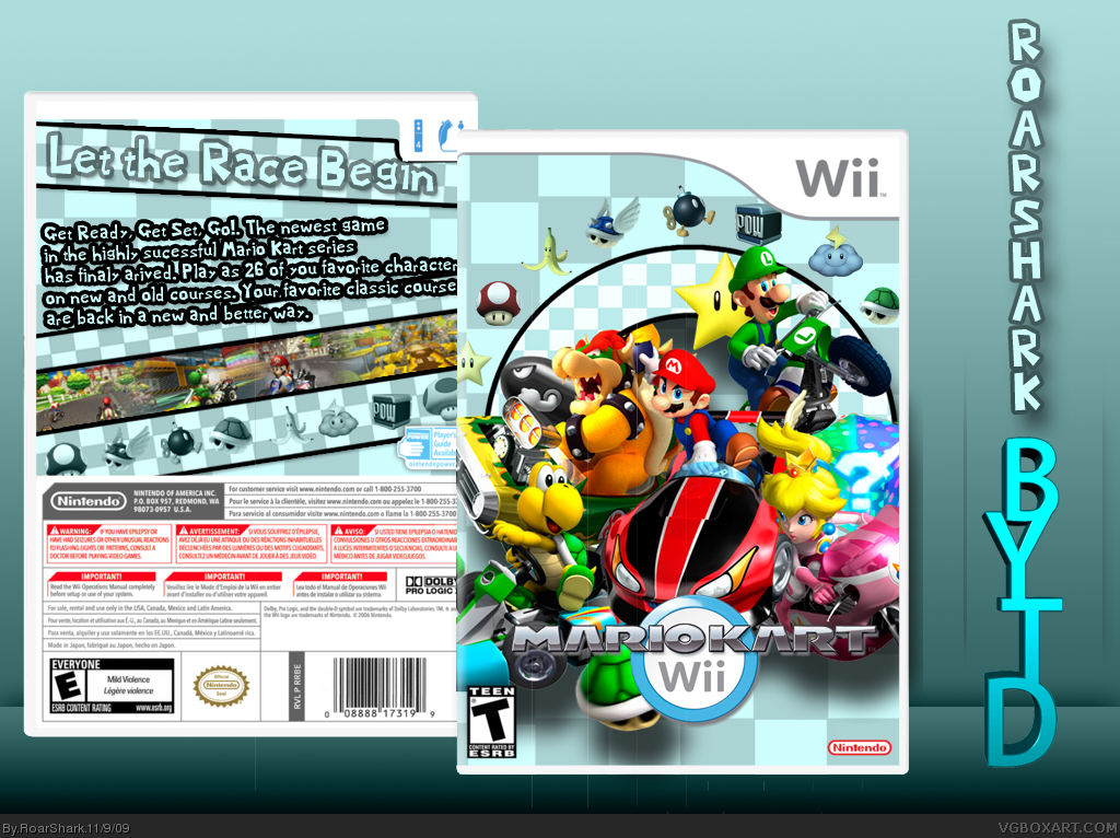
#2, I have a few suggestions: Turn the screenshots bigger, and the overall design more colorful (Maybe the items and the tagline).
As I said, they're just suggestions, just my opinion...
Great box, anyway.
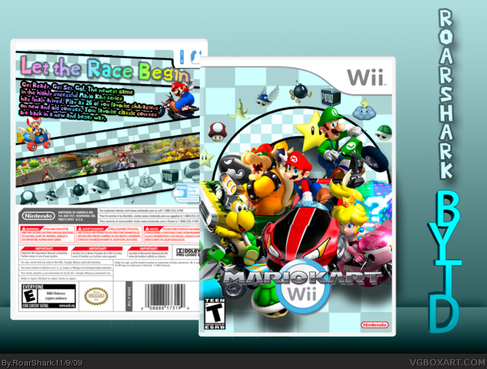
Wow, better than the official. The only things that keep it from perfect are the compatible controllers need to show GC and CC support and bob-omb that is cut off in Mario's right hand.
wow< this box is wonderful seeing how plan the original is >_>
yet the back i just have two pet peeves >_>
the top of toads head is bothersome but thats probably just me
and maybe give the items some color
and about #fifteen
i agree about the controlers though
The front is spectacular, maybe just a Wi-Fi logo, and T-rating needs to be an E-rating, the half Bob-Omb Mario's holding and more showing the new control. The Back isn't that great. The renders are fine, but the text doesn't seem to present the box well. You should say that it can use the Wii Wheel, Classic Controller, and the GC Controller. Also the Screenshots look clumped together, as if it were one huge screenshot. Other then that it's great.
Front:4.5/5(A few wrong things)
Back:3/5
Overall:4/5
 Mario Kart Wii Box Cover Comments
Love the front, but that back doesn't work for me...
[ Reply ]
#1, how can I fix it?
[ Reply ]
I like this version alot better. The back is easyer on the eye tbh.
[ Reply ]
Nice, I like the front+fav
Edit:#5, Agreed
Edited at 1 decade ago
[ Reply ]
#2, I have a few suggestions: Turn the screenshots bigger, and the overall design more colorful (Maybe the items and the tagline).
As I said, they're just suggestions, just my opinion...
Great box, anyway.
[ Reply ]
#5, Okay here is an update then.
[ Reply ]
#1, This.
[ Reply ]
Awesome, love the style.
[ Reply ]
Very nice (again).
[ Reply ]
Yes, that front is awesome but the back does let it down. plus the ESRB's don't match. Fave anyway :)
[ Reply ]
Awesome job, love the front.
[ Reply ]
The front is excellent!!!!
The back is not. MPut more emphasis on the game rather than text.
People ARE NOT going to read the text.
Edited at 1 decade ago
[ Reply ]
Thank You all, here's an update hopefully making the back good.
[ Reply ]
well this is quite different than your others...
and i like different
[ Reply ]
Wow, better than the official. The only things that keep it from perfect are the compatible controllers need to show GC and CC support and bob-omb that is cut off in Mario's right hand.
[ Reply ]
wow< this box is wonderful seeing how plan the original is >_>
yet the back i just have two pet peeves >_>
the top of toads head is bothersome but thats probably just me
and maybe give the items some color
and about #fifteen
i agree about the controlers though
either way i give this box a ninty nine %
[ Reply ]
The front is spectacular, maybe just a Wi-Fi logo, and T-rating needs to be an E-rating, the half Bob-Omb Mario's holding and more showing the new control. The Back isn't that great. The renders are fine, but the text doesn't seem to present the box well. You should say that it can use the Wii Wheel, Classic Controller, and the GC Controller. Also the Screenshots look clumped together, as if it were one huge screenshot. Other then that it's great.
Front:4.5/5(A few wrong things)
Back:3/5
Overall:4/5
Edited at 1 decade ago
[ Reply ]