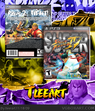
Sorry full size is a little huge, I may cut it down a little later.
Big thanks to Scorpion Soldier for the awesome template. I had a lot of fun making this box. I hope that it shows an artistic flair that reminds people of the style of the game itself. I was going to do some of the sketchy style from the official art, but decided I wanted to use in-game art instead.
Very cool, feels like retro! I only have a bit of a problem with the "Super" logo at the front, and I love the background as it looks like a poster/magazine ad.
#3, It actually isn't the official logo, as Grand mentioned. I took the official SF IV logo and added the SUPER myself. I might update to the official logo, since the emboss job is tighter on that one than my own. Otherwise, I'm happy with it. It would seem for the most part you guys enjoy it, too.
I mean the difference is minor but I don't know why he didn't use the official. True, the official kinda blows, but I'm always for using official logos when they're available.
#12, I just felt I wanted to recreate the effect if I could myself. I didn't do too bad, but like I said, I may end up grabbing an official version and using it to give it a little more legitimacy.
Nice retro logo sir! Definitely reminiscent of the original Super SF version. I really like how you put the design together with the presentation as well.
#14, I like the fact that I've ditched the plastic personally. It was a hinderance in making my presentations look good, and it has a more modern feel to it, in my opinion.
#15, I'm glad somebody likes my new presentation style! I'm going to be tweaking it as I go, try to make each one have elements from the actual game's style added into the mix, like the font style I chose for my name on this one.
I was kinda hoping this one deserved HoF, but then again, a lot of people have really stepped up their quality around here. Thanks for all the comments and favs, I hope that my next entry is better.
 Super Street Fighter IV Box Cover Comments
Sorry full size is a little huge, I may cut it down a little later.
Big thanks to Scorpion Soldier for the awesome template. I had a lot of fun making this box. I hope that it shows an artistic flair that reminds people of the style of the game itself. I was going to do some of the sketchy style from the official art, but decided I wanted to use in-game art instead.
Let me know what you think!
[ Reply ]
The logo is off. Why didn't you use the official logo? Like the one I used:
link
That's the official one.
I really like the back, though. But the overall background is kind of distracting.
[ Reply ]
#2, What is the difference between the logos?
[ Reply ]
Very cool, feels like retro! I only have a bit of a problem with the "Super" logo at the front, and I love the background as it looks like a poster/magazine ad.
[ Reply ]
Looks great, and I really like the logo too.
[ Reply ]
This is just superb.
[ Reply ]
#3, It actually isn't the official logo, as Grand mentioned. I took the official SF IV logo and added the SUPER myself. I might update to the official logo, since the emboss job is tighter on that one than my own. Otherwise, I'm happy with it. It would seem for the most part you guys enjoy it, too.
[ Reply ]
Awe-mazing.
[ Reply ]
AWESOME!! I like your logo a lot better than the official.
[ Reply ]
Very stylish!
[ Reply ]
Good very good..+fav
[ Reply ]
#3, You can't see the difference?
I mean the difference is minor but I don't know why he didn't use the official. True, the official kinda blows, but I'm always for using official logos when they're available.
[ Reply ]
#12, I just felt I wanted to recreate the effect if I could myself. I didn't do too bad, but like I said, I may end up grabbing an official version and using it to give it a little more legitimacy.
Edited at 1 decade ago
[ Reply ]
It looks wierd without a *plastic*, but still cool none-the-less.
Edited at 1 decade ago
[ Reply ]
Nice retro logo sir! Definitely reminiscent of the original Super SF version. I really like how you put the design together with the presentation as well.
[ Reply ]
#14, I like the fact that I've ditched the plastic personally. It was a hinderance in making my presentations look good, and it has a more modern feel to it, in my opinion.
#15, I'm glad somebody likes my new presentation style! I'm going to be tweaking it as I go, try to make each one have elements from the actual game's style added into the mix, like the font style I chose for my name on this one.
I was kinda hoping this one deserved HoF, but then again, a lot of people have really stepped up their quality around here. Thanks for all the comments and favs, I hope that my next entry is better.
[ Reply ]
Awesome, I like it a lot!
[ Reply ]