#2, esrb is good size, and its ALWAYS on top of anything that is art on a box, so if he doesnt want the logo to be covered he has to move the actual logo
This isn't horrible. The logo itself is nice, and conceptually It's impressive, but it suffers from the cliche' "splatter brush" that plagues the graphic design world.
Rarely are splatters appropriate for ANYTHING, this goes doubly for the LoZ series.
It reminds me of when Wasa-bi put a picture of Ada Wong on a white background with shitloads of black splatters, swirls, and a few butterfly brushes, then called it a RE4 cover.
Unfortunately, people eat that shit up, and I'm sure this box will be popular because of it.
In my personal opinions, splatters should stay where they belong: On discount graphic t-shirts from Wal-Mart.
#7, not really, it is true, most popular photoshop designs have splatter in them, its kinda like the lazy way out
EDIT: and to kinda respond for the slyder, sometimes game developers dont design the best boxes, look at MGS4 as an example, a troll could have done that, so just because they are big companies doesnt mean that THEY are always right when it comes to graphic design
#8, I would like to see you draw the cover of MGS4 in Photoshop. I think it is a good cover. It shows the main character and the age on his face. Yes they could have taken a different approach with the cover and kept it MGS style but they didn't. TheSlyder can be nicer in his comments.
Yes splatter paint should be used lightly but that doesn't mean you need to rip on him for it. I could see if he did it on multiple boxes. I think the splatter works with this kind of imagine.
#9, dude, its a supersized render, with logos, its cool but simple, and im not dishin on the kid, his box is excellent, but all im sayin is that what slyder said is true, its like agreeing that alcohol is bad, and then toasting to that agreement with a beer(lol)...
conclusion is...i love this box, but the splatter effect is a tad bit overused ON OTHER BOXES, not on this one...=]
1) Just because EA does it doesn't make it a good idea. Those boxes both look even more horrible than the generic "White background with sports star" covers that sports games usually harbor.
2) I never said it was rarely used, I said it was rarely appropriately used (As in it often is out of place, and is very obviously there just because it's the "in" thing with graphic design.)
3) I don't think I was being mean. I acknowledged the merits of the box, but I felt that the flaws of it were stronger, and I felt I addressed them appropriately.
#5, I never called it RE4-Cover (ADA CHRONICLES!!!) and you are missing certain other parts of that design, like a lot of those "so called splatters" being cracks of glass, butterflies and a bunch of ornaments from lingerie (butterflies and flowers can be seen on Adas dress, you know), but if you wanna play on that level again:
it is not better as acting like a handmade box with cockled leather is the biggest project the site has seen."Hats off" to the work, but it is far from being the biggest thing ever.
You sure are right saying that kinda look is way overused, but that's no reason to say it doesn't fit certain projects or it should no longer be used. Not to mention certain people used that style before it was "cool".
Anyways, get a life without your silly wasa-bi bashing all the time. Like when you post some negative comment about a box you always have to do the "like wasa-bi"-part. THX!
#8, because uncle slider and fans act like pros and post images on the net doesn't mean THEY are always right when it comes to graphic design. There is more behind graphic design than what you see when looking at, for example, the mgs package. A troll can make something like that? All right, show us! It is not like those poeple are just sitting there and loading pictures into documents.
OH! And own taste is something diffrent. You don't like the mgs package? Well... that's your thing. That's no reference for the designers work and skill, you know? Besides it is still the customer who does choose the design - in case of mgs it is konami, since they don't make packages on their own. They get a bunch of layouts and choose what they think is best. The designers just have to accept that!
Not to mention the very hard part - working with the corporate identity and corporate design. Something that's not considered on almost every package on this site. I don't do so as well on a lot of those homemade packages, but that's the good part at doing something for fun and completely free.
@ box: it looks a bit like a certain shops zelda-shirt, so the idea is not new to me. It is well executed, but the Zelda logo is a bit too much on the rating though. I would remove some of the texts tracking at the word "collection" too.
#13, dude, i never said i dont like the msg box, and yes the company has to actually MAKE the render, but all im saying is that its simple, thats all, its a simple box layout, why cant you be more like trevowns, he actually reads and comprehends what ppl are saying, and im not sayin that slyder is correct, im just going with what i think and what i stand by, in this case my and slyder kinda have he same idea and thoughts when it comes to splatter, so thats that, and lets not start a flood of flame comments on this kids box, its to good of a box to shower with comments that arent about it
Ignoring the debate.
I really like this box, especially with the design choice of using old sprites instead of old artwork, makes the splatters that much cooler.
#13, I really like how out of the entire essay you posted, a couple sentences were all that was relevant to the actual box. the rest of it was just bitching and crying, as always, and trying to insult or point the finger at someone else, as always, in an attempt to make yourself feel better.
It's funny, when I posted that, I knew you would reply to it hastily, because the only time you post is when someone mentions you, and it's always so that you can get defensive and retaliate.
#19, I really like how out of the entire essay you posted, a couple sentences were all that was relevant to the actual box. the rest of it was just bitching and crying about "how bad wasa-bi" is and the whole "I am the uber-artist", and trying to insult or point the finger at someone else, in an attempt to make yourself feel better. Not to mention you are pretty damn hit when someone is saying your stuff is not the best, like you do all the time. You can dish it out, but can't take it.
Hey and your last comment wasn't even related to the box in a single way.
It's funny, when I posted that, I knew you would reply to it hastily, because the only time you post is when you can write your half-truth comments about wasa-bi or when you get the chance of writing "oh that's just like wasa-bi", and it's always so that you can get defensive and retaliate.
You know the diffrence of getting into defence and adjusting some wrong stuff, right? Like the things you posted here. There was just one splatter on the ada package, the rest was the stuff as mentioned. Besides it was not called RE4 package.
And do you ever notice other comments from me? I doubt it. You just pick the ones you like.
Danke für das Kompliment, tausendfach zurückgeschenkt. Stinkstiefel!
Gomen, Mushir, but it's always like that with Slyder. Hope you'll be free from the whole "it's like wasa-bi" stuff in the future.
 The Legend Of Zelda: Collection Box Cover Comments
first comment and fav =]
as i said on the "set"
its creative, i like it alot
[ Reply ]
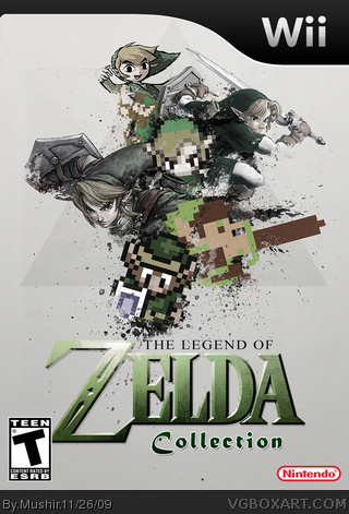
This is really creative, I really like it. One thing though, make the ESRB a bit smaller so it is not covering the logo.
Also, add a back please.
[ Reply ]
#2, esrb is good size, and its ALWAYS on top of anything that is art on a box, so if he doesnt want the logo to be covered he has to move the actual logo
[ Reply ]
This is really cool, I was going to make somthing very similar...
[ Reply ]
This isn't horrible. The logo itself is nice, and conceptually It's impressive, but it suffers from the cliche' "splatter brush" that plagues the graphic design world.
Rarely are splatters appropriate for ANYTHING, this goes doubly for the LoZ series.
It reminds me of when Wasa-bi put a picture of Ada Wong on a white background with shitloads of black splatters, swirls, and a few butterfly brushes, then called it a RE4 cover.
Unfortunately, people eat that shit up, and I'm sure this box will be popular because of it.
In my personal opinions, splatters should stay where they belong: On discount graphic t-shirts from Wal-Mart.
[ Reply ]
#5, and yet again, uncle slyder speaks the truth
[ Reply ]
#5, Say that to the EA covers link link
If your going to say something is rarely used then you should make sure its not on several new covers.
#6, and yet again someone ban wagens what TheSlyder says because they think he is always correct.
Edited at 1 decade ago
[ Reply ]
#7, not really, it is true, most popular photoshop designs have splatter in them, its kinda like the lazy way out
EDIT: and to kinda respond for the slyder, sometimes game developers dont design the best boxes, look at MGS4 as an example, a troll could have done that, so just because they are big companies doesnt mean that THEY are always right when it comes to graphic design
Edited at 1 decade ago
[ Reply ]
#8, I would like to see you draw the cover of MGS4 in Photoshop. I think it is a good cover. It shows the main character and the age on his face. Yes they could have taken a different approach with the cover and kept it MGS style but they didn't. TheSlyder can be nicer in his comments.
Yes splatter paint should be used lightly but that doesn't mean you need to rip on him for it. I could see if he did it on multiple boxes. I think the splatter works with this kind of imagine.
[ Reply ]
#9, dude, its a supersized render, with logos, its cool but simple, and im not dishin on the kid, his box is excellent, but all im sayin is that what slyder said is true, its like agreeing that alcohol is bad, and then toasting to that agreement with a beer(lol)...
conclusion is...i love this box, but the splatter effect is a tad bit overused ON OTHER BOXES, not on this one...=]
[ Reply ]
#10, Fair enough, I second that.
[ Reply ]
1) Just because EA does it doesn't make it a good idea. Those boxes both look even more horrible than the generic "White background with sports star" covers that sports games usually harbor.
2) I never said it was rarely used, I said it was rarely appropriately used (As in it often is out of place, and is very obviously there just because it's the "in" thing with graphic design.)
3) I don't think I was being mean. I acknowledged the merits of the box, but I felt that the flaws of it were stronger, and I felt I addressed them appropriately.
[ Reply ]
#5, I never called it RE4-Cover (ADA CHRONICLES!!!) and you are missing certain other parts of that design, like a lot of those "so called splatters" being cracks of glass, butterflies and a bunch of ornaments from lingerie (butterflies and flowers can be seen on Adas dress, you know), but if you wanna play on that level again:
it is not better as acting like a handmade box with cockled leather is the biggest project the site has seen."Hats off" to the work, but it is far from being the biggest thing ever.
You sure are right saying that kinda look is way overused, but that's no reason to say it doesn't fit certain projects or it should no longer be used. Not to mention certain people used that style before it was "cool".
Anyways, get a life without your silly wasa-bi bashing all the time. Like when you post some negative comment about a box you always have to do the "like wasa-bi"-part. THX!
#8, because uncle slider and fans act like pros and post images on the net doesn't mean THEY are always right when it comes to graphic design. There is more behind graphic design than what you see when looking at, for example, the mgs package. A troll can make something like that? All right, show us! It is not like those poeple are just sitting there and loading pictures into documents.
OH! And own taste is something diffrent. You don't like the mgs package? Well... that's your thing. That's no reference for the designers work and skill, you know? Besides it is still the customer who does choose the design - in case of mgs it is konami, since they don't make packages on their own. They get a bunch of layouts and choose what they think is best. The designers just have to accept that!
Not to mention the very hard part - working with the corporate identity and corporate design. Something that's not considered on almost every package on this site. I don't do so as well on a lot of those homemade packages, but that's the good part at doing something for fun and completely free.
@ box: it looks a bit like a certain shops zelda-shirt, so the idea is not new to me. It is well executed, but the Zelda logo is a bit too much on the rating though. I would remove some of the texts tracking at the word "collection" too.
Edited at 1 decade ago
[ Reply ]
Good job, I really like this.
[ Reply ]
lovely ^^
[ Reply ]
this is sweet....its a good "collection" box defiantly.
[ Reply ]
#13, dude, i never said i dont like the msg box, and yes the company has to actually MAKE the render, but all im saying is that its simple, thats all, its a simple box layout, why cant you be more like trevowns, he actually reads and comprehends what ppl are saying, and im not sayin that slyder is correct, im just going with what i think and what i stand by, in this case my and slyder kinda have he same idea and thoughts when it comes to splatter, so thats that, and lets not start a flood of flame comments on this kids box, its to good of a box to shower with comments that arent about it
[ Reply ]
Ignoring the debate.
I really like this box, especially with the design choice of using old sprites instead of old artwork, makes the splatters that much cooler.
[ Reply ]
#13, I really like how out of the entire essay you posted, a couple sentences were all that was relevant to the actual box. the rest of it was just bitching and crying, as always, and trying to insult or point the finger at someone else, as always, in an attempt to make yourself feel better.
It's funny, when I posted that, I knew you would reply to it hastily, because the only time you post is when someone mentions you, and it's always so that you can get defensive and retaliate.
[ Reply ]
#19, I really like how out of the entire essay you posted, a couple sentences were all that was relevant to the actual box. the rest of it was just bitching and crying about "how bad wasa-bi" is and the whole "I am the uber-artist", and trying to insult or point the finger at someone else, in an attempt to make yourself feel better. Not to mention you are pretty damn hit when someone is saying your stuff is not the best, like you do all the time. You can dish it out, but can't take it.
Hey and your last comment wasn't even related to the box in a single way.
It's funny, when I posted that, I knew you would reply to it hastily, because the only time you post is when you can write your half-truth comments about wasa-bi or when you get the chance of writing "oh that's just like wasa-bi", and it's always so that you can get defensive and retaliate.
You know the diffrence of getting into defence and adjusting some wrong stuff, right? Like the things you posted here. There was just one splatter on the ada package, the rest was the stuff as mentioned. Besides it was not called RE4 package.
And do you ever notice other comments from me? I doubt it. You just pick the ones you like.
Danke für das Kompliment, tausendfach zurückgeschenkt. Stinkstiefel!
Gomen, Mushir, but it's always like that with Slyder. Hope you'll be free from the whole "it's like wasa-bi" stuff in the future.
Edited at 1 decade ago
[ Reply ]