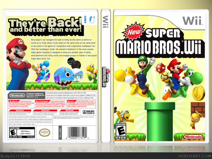
Hello everyone, and welcome to a project i had been tweaking for quite some time now:
New Super Mario Bros Wii.
I decided for myself that i wanted to make a game in which the colour-scheme is totally different from the usual.I chose a bit of a retro colour scheme, and i tried to listen to the comments in my WIP thread as much as i could.
Thanks to everyone who has helped me in the progress,from chats to the forums.Thanks alot.
The makeup of the text on the back could be a bit better and I guess you should move the headline on the back, since it's behind that "4-Player-/Controll-Icon". Making it a bti smaller would be okay too, just make sure nothing of it is kinda hiding behind that icon.
The yellow color for the background is a bit diffrent - but it got a fresh touch.
 New Super Mario Bros. Wii Box Cover Comments
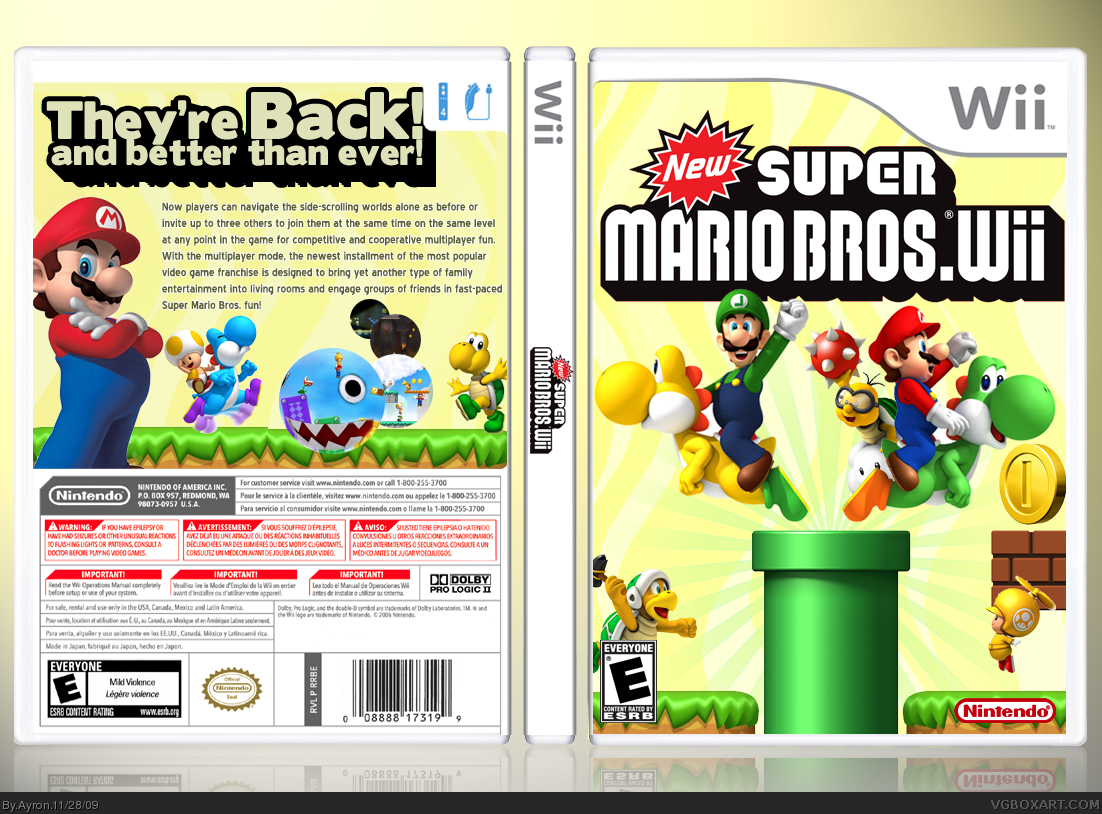
Hello everyone, and welcome to a project i had been tweaking for quite some time now:
New Super Mario Bros Wii.
I decided for myself that i wanted to make a game in which the colour-scheme is totally different from the usual.I chose a bit of a retro colour scheme, and i tried to listen to the comments in my WIP thread as much as i could.
Thanks to everyone who has helped me in the progress,from chats to the forums.Thanks alot.
Please,enjoy it =].
-Sander
[ Reply ]
looks great, but why is yellow toad so small on the front
where's blue toad?
And it kind of looks boring that the front and the back has the same background
+fav
Edited at 1 decade ago
[ Reply ]
You still need to flip luigi's L on the hat.
[ Reply ]
#3,I knew i forgot something.
Updated[flipped L].
Edited at 1 decade ago
[ Reply ]
Great job Sander, my favorite part would be the chain chomp screens, very innovative.
[ Reply ]
You finally completed it! Hurrah! Looks great!
[ Reply ]
Those screens are the shit
[ Reply ]
Nice, I love those screenshots!
[ Reply ]
Total WIN!
[ Reply ]
The makeup of the text on the back could be a bit better and I guess you should move the headline on the back, since it's behind that "4-Player-/Controll-Icon". Making it a bti smaller would be okay too, just make sure nothing of it is kinda hiding behind that icon.
The yellow color for the background is a bit diffrent - but it got a fresh touch.
[ Reply ]
I didnt realise you had posted this! Anyway good job, yet again another awesome box, fav :)
[ Reply ]
#10, Thanks for the criticism Wasa-bi, i'll be sure to keep those in mind for future designs.
Thanks alot for the feedback,everyone!
[ Reply ]
Clean and slick. I really like the yellow color with this design as well.
[ Reply ]