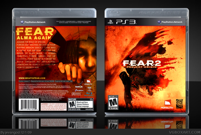
Hello everyone. Man I really worked hard on this one, seriously. Ok first I started on the colortone. I wanted a color tone that was different from the official and from the ones on this site. Next I rendered Alma on the front and put her on the wallpaper in which she is swinging but instead I made it her walking up the hill. Gives a bit creepy and lonely feeling. On the back I found this great image of alma peaking through broken glass and just had to use it. I tried to copy the same color tone on the front to the back but wasnt working out. So I had to find something really close to the front colortone. Than I finally did. So I hope you all realize that I wasnt going for info on the game and trying to fill up with the details and all but I was going for creativity.
Cooool!! That colour really sets the mood and feeling. I don't think a screen or 2 on the back would hurt, but even without them, this kicks some serious ass!! Hard work is 100% evident in this one.
Methinks it could be yet another HoF for you Jevan.
#8, Yea not telling right. I have no problem telling where I got it from but I cant remember. I think it was flickr.
Yea the organization on the back isnt its best but like I said I was going for a bit creativity look. yes that involves organization at times but not this time. Yea I really tried on the logo as well but it didnt come out quite well and felt that it would take away the look you see now on the box. Thanks for the comment man.
#16, I never said it had to have screen shots, it just looks like he copied and pasted a summary into a text block, set it to overlay and called it a day.
 F.E.A.R. 2: Project Origin Box Cover Comments
Hello everyone. Man I really worked hard on this one, seriously. Ok first I started on the colortone. I wanted a color tone that was different from the official and from the ones on this site. Next I rendered Alma on the front and put her on the wallpaper in which she is swinging but instead I made it her walking up the hill. Gives a bit creepy and lonely feeling. On the back I found this great image of alma peaking through broken glass and just had to use it. I tried to copy the same color tone on the front to the back but wasnt working out. So I had to find something really close to the front colortone. Than I finally did. So I hope you all realize that I wasnt going for info on the game and trying to fill up with the details and all but I was going for creativity.
[ Reply ]
The cover rocks my world.
[ Reply ]
Where did you get that template?
[ Reply ]
#3, Cant remember. It was a few months back when I got it.
[ Reply ]
Cooool!! That colour really sets the mood and feeling. I don't think a screen or 2 on the back would hurt, but even without them, this kicks some serious ass!! Hard work is 100% evident in this one.
Methinks it could be yet another HoF for you Jevan.
[ Reply ]
Crap..an epic box right In front of mine XD amazing job jevan
[ Reply ]
i....just.....juiced myself a little =S
[ Reply ]
#4, That's Jevan for "I'm not telling"
The back feels poorly done organization wise, and the logo on the front could be bigger. The editing is well done though.
[ Reply ]
O_o Woah... Earning your Rank, Jevan... very stylish.
Edited at 1 decade ago
[ Reply ]
#8, Yea not telling right. I have no problem telling where I got it from but I cant remember. I think it was flickr.
Yea the organization on the back isnt its best but like I said I was going for a bit creativity look. yes that involves organization at times but not this time. Yea I really tried on the logo as well but it didnt come out quite well and felt that it would take away the look you see now on the box. Thanks for the comment man.
[ Reply ]
Sorry but that front is almost exactly the same as Bretteska99's just with different colors.
Edited at 1 decade ago
[ Reply ]
Incredible, very original.
[ Reply ]
Noice!
[ Reply ]
Even though Brettska has done this front, your back is better :)
[ Reply ]
#14, Thanks.
Like I said people I was just really going creative with this one. Thats what people ask from me and thats what I give back.
[ Reply ]
@#8, There is no VGBoxart law stating that a back needs to have screenshots.
Honestly I prefer it this way - the effect would've been ruined with forced addition of screenshots or extra text/quotes.
Great job Jevan. I love the front and the back and good for you that you managed to find a similar colortone.
Although my perfectionist senses tell me that the F.E.A.R logo on the front is not dead in the center (its slightly nudged to the left).
[ Reply ]
#16, I never said it had to have screen shots, it just looks like he copied and pasted a summary into a text block, set it to overlay and called it a day.
[ Reply ]
#16, Thanks. Yea I noticed the logo is off a bit as well. Ill see if I can fix it later on.
#17, No I didnt copy and paste it. I actually typed it from the official back, than worked on the blending methods.
[ Reply ]
This is fucking awesome. I love it.
[ Reply ]
#19, Yea, well I try.
[ Reply ]
Bump because this is freaking incredible. If only I faved boxes.
[ Reply ]
#21, Thank you girl friend.
[ Reply ]
It's different and that's what matters.
+FAV
[ Reply ]
How did I miss this? It's fantastic!
[ Reply ]
#24, Thanks. Printable added.
Noice second HOF of the year.
Edited at 1 decade ago
[ Reply ]
I really like this a lot. +Fave.
[ Reply ]
you are my master never seen cover like that brilliant
[ Reply ]
WOW very good! thanks for sharing
[ Reply ]