[ Box updated on December 4th, 2009 ] [ original ]
 Paper Mario: The Thousand-Year Door Box Cover Comments
Comment on Joe_Yoshi's Paper Mario: The Thousand-Year Door Box Art / Cover.
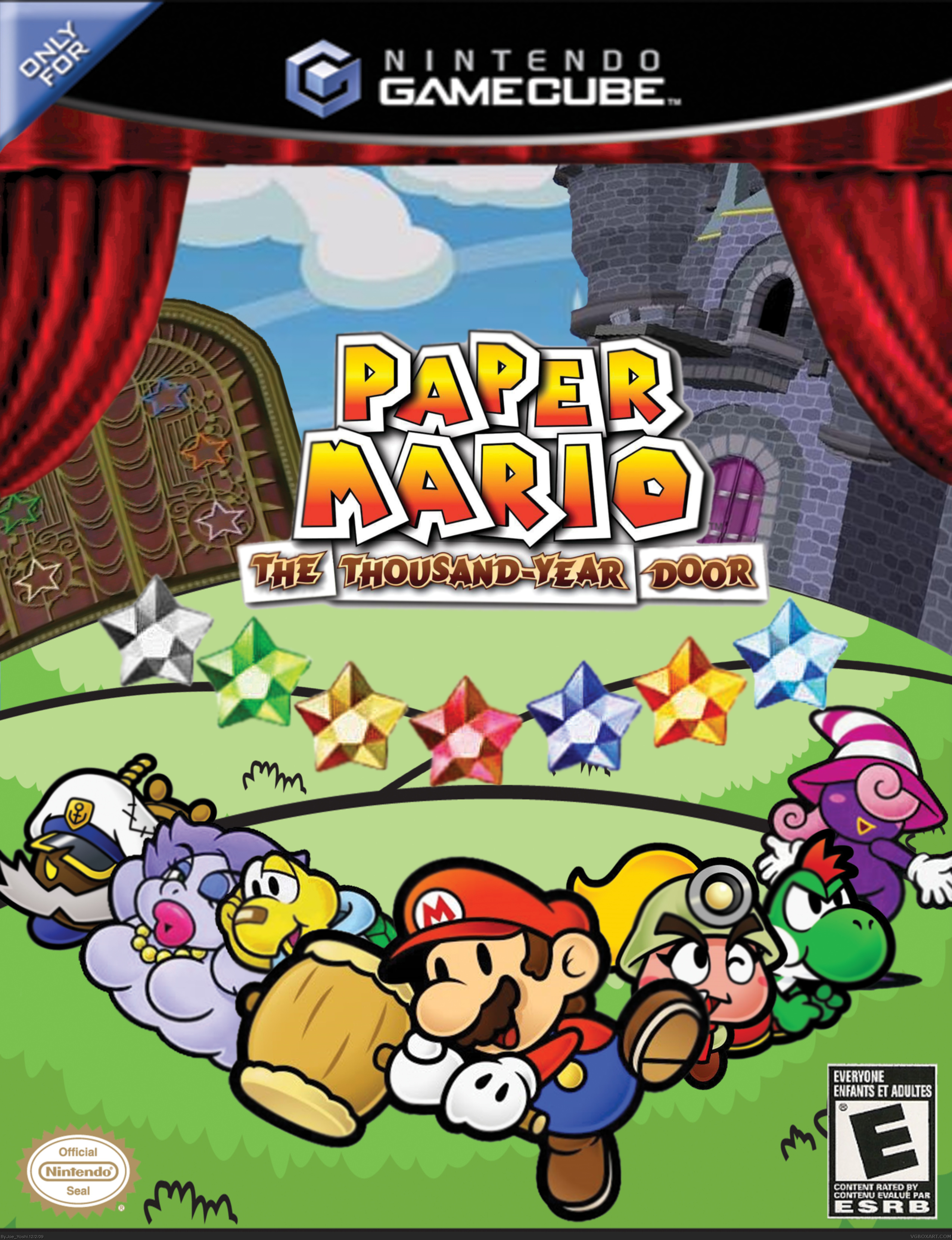
[ Box updated on December 4th, 2009 ] [ original ]
Comment on Joe_Yoshi's Paper Mario: The Thousand-Year Door Box Art / Cover.
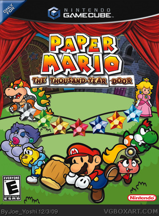
Hey guys! This is my first box art! Please tell me what you think.
Paper Mario and all relative material is copyright Nintendo.
[ Reply ]
Brilliant for a first! One thing I would do is replace Sir Bobbery and Vivian with other characters such as peach, just to prevent spoilers. For actual box design, The logo should be bigger, and the curtains are very low quality. The characters, although paper, still should have shadows, and finally, I would like to see it on a better template and a back. For suggestions of a template, I would suggest qwerty334's template from the forums.
[ Reply ]
To #2. Lol! I hadn't though about the possibility of spoilers! I will definately change that. Hmm. I thought the logo would be fine since it's right in the middle, but if you say it should be bigger then commenters are usually right. Curtains I just kind googles and picked out the best looking one. And shadows! Damn. Totally had forgotten. I will definitely change all of this and update. Thanks by the way!
[ Reply ]
#3, Youre welcome, but it is great for a first! Fix those things and I'll fav ;)
Also, just PM me if you ever need any help with your boxes.
Oh, and when I said qwerty's template from the forums, I meant the RESOURCES section, lol.
Edited at 1 decade ago
[ Reply ]
Great for a first. In addition to what #2 said you might want to change the logos at the bottom when you update. The rating should be on the left I think, and instead of a nintendo seal of quality you just need the regular nintendo logo on the bottom right. Again really nice for a first.
[ Reply ]
i see nothing wrong with this box, just think peach and bowser should be on it.
i'll fave this XD
[ Reply ]
#5, Wow. Thanks alot! I will change that too.
[ Reply ]
#7, Very nice. One of the best firsts on the site! I can see that youll shape up to be one of the great artists here.
[ Reply ]
#8,Wow! You really think so!? Here I'm just a grade 10 student attempting to be good in graphic art... Lol. Thanks a lot!
[ Reply ]
#9, Well, not advertising, but check out VERSION ONE my first, and you'll see what I mean xD
[ Reply ]
It's amazing! 5/5!
[ Reply ]
This is your fist?! Its fucking amazing. Fav + Author Fav!
[ Reply ]
#12, Jeez! thanks!
[ Reply ]