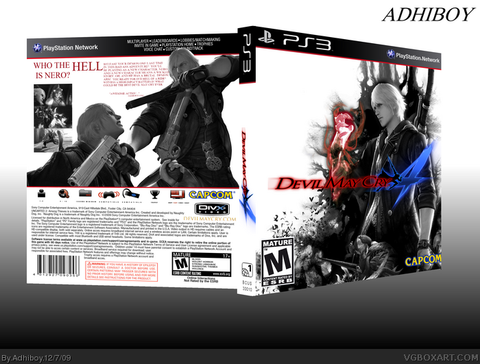
So here it is. Let me just start off by saying that there were two other completely different versions of this box. I actually posted one, then deleted.
I used made this box because I wanted a reason to use the new PS3 template. I'm pretty proud of the end result.
I was going to do a reflection, but I didn't want to ruin it. At the last second, I changed the font on the back because it was too small.
Please comment.
That front image... I've seen it on google images, except nero has a blue hand. And on the back dante is covering the temp partially. And i don't like how the screen shots are in black and white, make them colour and they should stand out more.
This is soooooooo stylish. Perfect for the game! I agree with the others about the screenshots, but who even cares, really? I personally would just delete them cause it looks great how it is!
#6, that argument is a big no go on this site - even if you may seem right about this
anyways: the package is not tthat bad, but I somehow think that image on the front is familiar. as for the back: the screenshots should stand out more, I have to agree with that. add color? no, i wouldn't, but maybe some outlines or ornamental frames? you should also work a bit more with the images tones. try to get a better contrast, to make more details visible (on the back AND front). they are looking like some big, gray mush if you just remove their color. the copy on the back could be a bit bigger and you should try to find some line to align it with. how about the top of the headline?
 Devil May Cry 4 Box Cover Comments
So here it is. Let me just start off by saying that there were two other completely different versions of this box. I actually posted one, then deleted.
I used made this box because I wanted a reason to use the new PS3 template. I'm pretty proud of the end result.
I was going to do a reflection, but I didn't want to ruin it. At the last second, I changed the font on the back because it was too small.
Please comment.
[ Reply ]
That front image... I've seen it on google images, except nero has a blue hand. And on the back dante is covering the temp partially. And i don't like how the screen shots are in black and white, make them colour and they should stand out more.
[ Reply ]
i like the tag who the hell is nero? that is true, he seemingly popped out of nowher :P
+fav
[ Reply ]
I like the box and the monochromatic style you used. Also the simplicity is cool and the tagline is funny. lol
My only question is...
Why not place it on a plastic?
Edited at 1 decade ago
[ Reply ]
I like it, but the screen shots aren't very well blended and I think they would look better in a border.
[ Reply ]
#2
*Looks at jayhog's boxes*
You're really gonna judge me?
Edited at 1 decade ago
[ Reply ]
Amazing. Is there any chance you can make this printable? please?
[ Reply ]
if not for the screenshots looking awkward...i like it.
[ Reply ]
This is soooooooo stylish. Perfect for the game! I agree with the others about the screenshots, but who even cares, really? I personally would just delete them cause it looks great how it is!
[ Reply ]
i love the tagline
[ Reply ]
#6, that argument is a big no go on this site - even if you may seem right about this
anyways: the package is not tthat bad, but I somehow think that image on the front is familiar. as for the back: the screenshots should stand out more, I have to agree with that. add color? no, i wouldn't, but maybe some outlines or ornamental frames? you should also work a bit more with the images tones. try to get a better contrast, to make more details visible (on the back AND front). they are looking like some big, gray mush if you just remove their color. the copy on the back could be a bit bigger and you should try to find some line to align it with. how about the top of the headline?
Edited at 1 decade ago
[ Reply ]
looks great! how can I get a printable version?
[ Reply ]