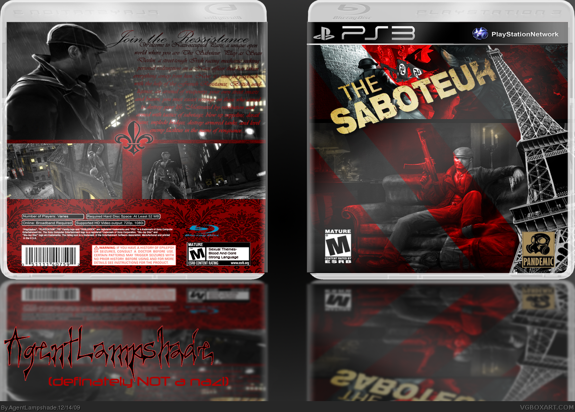
Very nice. Loving the front and equally good on the back. Lets see if people like that bottom left bit though. doesn't completely match everything else but still good.
As for you burger king - get photoshop and stop dicking around with paint.net (shudders) - it's the designer's nightmare. If your too cheap for PS then get The Gimp - it's free. You officially no longer have an excuse to suck at this. It's down to you.
Is it just me or is the package indeed squeezed/deformed? Anyways it s not that bad, but the back needs a lot more work, starting with the readability (?) of the copy, etc.
The reflection is (still) wrong... The images you are using as reflection should be as big as the original package, unless your box is standing at about 90° on the ground.
the back, well, the text... anyways, i also see a flaw in the reflection, so i'd omit it until i mastered its creation.
otherwise, pretty sweet job! every box ends up having some sort of flaw in it, as i've found. i think we all know what that means... lol
anyways, i give this a 3.91/5. you've got the right idea, but the back's text needs to blend less w/ the background and stand out, along with a change in reflection. really great anyways, I think, but it does need some touching up. +fav
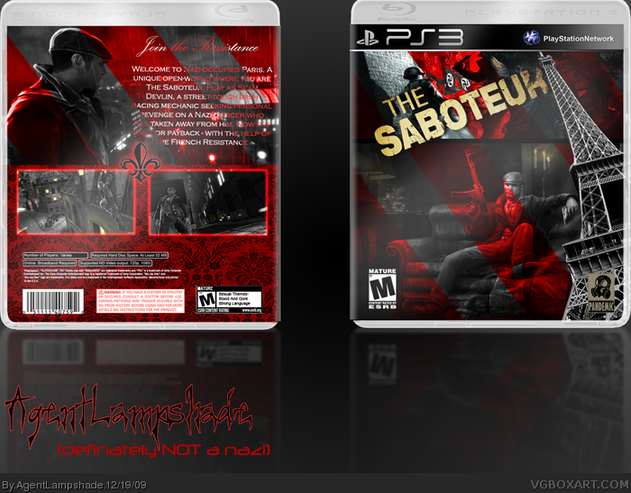
Ahh, I uploaded the wrong image! It was my work-in-progress one i uploaded, which explains why the reflection was off, and I never had the Pandemic Studios logo...Any way, i've uploaded the proper one now. And changed the back - For better or worse. Apologies for any mix-ups
 The Saboteur Box Cover Comments
I'm quite fond of this one really. say what you will...
[ Reply ]
Very nice. Loving the front and equally good on the back. Lets see if people like that bottom left bit though. doesn't completely match everything else but still good.
[ Reply ]
The box itself is really good! But the reflection is a little streched and the reflection is more blury than faded.
All together 4/5.
Edited at 1 decade ago
[ Reply ]
I like it but it's squished.
[ Reply ]
how u do the refelcting thing
[ Reply ]
Thanks for the comments everyone. I'll update it soon with a better reflection.
burgerking13 - link
[ Reply ]
This totally sucks :L
As for you burger king - get photoshop and stop dicking around with paint.net (shudders) - it's the designer's nightmare. If your too cheap for PS then get The Gimp - it's free. You officially no longer have an excuse to suck at this. It's down to you.
Edited at 1 decade ago
[ Reply ]
It sucks? In what way? (aside from the reflection, which I am currently fixing)
[ Reply ]
COS YOU MADE IT! THERE ARE SCARY NAZIs!!! (faving)
[ Reply ]
Is it just me or is the package indeed squeezed/deformed? Anyways it s not that bad, but the back needs a lot more work, starting with the readability (?) of the copy, etc.
[ Reply ]
Okay I've updated it now, just fixed the reflection. I've never been good at doing backs, hopefully I'll get better...
[ Reply ]
Sorry Taylor. It's still shite. :L:L:L
[ Reply ]
I can never win can I Gorgorath?
[ Reply ]
nice
[ Reply ]
The reflection is (still) wrong... The images you are using as reflection should be as big as the original package, unless your box is standing at about 90° on the ground.
[ Reply ]
the back, well, the text... anyways, i also see a flaw in the reflection, so i'd omit it until i mastered its creation.
otherwise, pretty sweet job! every box ends up having some sort of flaw in it, as i've found. i think we all know what that means... lol
anyways, i give this a 3.91/5. you've got the right idea, but the back's text needs to blend less w/ the background and stand out, along with a change in reflection. really great anyways, I think, but it does need some touching up. +fav
[ Reply ]
No Agent, you cannot. HAHAHA!
[ Reply ]
Ahh, I uploaded the wrong image! It was my work-in-progress one i uploaded, which explains why the reflection was off, and I never had the Pandemic Studios logo...Any way, i've uploaded the proper one now. And changed the back - For better or worse. Apologies for any mix-ups
[ Reply ]
This is a vast improvement. :) I'd fav but I can't do it twice :L
[ Reply ]