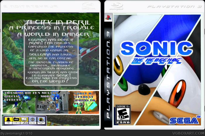
This box could use some work. The front is interesting. I would suggest getting rid of your watermark, and fixing the Sega logo. The back is pretty bad though. The 2d background taking up the whole back doesn't really fit with the 3d screenshots you're using. The screenshots could use some boarders. And Eggman shouldn't just be floating in the middle of nowhere like he is. Also maybe get rid of the stroke around Eggman. The back looks blurry too. And everywhere there is text on this box it looks jagged. Just some things you might want to think about fixing, or keep in mind for next time.
I suggest using a different font than the one chosen. If you can, find one that seems suitable for a more "serious" sonic game- which is what this one is. I'd use something along the lines of, say, Oliver's Barney 2.0. Just go to 1001fonts.com and look in the "Caps Only" font type. Should be on page two.
 Sonic the Hedgehog Box Cover Comments
hopefully my boxes are starting to get better, i tried Hard on this so i hope you like it
[ Reply ]
This box could use some work. The front is interesting. I would suggest getting rid of your watermark, and fixing the Sega logo. The back is pretty bad though. The 2d background taking up the whole back doesn't really fit with the 3d screenshots you're using. The screenshots could use some boarders. And Eggman shouldn't just be floating in the middle of nowhere like he is. Also maybe get rid of the stroke around Eggman. The back looks blurry too. And everywhere there is text on this box it looks jagged. Just some things you might want to think about fixing, or keep in mind for next time.
[ Reply ]
gotta tell you that i love the front but i hate the back needs more work
[ Reply ]
I also love the front but i dont really like the back.
[ Reply ]
The front is nice but the back can use some work. Maybe you should change that low qaulity picture of green hillzone.
[ Reply ]
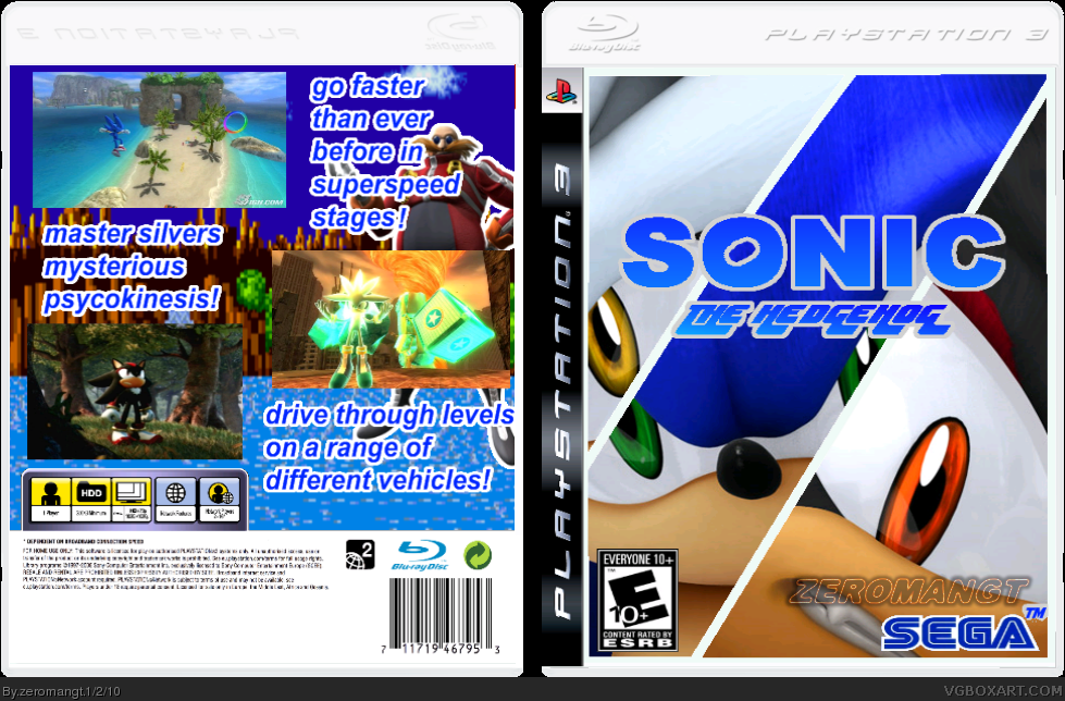
There! Fixed (hopefully.)
Also thanks rpgfreak and JoeyTheHedgehog for the faves
[ Reply ]
sorry but no... and on the back, the copyright text and that thing dosent exist
[ Reply ]
I suggest using a different font than the one chosen. If you can, find one that seems suitable for a more "serious" sonic game- which is what this one is. I'd use something along the lines of, say, Oliver's Barney 2.0. Just go to 1001fonts.com and look in the "Caps Only" font type. Should be on page two.
[ Reply ]